This post contains affiliate links and is a member of the Amazon Services LLC Associates Program. If you make a purchase using one of these affiliate or Amazon links, I may receive compensation at no extra cost to you.
Best Gray-Green Paint Colors for a Coastal Home

When most people think “coastal style,” they immediately picture navy blues and powder blues. But honestly? That’s not me. I wanted that beachy, serene feeling without looking like every other coastal project out there.
I’ve been deep in paint research mode lately for a new project and I kept coming back to these gorgeous gray-green paint colors and tones that somehow capture everything I love about coastal living. Think sea glass on a cloudy day, weathered driftwood, that perfect sage you see growing wild near the shore. They’re fresh and calming without screaming “traditional beach house”
After way too many paint chips, reading designer interviews, and honestly becoming a bit obsessed with color psychology research, I’m convinced gray-green is the sweet spot for sophisticated coastal style.
Why I’m Obsessed with Gray-Green for Coastal Homes
Okay, so there’s actually science behind why these colors work so well, and it’s fascinating.
The Psychology Bit (Bear with Me—It’s Cool)
I went down a bit of a deep dive reading about color psychology, and turns out green has been “associated with reduced stress levels, improved mood, and increased relaxation” and “studies have also linked the colour green to enhanced cognitive function, creativity, and overall psychological wellbeing” according to research from Forest Healing.
Even more interesting—a study published in SAGE Open found that “shades of green have a relaxing and refreshment effect” and research in the International Journal of Environmental Research showed that “exposure to green when walking…was related to a decreased heart rate”.
So basically, these colors aren’t just pretty—they’re actually making you feel calmer. No wonder I kept gravitating toward them!
What the Design Pros Are Saying
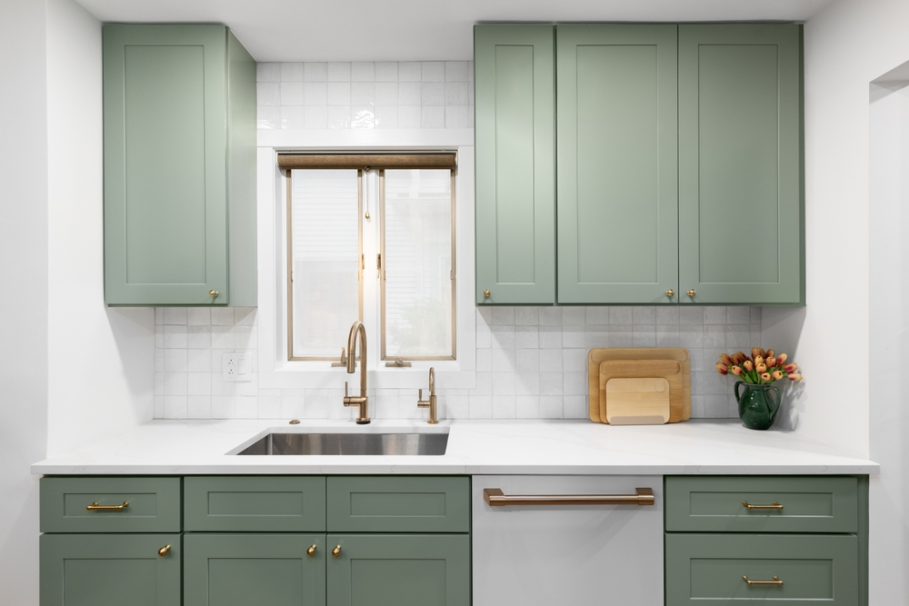
The timing couldn’t be better for this obsession. HGTV Home by Sherwin-Williams just named their 2025 Color of the Year as “Quietude,” described as a “cool sage green with a slight blue undertone”. They’re calling it “a calming color that sits somewhere between blue and green” and honestly, that perfectly captures what I love about this whole color family.
Plus, interior designer Ashley Macuga from Collected Interiors told Good Housekeeping that “relaxed green shades are gentle and subdued, inspired by natural elements like eucalyptus and olive leaves. These greens often lean towards neutral undertones, such as gray or beige, making them highly versatile — perfect for cabinetry, millwork or walls”.
The appeal for me is how these colors work with everything coastal—white shiplap, natural textures, warm wood floors. They’re like the perfect neutral that isn’t actually neutral.
My Top Gray-Green Paint Picks
I’ve narrowed it down to five colors that keep showing up in the most beautiful coastal spaces. Here’s my honest take on each:
Sherwin-Williams Sea Salt (SW 6204)
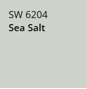
The shape-shifter everyone loves
This is probably the most talked-about color in coastal design right now, and I get it. Sea Salt is like that friend who looks different in every photo—sometimes more green, sometimes blue, sometimes perfectly gray. It’s this chameleon quality that makes it work in so many spaces.
I love how Sarah from Life on Virginia Street describes it: “a soft, muted green-gray with a hint of blue, Sherwin Williams Sea Salt resembles sea foam and coastal mist”. She also mentions that “it can absolutely still act as a neutral in a coastal space” despite being more colorful than typical neutrals.
Where I’d use it:
- Bathrooms (it’s magical in natural light)
- Bedrooms where you want that spa-like calm
- Open living areas—it flows beautifully from room to room
My take: It’s popular for a reason, but test it thoroughly. The way it changes throughout the day is either going to delight you or drive you crazy.
Sherwin-Williams Evergreen Fog (SW 9130)
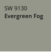
The moody sophisticate
This one’s darker and more decisive than Sea Salt. According to JK Paint, “Evergreen Fog brings nature’s calm to the exterior of your home. This green-gray hue seamlessly melds with its surroundings”. I love that it has presence without being overwhelming.
Where I’d use it:
- Statement walls behind built-ins
- Kitchen cabinets for that modern coastal vibe
- Dining rooms where you want something a bit more dramatic
My take: This is for people who want to commit to color. It’s beautiful but definitely reads as “green” rather than neutral.
Sherwin-Williams Silver Strand (SW 7057)
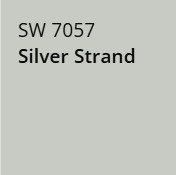
The commitment-phobe’s dream
If Evergreen Fog is the dramatic friend, Silver Strand is the reliable one. It’s mostly gray with just enough green to keep things interesting. Perfect if you want coastal vibes without anyone really noticing you used color.
Where I’d use it:
- Open-concept spaces where you need something that flows
- Hallways and transitional areas
- Any room where you’re nervous about using “real” color
My take: Safe, versatile, and surprisingly sophisticated. Sometimes the subtle choice is the smartest choice.
Benjamin Moore Healing Aloe (1562)
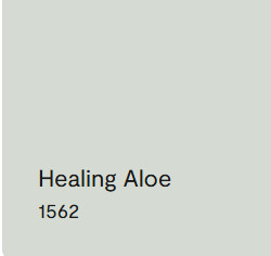
The gentle giant
This one’s lighter and airier than the Sherwin-Williams options. It has that fresh, spa-like quality that makes small spaces feel bigger and dark rooms feel brighter.
Where I’d use it:
- Guest bedrooms
- Powder rooms with limited natural light
- Anywhere you want calm without drama
My take: It’s the “your lips but better” of paint colors—noticeable improvement that looks completely natural.
Benjamin Moore Saybrook Sage (HC-114)
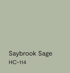
The earthy alternative
This leans warmer and more toward actual sage than the others. It’s earthier, more organic feeling. Life on Virginia Street notes it’s “one of my favorite color options for a front door or shutters, particular when paired with shaker shingles or other neutral exteriors”.
Where I’d use it:
- Dining rooms
- Cozy reading nooks
- Spaces with lots of natural wood and warm textures
My take: Choose this if your coastal style leans more “organic beach cottage” than “crisp modern seaside.”
The Testing Process That Actually Works
Here’s where I learned the hard way: you cannot judge these colors from tiny paint chips. Just can’t.
I came across this advice from interior designer Kelly Hoppen that completely changed how I test paint. She told the hosts of This Morning that “people tend to paint it on a wall, but because the color changes so much in your room depending on whether it’s night or day, you actually need to paint it on a piece of paper, so that you can see the different tones you’re going to have when it’s night time and when it’s day time”.
My Actual Testing Method:
- Get large samples—I’m talking 12×12 inch foam boards, minimum
- Paint them properly—primer first, two coats of color
- Move them around—different walls, different times of day
- Live with them for a week—your gut reaction on day one might completely change
The lighting thing is huge with gray-greens. They can look completely different in morning light vs. evening light vs. that weird afternoon light that hits certain walls.
Pairing These Colors (Without Looking Basic)
The Trim Situation
Most people automatically go white trim with colored walls, but Kelly Hoppen has this brilliant point. She recommends painting skirting boards and architectural details “the same color” as walls rather than contrasting white, saying “your eyes are going to go to that – so it should all be the same color, and often the same with the ceiling, too” when speaking on This Morning.
I love this approach—it makes everything feel more sophisticated and intentional.
But if you do want contrast:
- Crisp white trim brings out the green undertones
- Warm white trim makes everything feel more organic and beachy
What Actually Works Together:
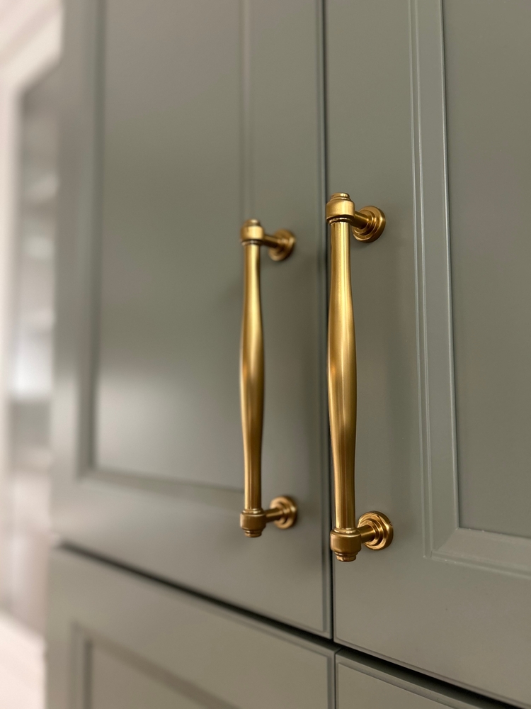
- Warm brass hardware (so much better than chrome with these colors)
- Natural wood furniture in blonde oak or weathered teak
- Soft corals and blush pinks for warmth
- Classic navy for that timeless coastal contrast
- Natural fiber rugs—jute, sisal, anything with texture
Why This Trend Has Staying Power
I’m usually skeptical of color trends, but this one feels different. Color expert TC Chou told Good Housekeeping that “the 2025 color trend will be calm and peaceful colors with earthy tones, like blue-green, to settle down the dust in your mind”.
After the past few years, who doesn’t want their home to feel like a mental reset button?
Plus, these colors work with so many different styles—modern coastal, traditional beachy, even that organic minimalist vibe that’s everywhere right now. They’re neutral enough to live with long-term but interesting enough to feel fresh.
When Gray-Green Might Not Be Your Friend
Let’s be real—no color works everywhere. Skip gray-green if:
- Your room gets zero natural light (these colors can look muddy in dark spaces)
- You have very yellow-toned artificial lighting (it’ll clash)
- Your style is super traditional or formal (these lean casual and relaxed)
- You’re a commitment-phobe who changes their mind every six months (stick with white)
My Final Take
Look, I’ve spent way too much time thinking about paint lately, but here’s what I keep coming back to: gray-green hits that sweet spot between interesting and livable. It’s coastal without being cliché, colorful without being risky, and sophisticated without being stuffy.
If you’re going to try one:
- Sea Salt for maximum versatility and that color-changing magic
- Evergreen Fog if you want something with more personality
- Silver Strand if you’re nervous about color but want something better than beige
The key is testing properly (seriously, do the foam board thing) and trusting your gut. The best paint color is the one that makes you happy every time you walk into the room—even at 7 AM before coffee.
And honestly? After all this research, I’m more convinced than ever that gray-green is having a moment for all the right reasons. It’s calming, sophisticated, and gives you that coastal vibe without looking like you copied every beach house on Instagram.