This post contains affiliate links and is a member of the Amazon Services LLC Associates Program. If you make a purchase using one of these affiliate or Amazon links, I may receive compensation at no extra cost to you.
Sage Green Christmas Tree Ideas That Feel Fresh
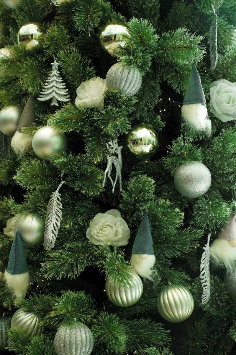
These sage green Christmas tree ideas will be all the rage this year!
I’ve been working with sage green a lot lately—mostly in unexpected places. Muted rugs that ground a room without demanding attention. Artwork with those soft, botanical tones that feel expensive without trying too hard. Greenery arrangements that lean more eucalyptus than poinsettia.
So when I started thinking about Christmas tree decor this year, I kept coming back to sage green. Not because it’s trending (though it is), but because I’m kind of over the traditional red-and-green thing that announces “IT’S CHRISTMAS” the second you walk through the door.
Sage green does something different. It’s still festive, but in a way that feels collected rather than coordinated. Like you’ve been gathering pieces over time instead of buying everything in one Target run.
Why This Actually Works
Sage green is technically green, so you’re still nodding to the traditional Christmas palette. But it’s muted enough that it doesn’t fight with your actual decor.
Zeina Badawi, an interior designer at La-Z-Boy Kanata, says it well: “Colours like sage green and sky blues will be perfect for bringing a sense of calm and connection to nature into your home.”
That’s the key. Most Christmas decor demands attention. Sage green invites it. It creates space for texture and natural materials to do the heavy lifting.
Sophie Burke, principal of Sophie Burke Design, explains that sage “offers a soft backdrop that can transform to suit either modern or traditional interiors…It evokes a sense of calm sophistication.”
Which is exactly what you want if you’re trying to decorate for Christmas without making your home feel like a holiday pop-up shop.
The Color Pairings That Actually Look Good
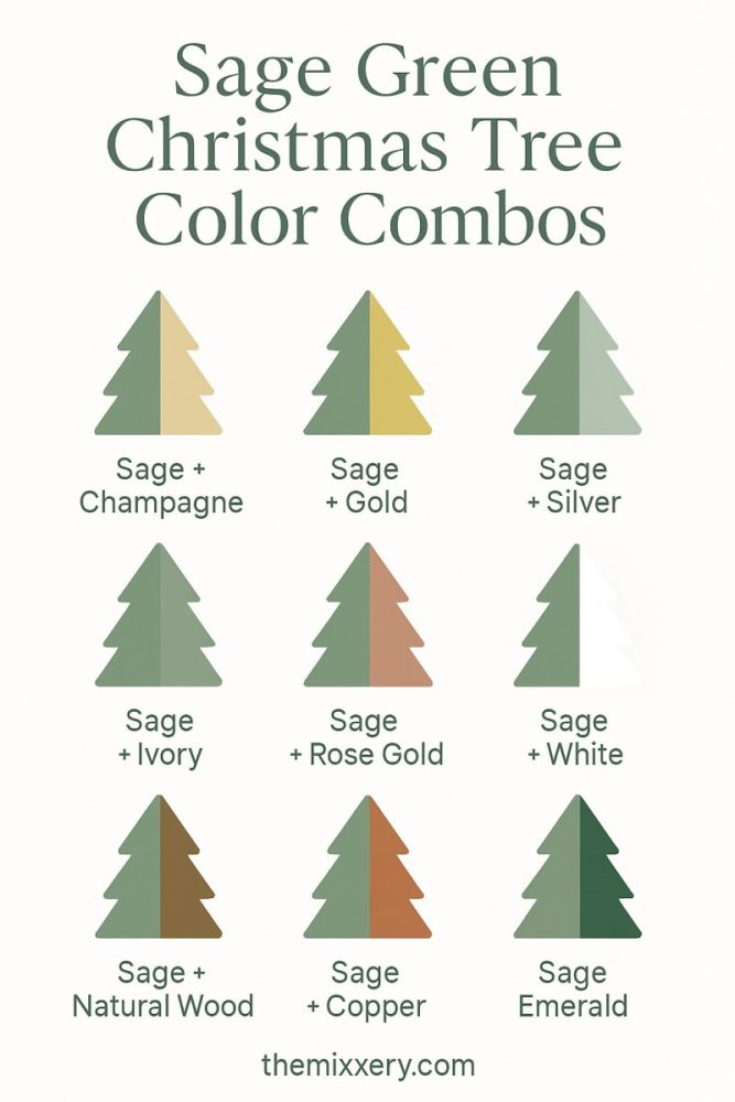
Here’s where sage green gets interesting—it works with almost everything. But some combinations feel more intentional than others.
Sage + Gold + Cream
This is warm and elevated without being precious. Gold catches light without screaming for attention. Cream softens everything. If you want your tree to feel expensive but livable, this is it.
Sage + White + Natural Wood
The Scandinavian approach. Clean, simple, with just enough texture to keep it from feeling sterile. Wooden bead garlands, linen ribbons, unfinished ornaments. Very “I collected these over time” energy.
Sage + Brass + Warm Neutrals
This leans cottage—but the sophisticated kind. Brass has that slightly tarnished, vintage quality that makes sage feel grounded. Add taupe, beige, soft browns. It’s cozy without tipping into cutesy.
Sage + Blush + Champagne
If you want something softer and more romantic, this works surprisingly well. The pink keeps it from feeling too earthy, and champagne ties everything together. It’s feminine without being overly sweet.
Sage + Silver + Cool Gray
The modern minimalist version. Cooler tones, cleaner lines, very intentional. This works especially well in smaller spaces or if your style already leans contemporary.
Let’s Look at Some Actual Trees
I’ve been saving sage green Christmas tree inspiration, and I want to walk through what’s actually working in real spaces. Not the styled-to-death magazine shots, but ideas you can actually pull off.
Frosted and Layered
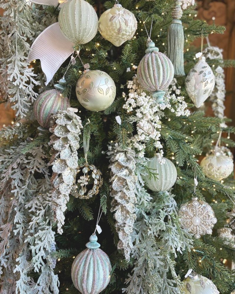
Image via @daniellabellasxo4 on Instagram
This is what happens when you let texture do the work instead of color. The frosted tree creates a neutral backdrop, so the sage ornaments—some blue-toned, some warmer—feel intentional rather than random.
The key here is variety in shape, not color. Ribbed glass, elongated teardrops, beaded spheres. Everything stays within the same tonal family (sage, cream, soft white), but the different textures keep it from feeling flat.
Those frosted berry picks are doing more work than you’d think. They break up the ornaments and add organic texture without introducing another color to manage. Same with the ribbon—it’s there, but quiet. Probably velvet, definitely tonal.
If you’re recreating this: Start with a heavily flocked tree. Stick to 2-3 shades of sage in different finishes. Add cream and champagne for warmth. Keep the ribbon minimal.
Sage Meets Snow
Image via @lululoveshome on TikTok
This one leans heavier into white, and it works because of that basket base. Without it, this could read too “winter wonderland.” The natural wicker grounds everything and makes the pale palette feel purposeful.
The sage here is subtle—mostly in the flocked branches themselves and a few matte ornaments scattered throughout. It’s not fighting with the white. Instead, everything’s working in the same soft, muted register. The oversized ornaments at the base are smart. They anchor the tree and create visual weight without needing a traditional tree skirt.
Notice how the flocking is uneven. Some branches are heavily frosted, others barely touched. That variation keeps it from looking too uniform or artificial. The white picks and faux florals add fullness without being fussy.
If you’re recreating this: Use a wicker or basket tree collar instead of a skirt. Go heavy on white with sage as an accent rather than the main color. Vary your ornament sizes—bigger at the bottom, smaller as you move up. Look for picks with texture (berries, pine cones, varied foliage) rather than flat greenery.
Perfect! Here’s the commentary:
Ribbon as the Statement
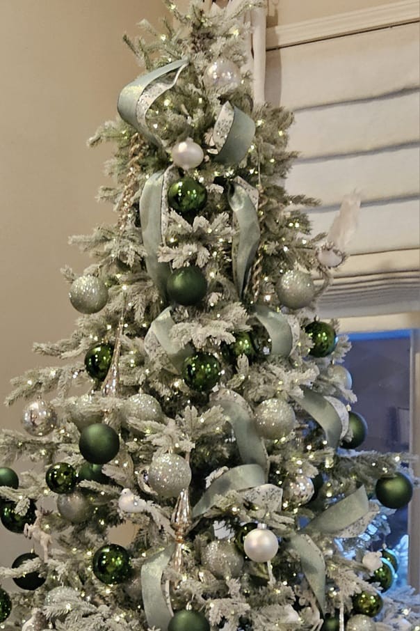
Image via Facebook user (original post)
This is how you use ribbon when you actually mean it. Instead of tucking it in as an afterthought, it’s cascading down the tree in loose, generous loops. The sage velvet ribbon creates movement and draws your eye vertically, which makes the tree feel taller.
The ornament strategy here is simple: deeper emerald greens mixed with softer sage tones and champagne metallics. The contrast between the darker forest green and the muted sage keeps it from feeling washed out against all that white flocking. Notice how the ornaments are clustered rather than evenly spaced—it feels more organic, less formulaic.
The heavily flocked tree is doing the heavy lifting. It softens everything and makes even the shinier ornaments feel more sophisticated. Without that frost, this color combo might read too traditional “Christmas green.”
If you’re recreating this: Invest in quality ribbon—you’ll need several yards. Practice the cascade method (there are videos). Mix at least two shades of green: one deeper, one muted. Add champagne or soft gold to bridge the gap. Use a flocked tree to keep it from feeling too bold.
Maximalist and Moody
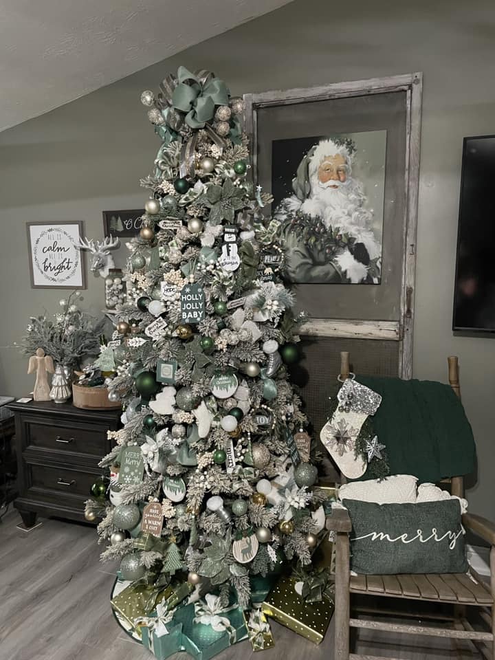
Image via Facebook user (original post)
This is the opposite of minimalist, and it absolutely works. The sage green here is deeper, almost teal in some of the ornaments, which reads more sophisticated against the gray walls than a lighter sage would.
The key is the room itself. Those charcoal-gray walls can handle this much visual weight. In a white room, this would feel overwhelming. Here, it feels intentional. The vintage Santa art, the distressed wood frame, the dark furniture—everything’s working in the same moody, collected register.
Notice the ornament variety. There are ball ornaments, sure, but also signs, ribbons, picks, what looks like small houses or bottle brush trees tucked in. It’s layered to the point of being almost cluttered, but because the color palette stays tight (sage, deeper green, white, cream, touches of gold), it holds together.
The velvet tree collar at the base in that rich green is a smart move. It grounds all that visual activity and creates a stopping point for your eye.
If you’re recreating this: Layer aggressively—more is more here. Mix ornament types beyond just balls (signs, picks, figurines). Stick to a tight color story even as you add volume. Consider a plush or velvet tree collar instead of a traditional skirt.
Sage Meets Blush
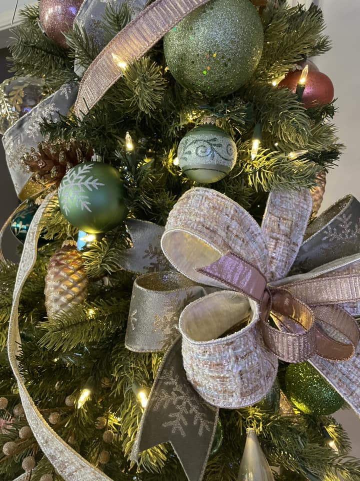
Image via Facebook user (original post)
This is what happens when you add an unexpected color and it somehow makes everything feel more cohesive. The blush-toned ribbon and rose gold accents warm up the sage in a way that silver or white wouldn’t. It’s softer, more romantic, but not overly sweet.
The ribbon is doing a lot here—that textured, almost tweedy finish in a pale pink keeps it from reading too precious. And notice how it’s layered with gray and touches of gold-edged ribbon. It’s not just one ribbon wrapped around the tree. It’s multiple textures working together.
The sage ornaments vary from matte to glitter-covered, which adds depth without introducing new colors. The rose gold and copper tones bridge the gap between the green and the pink. Without those metallics, this combo might feel too Easter. With them, it feels intentional.
The tree itself is unflocked, which lets the warmer palette shine. A frosted tree would cool everything down too much.
If you’re recreating this: Layer ribbons in complementary textures (smooth, woven, metallic-edged). Add rose gold or copper as your metallic instead of silver or traditional gold. Keep your sage ornaments varied in finish. Use an unflocked tree so the warmer tones don’t get lost.
Gold and Sage on a Flocked Base
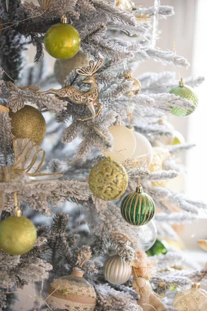
This is the gold-forward version, and it’s working because the sage stays muted. The heavily flocked tree creates that winter-white backdrop that lets both the gold and the various shades of green pop without competing.
Notice the range of greens here—chartreuse, deeper forest, true sage. They’re all different, but the gold ties them together. The metallic acts as a unifier, which is what lets you get away with this much green variation. Without the gold, this might feel scattered.
The ornament finishes matter. Glitter, matte, glass, textured—mixing finishes within the same color family adds visual interest without adding visual noise. That gold reindeer ornament is a good example of how a statement piece can work when everything else is supporting it rather than competing with it.
The flocking here is key. It softens what could otherwise feel too bold or too Christmas-in-July with all that chartreuse.
If you’re recreating this: Go heavy on the flocking. Use gold as your main metallic and let it do the unifying work. Don’t be afraid to mix green tones as long as you have that metallic thread pulling everything together. Layer matte and shiny finishes for depth.
Whimsical with Florals
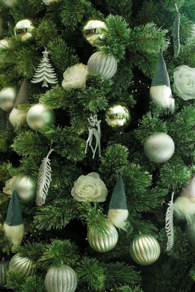
This is the version for people who don’t want their tree to look like everyone else’s. Those pale roses tucked into the branches completely change the vibe—it’s less “traditional Christmas” and more “woodland fantasy.”
The sage here is soft and varied. Some ornaments lean yellow-green, others are more muted. But the unifying element is texture: glittered finishes, matte surfaces, those ribbed glass ornaments. Everything has dimension.
The gnomes are either going to be your thing or they’re not, but here’s why they work: they’re tonal. The sage hats tie directly into the ornament palette. If they were red or bright blue, this would fall apart. The silver glittered accents (the deer, the feather, the trees) add just enough sparkle without turning this into a disco ball.
The unflocked tree is the right call here. Flocking would compete with all the textural variety already happening. The deep green branches let the lighter sage tones pop.
If you’re recreating this: Don’t be afraid to add unexpected elements (florals, figurines) as long as they stay within your color story. Mix matte and glitter finishes aggressively. Keep your metallics to one family—here it’s all silver-toned. Use an unflocked tree if you’re adding a lot of textural elements.
The Bottom Line
Sage green works for Christmas because it doesn’t demand that your entire home transform into a holiday showroom. It adapts to what you already have—whether that’s modern farmhouse, coastal, maximalist, or somewhere in between.
The key is committing to a palette and letting texture do the rest. Flocked or unflocked. Matte or metallic. Minimal or layered. All of it works as long as you’re not trying to do everything at once.
If you’ve been decorating the same way for years and it’s starting to feel automatic rather than intentional, sage green is worth trying. Not because it’s trendy, but because it gives you permission to do Christmas differently—in a way that actually feels like your home.