This post contains affiliate links and is a member of the Amazon Services LLC Associates Program. If you make a purchase using one of these affiliate or Amazon links, I may receive compensation at no extra cost to you.
21 Best Moody Blue Paint Colors That Actually Look Good

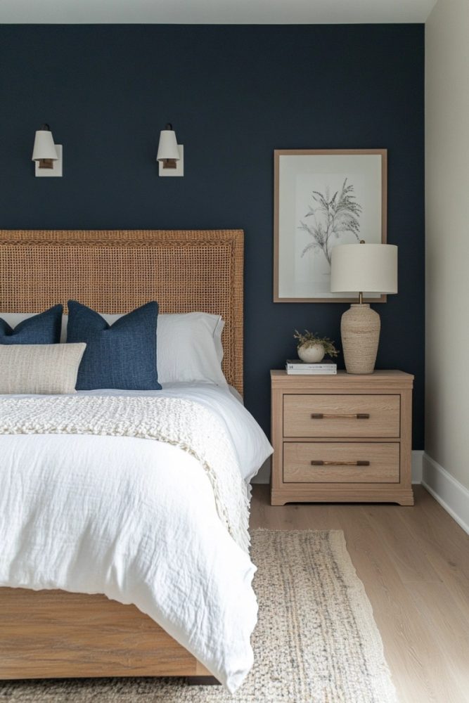
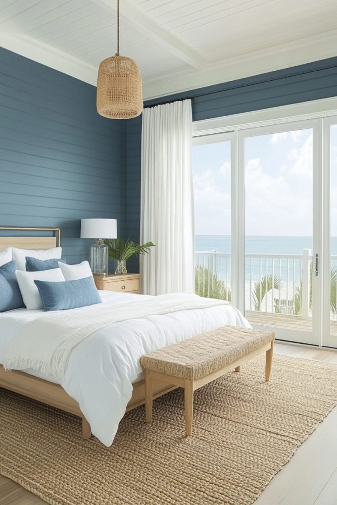
Moody blue paint colors are having a moment, and for good reason. They strike that perfect balance between bold and sophisticated, making any space feel stylish without being overwhelming. But with so many shades out there, it’s easy to end up with something that’s either too bright, too dull, or just… off. Whether you’re looking for a deep navy, a stormy gray-blue, or a rich teal, the right moody blue can transform a room. Here are 21 of the best moody blue paint colors that actually look as good on the wall as they do in your head.
What Makes a Moody Blue Paint Color Work?
Moody blues work best when they have a mix of depth and complexity. The best shades often have gray, green, or black undertones that keep them from feeling too vibrant or juvenile. Lighting plays a huge role too—some blues look almost navy in low light but show more vibrancy in natural sunlight. If you’re unsure, always test a few swatches on different walls and check them throughout the day. Now, let’s diget into the best shades out there.
1. Hale Navy – Benjamin Moore
Hale Navy is a designer favorite because it’s deep, rich, and timeless. It has subtle gray undertones that keep it from feeling too stark or nautical. It works well in traditional and modern spaces alike, whether as an accent wall or cabinetry. Pair it with crisp white trim for a classic look or warm wood tones for a cozier vibe.
RELATED: 18 Home Office in Bedroom Ideas for a Cozy Yet Productive Space
2. Railings – Farrow & Ball
Technically a soft black with blue undertones, Railings is a moody dream. It shifts between deep navy and charcoal depending on the lighting, making it feel luxurious and dramatic. It’s stunning on kitchen cabinets, doors, and accent walls. If you want a blue that’s almost black but still has character, this is it.
3. Charcoal Blue – Sherwin-Williams
This one sits right between navy and charcoal, making it the perfect deep, stormy blue. It has enough warmth to keep it from feeling too cold but still brings that classic moody blue drama. It’s especially gorgeous in bedrooms and offices where you want a calming but sophisticated atmosphere. Try it with brass or gold accents to bring out its richness.
4. Deep Royal – Benjamin Moore
As the name suggests, this is a regal, dramatic blue with a slight purple undertone. It’s a bold choice, but when used strategically, it creates a stunning effect. It works beautifully in dining rooms or libraries where you want a cozy yet elegant feel. Just make sure to balance it with neutral furniture and décor.
5. Stiffkey Blue – Farrow & Ball
A rich, deep blue with a slight vintage feel, Stiffkey Blue has just the right amount of depth. It leans slightly toward navy but has a bit of a muted quality, which makes it softer than some of the bolder navies. It looks fantastic in well-lit rooms where you can appreciate its depth. Pair it with warm tones for an inviting, sophisticated look.
6. Naval – Sherwin-Williams
Naval is a true navy with just a touch of warmth to keep it from feeling too stark. It’s one of the best options for a classic, timeless blue that works anywhere.
It’s particularly striking in a high-contrast look with white trim and gold fixtures. If you want a deep blue that’s elegant but not too dark, this is a great choice.
7. Blue Note – Benjamin Moore
This shade is moody in the best way—it’s a deep, rich blue with smoky gray undertones. It’s the kind of color that makes a room feel intimate and stylish without being overwhelming. It’s a fantastic choice for a cozy living room or a dramatic dining room. Pair it with warm wood tones for extra depth.
8. Down Pipe – Farrow & Ball
While technically a charcoal gray, Down Pipe has strong blue-green undertones that make it read as a deep, moody blue in certain lighting. It’s a sophisticated choice for a modern home, especially on cabinetry and built-ins. It pairs beautifully with soft whites and warm metals. If you want a blue that’s borderline gray but still full of character, this is a winner.
9. Indigo Batik – Sherwin-Williams
A rich, classic indigo, this shade brings depth without feeling too dark. It has just enough brightness to keep it lively while still reading as a true moody blue. It works well in both traditional and contemporary spaces. Use it on an accent wall or a whole room for a bold statement.
10. Hague Blue – Farrow & Ball
One of the most-loved moody blues, Hague Blue has deep green undertones that give it a unique richness. It’s dramatic but still incredibly sophisticated, making it a favorite for feature walls, cabinetry, and even exteriors. It changes beautifully in different lighting, making it a dynamic and interesting choice. If you want something bold but elegant, this is the one.
11. Hale Navy – Benjamin Moore
Hale Navy is a classic, true navy blue with just enough depth to feel rich and moody. It’s a solid choice for those who want a straightforward navy that doesn’t lean too bright or too gray. It’s especially striking in bedrooms and studies. Pair it with warm neutrals for a balanced look.
12. Midnight Blue – Behr
A true midnight navy, this shade is deep and saturated without being black. It has a velvety quality that makes it feel extra luxe in the right space. It’s a great choice for a moody bedroom or a dramatic powder room. Use it with matte black or brass accents for extra drama.
13. Gentleman’s Gray – Benjamin Moore
Despite the name, this is actually a rich, deep blue with slight teal undertones. It’s bold without being too overpowering, making it a great statement color. It’s perfect for accent walls, built-ins, or even a full room if you want something dramatic. It pairs well with warm neutrals to balance its intensity.
14. Stormy Sky – Benjamin Moore
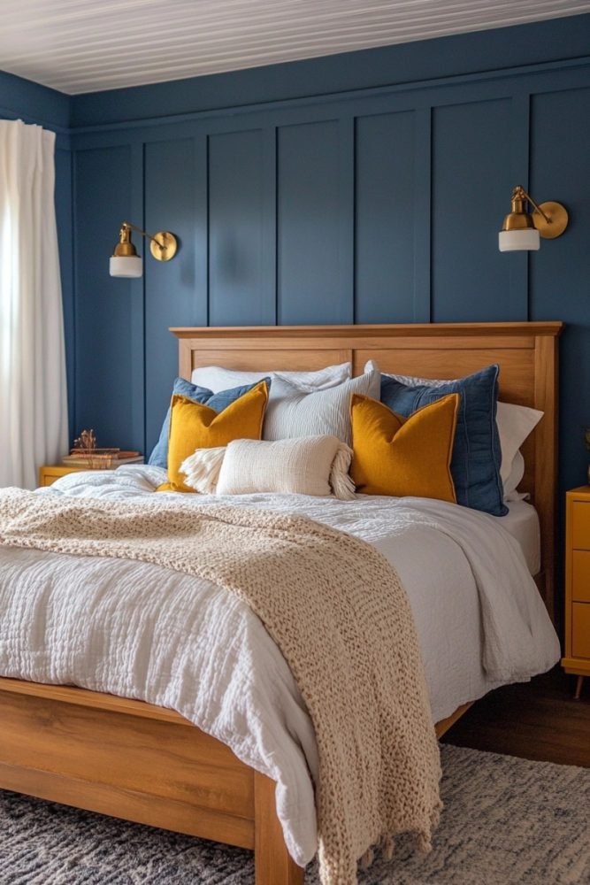
True to its name, Stormy Sky is a deep, atmospheric blue with strong gray undertones. It’s perfect if you want a blue that feels grounded and sophisticated rather than too bright or playful. It works beautifully in bedrooms, offices, and even exterior spaces. Pair it with soft whites and warm wood tones for a cozy, inviting look.
15. Anchors Aweigh – Sherwin-Williams
This shade is a rich, nautical-inspired navy with a modern twist. It’s deep enough to feel moody but still has enough vibrancy to avoid looking flat. It looks stunning on kitchen cabinets, especially with brass hardware. If you’re looking for a strong, classic navy that pairs well with a variety of design styles, this is a great pick.
16. Newburyport Blue – Benjamin Moore

Newburyport Blue is a versatile navy with a slight gray undertone, making it feel more muted than some of the brighter blues. It’s a fantastic choice for exterior doors, accent walls, or even an entire room. It works particularly well in coastal-inspired spaces without feeling too themed. If you want a timeless moody blue, this one won’t disappoint.
17. Van Deusen Blue – Benjamin Moore
A deep but not-too-dark blue, Van Deusen Blue sits right between classic navy and slate blue. It has enough warmth to feel inviting but still maintains that bold, moody effect. It’s a solid choice for a dining room, study, or even a cozy living space. Try it with crisp white trim and gold accents for a polished look.
18. Dark Night – Sherwin-Williams

If you love deep blue-green hues, Dark Night is a must-consider. It’s a rich, almost inky shade with a luxurious feel, making it perfect for creating drama in a space. It pairs beautifully with warm wood tones, brass accents, and soft whites. If you’re after a moody blue with a little extra personality, this one’s a winner.
19. Deep Space – Benjamin Moore
This one leans toward the gray-blue side, making it feel ultra-sophisticated and modern. It’s perfect for spaces where you want depth without the intensity of a true navy. It works well in contemporary interiors and looks amazing on kitchen cabinets or built-ins. Pair it with warm lighting to bring out its richness.
20. Blue Dusk – Behr

A deep, muted blue with just a hint of green, Blue Dusk is a stunning choice for a moody, dramatic effect. It has a soft, almost velvety appearance that works beautifully in bedrooms or cozy living rooms. It changes throughout the day depending on the lighting, adding depth and interest to any space. If you want a unique take on moody blue, this is a great option.
21. Bunglehouse Blue – Sherwin-Williams
Bunglehouse Blue is a historic, rich blue that leans toward teal, giving it a slightly vintage feel. It’s deep enough to feel moody but has just enough brightness to avoid feeling too heavy. It looks especially beautiful in homes with classic or Craftsman-style architecture. If you want a blue that feels both bold and timeless, this one’s worth considering.
Final Thoughts on Moody Blue Paint Colors
Moody blues are some of the most versatile and stunning paint colors out there. Whether you want a classic navy, a smoky gray-blue, or a deep teal-infused shade, there’s a moody blue to suit your space. The key to picking the right one is testing swatches in different lighting and pairing it with complementary colors and textures. No matter which shade you choose, a rich, moody blue will add depth, drama, and sophistication to your home.
Need Even More Best Moody Blue Paint Colors Inspo?