This post contains affiliate links and is a member of the Amazon Services LLC Associates Program. If you make a purchase using one of these affiliate or Amazon links, I may receive compensation at no extra cost to you.
Best Moody Paint Colors of 2026
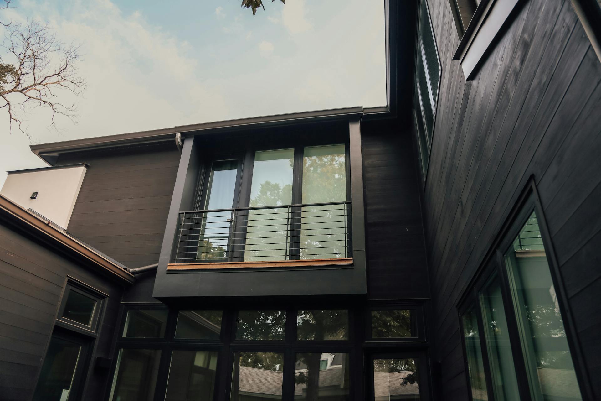
If you’ve been looking for paint colors with real personality, you’re in the right place. Moody shades are having a serious moment right now, and they’re popping up in some unexpected corners of our homes. It’s a trend worth obsessing over because it takes those deep, saturated tones and uses them in a way that feels modern instead of heavy.
Forget the cave-like rooms you might be picturing. Today’s take is all about placing moody shades with intention to bring depth, personality, and a little bit of drama, all without shrinking the room.
The Case for Going Moody
There’s something about these colors that completely shifts the feel of a space. They’re ideal for anchoring a focal wall, wrapping a cozy reading nook in atmosphere, or giving a whole room that bold-but-grown-up energy. The best part is how flexible they are.
Kitchens, bedrooms, powder rooms, living rooms, they all work. And you don’t have to commit to four walls either. A single accent wall or a few moody accents through your decor can pull the whole look together.
Ready to see what’s trending? Here’s the lineup of the best moody paint colors of 2026 everyone is reaching for right now.
Moody Greens
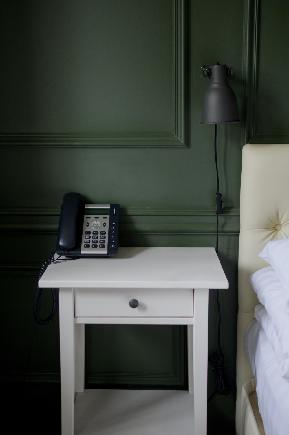
1. Shade Grown by Sherwin Williams (SW 6188)
A deep, woodsy green layered with warm brown undertones. This one shines in smaller spaces like powder rooms, home offices, or cozy nooks where you want depth without feeling cold.
2. Pewter Green by Sherwin Williams (SW 6208)
A soft sage-meets-gray green that has stayed at the top of the cabinet color charts for good reason. It reads sophisticated in kitchens and grounds built-ins beautifully.
3. Backwoods by Benjamin Moore (CC-630)
A warm forest green built on a true black base. Perfect for paneled walls, libraries, or any room where you want richness with a moody, lived-in edge.
4. Rock Bottom by Sherwin Williams (SW 7062)
A cool, slate-leaning dark green with gray undertones. A favorite for kitchen islands and vanity cabinets when you want a statement without going full black.
5. Bavarian Forest by Benjamin Moore (4133)
Trending hard for 2026, this lush emerald-leaning green feels rich and elevated. Try it on a dining room ceiling or wrapping a butler’s pantry for major impact.
6. Tarrytown Green by Benjamin Moore (HC-134)
A historic, slightly muted green that’s having a serious comeback. It pairs beautifully with brass hardware and brings instant character to entryways and studies.
7. Salamander by Benjamin Moore (2050-10)
An almost-black green that reads nearly charcoal in low light. One of the most requested designer colors right now for moody dining rooms and powder baths.
8. Essex Green by Benjamin Moore (HC-188)
A nearly-black forest green with timeless appeal. Stunning on exterior doors and shutters, but designers are bringing it inside for kitchen cabinetry too.
9. Dark Olive by Sherwin Williams (SW 6188)…
Wait, let me swap that. Dard Hunter Green by Sherwin Williams (SW 0041): A historic, saturated hunter green with depth that feels both traditional and current, ideal for paneled studies and dramatic dining rooms.
10. Forest Floor by Benjamin Moore (2115-30)
A complex moody green with subtle brown undertones, perfect for creating that grounded, organic feel everyone is chasing in 2026.
Moody Browns
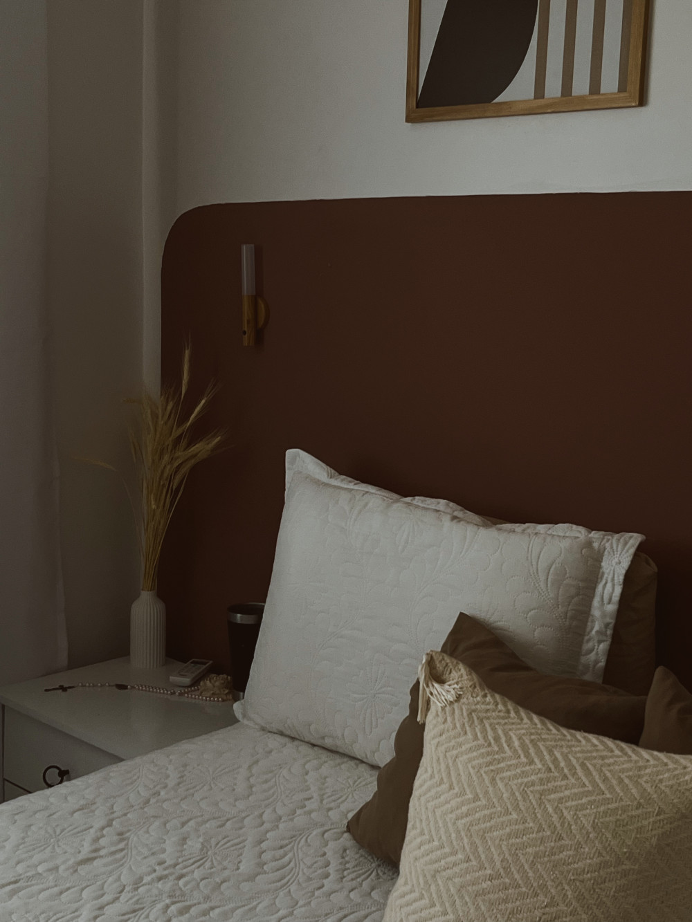
1. Bear Creek by Sherwin Williams (SW 7026)
A rich, warm brown with subtle red undertones. It brings instant warmth to dining rooms and home offices, and pairs beautifully with cream trim and natural wood.
2. Turkish Coffee by Benjamin Moore (2111-10)
A deep, espresso-leaning brown that reads almost black in low light. A designer favorite for cabinetry, built-ins, and moody powder rooms heading into 2026.
3. Van Buren Brown by Benjamin Moore (HC-70)
A historic, slightly dusty brown with serious character. Perfect for libraries, paneled walls, and front doors that need to feel timeless and grounded.
4. Black Bean by Sherwin Williams (SW 6006)
A complex near-black brown with cool undertones. Stunning on kitchen islands and vanities when you want depth without committing to true black.
5. Porpoise by Benjamin Moore (2106-50)
A soft, taupe-leaning brown with gray undertones. Trending for full-room treatments because it feels enveloping without going too dark.
6. Foothills by Sherwin Williams (SW 7514)
A warm, earthy brown with a hint of beige. Ideal for bedrooms and living rooms where you want that quiet, cocooning vibe everyone is after right now.
7. Chocolate Truffle by Behr (PPU5-19)
A creamy, dessert-inspired brown that’s having a moment in kitchens and dining rooms. It pairs effortlessly with brass, cream, and warm wood tones.
8. Espresso Bean by Benjamin Moore (2114-10)
A deep, true espresso brown with rich undertones. A go-to for statement cabinetry and built-in shelving when you want maximum drama.
9. Brown Horse by Benjamin Moore (2108-30)
A saturated, leather-inspired brown with warm red undertones. Designers are loving it for studies, dens, and accent walls in 2026.
10. Java by Benjamin Moore (2106-20)
A versatile, medium-dark brown that bridges traditional and modern. Works beautifully on doors, trim, and full accent walls without overwhelming a space.
Moody Blacks
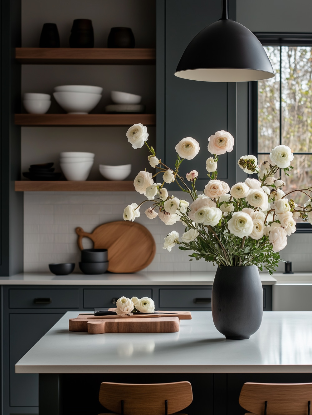
1. Tricorn Black by Sherwin Williams (SW 6258)
A true, pure black with no warm or cool undertones. The go-to when you want crisp, high-contrast drama on doors, trim, or full accent walls.
2. Wrought Iron by Benjamin Moore (2124-10)
A soft, smoky near-black with subtle blue undertones. Designers reach for this one when they want depth and moodiness without the harshness of a true black.
3. Cracked Pepper by Behr (PPU18-01)
Behr’s reigning moody black favorite. It reads warm in candlelight and crisp in daylight, making it incredibly versatile for cabinets, exteriors, and feature walls.
4. Caviar by Sherwin Williams (SW 6990)
A rich, slightly warm black with just enough softness to feel inviting. A top pick for kitchen islands and statement built-ins in 2026.
5. Black Magic by Sherwin Williams (SW 6991)
A deep, dramatic black with subtle blue undertones. Perfect for moody bedrooms, libraries, and accent walls that need to feel enveloping.
6. Onyx by Benjamin Moore (2133-10)
A complex, near-black with cool undertones. Stunning on exterior trim, front doors, and interior cabinetry when you want sophistication with edge.
7. Black Beauty by Benjamin Moore (2128-10)
A soft, slightly muted black with hidden green undertones. It feels organic and lived-in, making it a favorite for full-room treatments.
8. Iron Ore by Sherwin Williams (SW 7069)
Technically a charcoal, but designers use it as their go-to “black” because it reads softer and more livable. Beloved for exteriors, cabinets, and feature walls.
9. Soot by Benjamin Moore (2129-20)
A versatile, blue-leaning black that adds quiet drama without overwhelming a space. Trending for powder rooms and moody dining spaces in 2026.
10. Black Pepper by Sherwin Williams (SW 9580)
A complex shade that sits between black and deep charcoal with subtle green undertones. One of the most requested moody colors right now for bedrooms and enveloping accent walls.
Trendy Blues and More
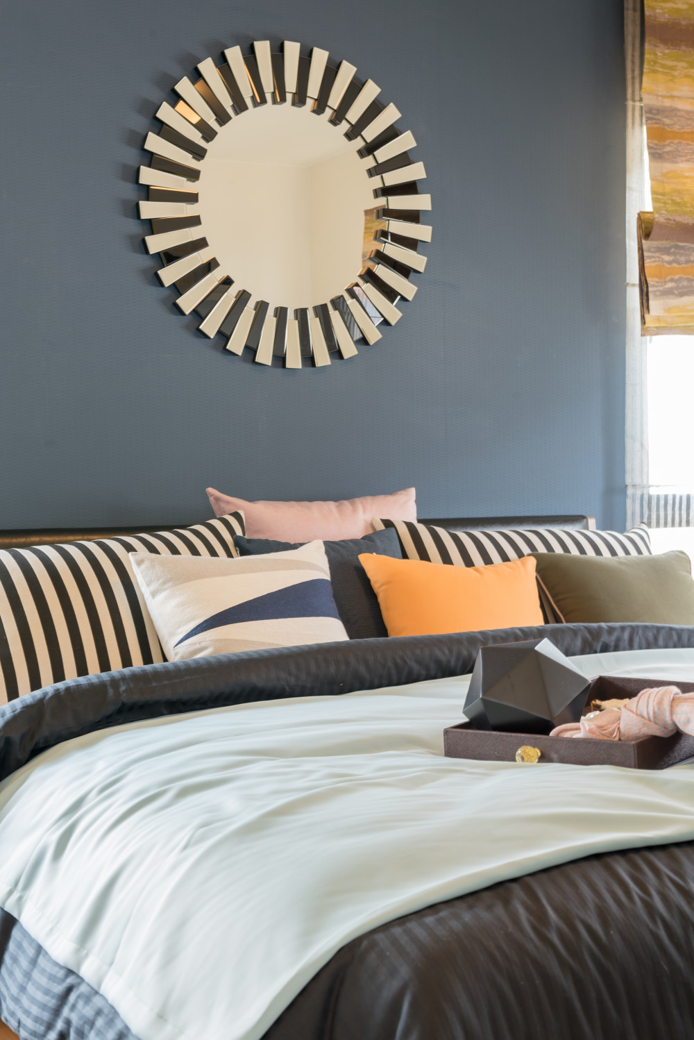
1. Hale Navy by Benjamin Moore (HC-154)
The navy that refuses to go out of style. Still the gold standard for moody libraries, kitchen islands, and front doors heading into 2026.
2. Naval by Sherwin Williams (SW 6244)
A deeper, richer navy with subtle black undertones. The pick when Hale Navy feels too soft and you want full saturation and drama.
3. Salty Dog by Sherwin Williams (SW 9177)
A deep, slightly muted navy with hints of gray. It feels grounded and timeless, making it a favorite for cabinetry, board-and-batten, and accent walls.
4. Newburyport Blue by Benjamin Moore (HC-155)
A classic, slightly brighter navy with warm undertones. Stunning on shaker cabinets, dining rooms, and front doors that need to feel welcoming.
5. Cyberspace by Sherwin Williams (SW 7076)
A complex blue-black that walks the line between navy and charcoal. Designers love it for moody bedrooms, powder rooms, and statement built-ins.
6. Gentleman’s Gray by Benjamin Moore (2062-20)
Don’t let the name fool you, this is a deep teal-leaning blue with rich green undertones. Trending hard for 2026 in dining rooms and home offices.
7. Inkwell by Sherwin Williams (SW 6992)
A near-black blue with serious depth. Perfect for cabinetry and accent walls when you want a sophisticated alternative to true black.
8. Polo Blue by Benjamin Moore (2062-10)
A saturated, true navy with timeless appeal. A go-to for paneled walls, libraries, and any space that needs a classic moody anchor.
9. Slate Teal by Benjamin Moore (2058-20)
A dusty, blue-green hybrid that feels both moody and organic. Designers are using it on kitchen islands and full-room treatments in 2026.
10. Dark Night by Sherwin Williams (SW 6237)
A deep, slightly purple-leaning navy with rich undertones. Ideal for bedrooms and cozy dens where you want that cocooning, dreamlike vibe.
Moody Grays
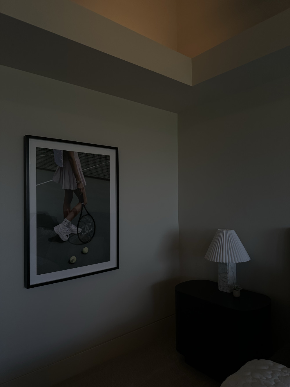
1. Peppercorn by Sherwin Williams (SW 7674)
A deep, charcoal-leaning gray with subtle warm undertones. A designer go-to for cabinetry, trim, and accent walls that need richness without going full black.
2. Kendall Charcoal by Benjamin Moore (HC-166)
A timeless, warm charcoal gray with just enough depth to feel moody. Stunning on kitchen islands, exterior trim, and statement built-ins.
3. Urbane Bronze by Sherwin Williams (SW 7048)
A complex gray-brown hybrid that reads warm and grounded. It’s been a top trending color and continues to dominate in 2026 for full-room treatments.
4. Chelsea Gray by Benjamin Moore (HC-168)
A medium-dark gray with warm, slightly greige undertones. Perfect when you want moody without the drama, ideal for living rooms and bedrooms.
5. Gauntlet Gray by Sherwin Williams (SW 7019)
A rich, slightly warm gray that anchors a room beautifully. A favorite for exteriors, but designers are bringing it inside for cabinetry and feature walls.
6. Graphite by Benjamin Moore (1603)
A deep, saturated charcoal with cool undertones. Stunning on moody dining rooms, powder baths, and any space that needs sophisticated depth.
7. Dovetail by Sherwin Williams (SW 7018)
A medium-toned gray with warm undertones that walks the line between soft and moody. Ideal for full-room treatments when you want cocooning without going too dark.
8. Amherst Gray by Benjamin Moore (HC-167)
A deep, slightly green-leaning gray that feels organic and grounded. Trending for kitchen cabinetry and built-ins heading into 2026.
9. Cityscape by Sherwin Williams (SW 7067)
A complex, mid-deep gray with cool undertones. A designer favorite for moody bedrooms and accent walls that need a quiet, modern edge.
10. Trout Gray by Benjamin Moore (2124-30)
A soft, blue-leaning gray with serious moody potential. Perfect for powder rooms and accent walls when you want depth with a hint of coolness.
Best Moody Paint Colors by Sherwin Williams
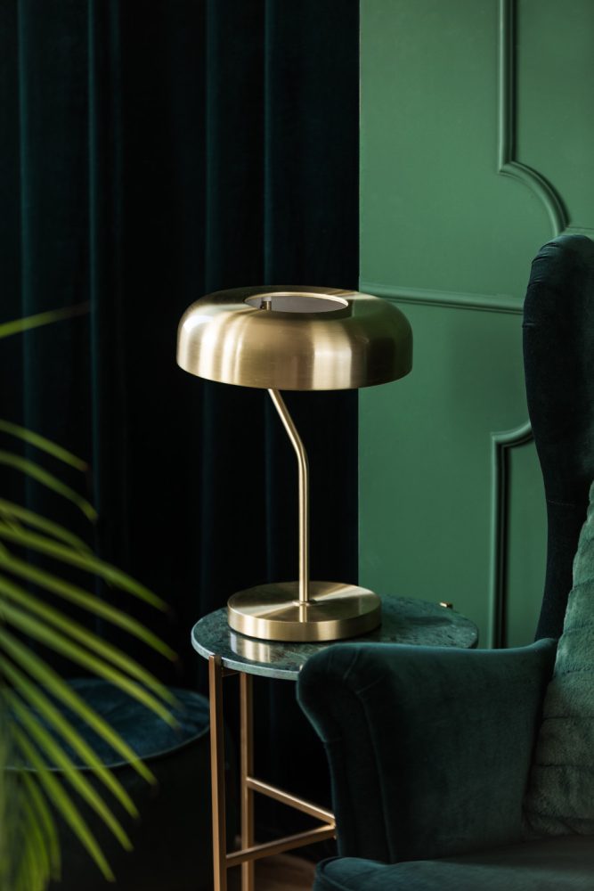
1. Urbane Bronze (SW 7048)
A complex gray-brown hybrid with warm, grounded undertones. Still dominating in 2026 for full-room treatments, cabinetry, and exteriors that need cozy sophistication.
2. Pewter Green (SW 6208)
A soft sage-meets-gray green that has stayed at the top of the cabinet color charts for years. It reads timeless in kitchens and grounds built-ins beautifully.
3. Naval (SW 6244)
A rich, saturated navy with subtle black undertones. The go-to when you want full drama on kitchen islands, libraries, and statement front doors.
4. Tricorn Black (SW 6258)
A true, pure black with no warm or cool undertones. The designer pick for crisp, high-contrast moments on doors, trim, and dramatic accent walls.
5. Iron Ore (SW 7069)
Technically a charcoal, but used as the go-to “softer black.” Beloved for exteriors, cabinets, and feature walls because it feels livable and never harsh.
6. Peppercorn (SW 7674)
A deep, charcoal-leaning gray with subtle warm undertones. Perfect for cabinetry, trim, and accent walls when you want richness without committing to black.
7. Rock Bottom (SW 7062)
A cool, slate-leaning dark green with gray undertones. A favorite for kitchen islands and vanities when you want a moody statement that still feels neutral.
8. Cyberspace (SW 7076)
A complex blue-black that walks the line between navy and charcoal. Stunning in moody bedrooms, powder rooms, and statement built-ins.
9. Black Pepper (SW 9580)
A nuanced shade sitting between black and deep charcoal with subtle green undertones. One of the most requested moody colors right now for enveloping spaces.
10. Bear Creek (SW 7026)
A rich, warm brown with subtle red undertones. Brings instant warmth to dining rooms and home offices, and pairs beautifully with cream trim and natural wood.
Best Moody Paint Colors By Benjamin Moore
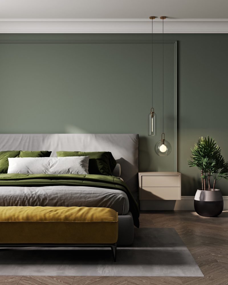
1. Hale Navy (HC-154)
The navy that refuses to go out of style. Still the gold standard for moody libraries, kitchen islands, and front doors heading into 2026.
2. Wrought Iron (2124-10)
A soft, smoky near-black with subtle blue undertones. Designers reach for this one when they want depth and moodiness without the harshness of true black.
3. Kendall Charcoal (HC-166)
A timeless, warm charcoal gray with just enough depth to feel moody. Stunning on kitchen islands, exterior trim, and statement built-ins.
4. Backwoods (CC-630)
A warm forest green built on a true black base. Perfect for paneled walls, libraries, and any space that needs richness with a moody, lived-in edge.
5. Chelsea Gray (HC-168)
A medium-dark gray with warm, slightly greige undertones. Ideal when you want moody without the drama, especially in living rooms and bedrooms.
6. Salamander (2050-10)
An almost-black green that reads nearly charcoal in low light. One of the most requested designer colors right now for dining rooms and moody powder baths.
7. Gentleman’s Gray (2062-20)
Don’t let the name fool you, this is a deep teal-leaning blue with rich green undertones. Trending hard for 2026 in dining rooms and home offices.
8. Tarrytown Green (HC-134)
A historic, slightly muted green having a major comeback. It pairs beautifully with brass hardware and brings instant character to entryways and studies.
9. Turkish Coffee (2111-10)
A deep, espresso-leaning brown that reads almost black in low light. A designer favorite for cabinetry, built-ins, and moody powder rooms.
10. Van Buren Brown (HC-70)
A historic, slightly dusty brown with serious character. Perfect for libraries, paneled walls, and front doors that need to feel timeless and grounded.
Best Moody Paint Colors for Living Room
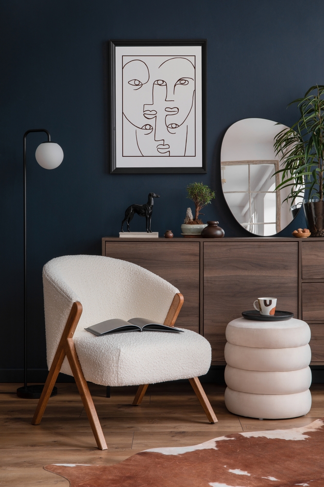
1. Hale Navy by Benjamin Moore (HC-154)
A timeless, deep navy that anchors a living room without overwhelming it. Pairs effortlessly with cream sofas, natural wood, and warm brass accents.
2. Urbane Bronze by Sherwin Williams (SW 7048)
A warm gray-brown that creates an instant cocooning effect. Perfect for full-room treatments when you want your living room to feel like a cozy retreat.
3. Chelsea Gray by Benjamin Moore (HC-168)
A medium-dark gray with warm greige undertones. Ideal when you want moody depth without the drama, especially in spaces with lots of natural light.
4. Pewter Green by Sherwin Williams (SW 6208)
A sage-meets-gray green that feels both fresh and grounded. Stunning on built-ins, fireplace surrounds, or wrapped around an entire living room.
5. Backwoods by Benjamin Moore (CC-630)
A warm forest green with a true black base. Brings instant library-vibes to a living room, especially when paired with leather furniture and warm wood.
6. Cracked Pepper by Behr (PPU18-01)
A versatile soft black that reads warm in candlelight and crisp in daylight. Works beautifully on accent walls behind a sofa or fireplace.
7. Kendall Charcoal by Benjamin Moore (HC-166)
A warm charcoal with timeless appeal. Adds quiet drama to living rooms without going full black, and pairs beautifully with creamy whites.
8. Salamander by Benjamin Moore (2050-10)
An almost-black green that reads charcoal in low light. One of the most requested designer colors for moody living rooms in 2026.
9. Cyberspace by Sherwin Williams (SW 7076)
A complex blue-black that bridges navy and charcoal. Perfect for evening-focused living rooms where you want enveloping, dreamlike depth.
10. Bear Creek by Sherwin Williams (SW 7026)
A rich, warm brown with subtle red undertones. Brings serious warmth to living rooms and pairs beautifully with cream textiles, vintage rugs, and brass lighting.
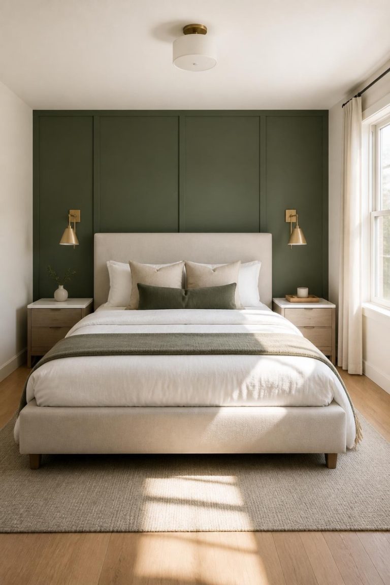
Best Moody Paint Colors for Bedroom
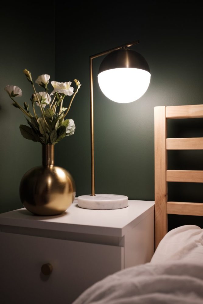
1. Wrought Iron by Benjamin Moore (2124-10)
A soft, smoky near-black with subtle blue undertones. Creates that enveloping, hotel-suite feel everyone is chasing for their bedrooms in 2026.
2. Black Pepper by Sherwin Williams (SW 9580)
A complex shade between black and deep charcoal with subtle green undertones. Ideal for primary bedrooms when you want to feel completely cocooned at night.
3. Hale Navy by Benjamin Moore (HC-154)
A timeless navy that brings instant calm to bedroom walls. Pairs beautifully with crisp white bedding, linen drapes, and natural wood nightstands.
4. Dark Night by Sherwin Williams (SW 6237)
A deep, slightly purple-leaning navy with rich undertones. Perfect for creating that dreamlike, restful vibe that makes a bedroom feel like a true retreat.
5. Salamander by Benjamin Moore (2050-10)
An almost-black green that reads nearly charcoal in low light. One of the most requested bedroom colors right now for its mysterious, sophisticated depth.
6. Urbane Bronze by Sherwin Williams (SW 7048)
A warm gray-brown that wraps a bedroom in cozy sophistication. Especially stunning behind a tufted headboard or on a single accent wall.
7. Cyberspace by Sherwin Williams (SW 7076)
A complex blue-black that walks the line between navy and charcoal. Ideal for bedrooms where you want enveloping drama without going full black.
8. Chelsea Gray by Benjamin Moore (HC-168)
A medium-dark warm gray with greige undertones. The perfect middle ground when you want moody but still soft enough to wake up to every morning.
9. Porpoise by Benjamin Moore (2106-50)
A soft, taupe-leaning brown with gray undertones. Trending hard for full bedroom treatments because it feels enveloping without ever feeling heavy.
10. Caviar by Sherwin Williams (SW 6990)
A rich, slightly warm black with just enough softness to feel inviting. Stunning on a single accent wall behind the bed or wrapped around the entire room.
Best Moody Paint Colors Exterior

1. Iron Ore by Sherwin Williams (SW 7069)
The reigning champion of moody exteriors. A soft, livable charcoal that reads almost black but never feels harsh, perfect for modern farmhouses and craftsman homes alike.
2. Tricorn Black by Sherwin Williams (SW 6258)
A true, pure black for homeowners who want full contrast and drama. Stunning paired with crisp white trim, natural wood doors, and black-framed windows.
3. Hale Navy by Benjamin Moore (HC-154)
A timeless navy that gives exteriors instant coastal-meets-classic appeal. Pairs beautifully with white trim, natural stone, and brass exterior lighting.
4. Urbane Bronze by Sherwin Williams (SW 7048)
A warm gray-brown that’s dominating exterior trends in 2026. Especially stunning on modern homes with wood accents and black window frames.
5. Wrought Iron by Benjamin Moore (2124-10)
A smoky near-black with subtle blue undertones. Perfect for homeowners who want moody exteriors that still feel soft and approachable.
6. Essex Green by Benjamin Moore (HC-188)
A nearly-black forest green with timeless appeal. A classic choice for shutters and doors, and trending for full exterior treatments on Tudor and colonial homes.
7. Peppercorn by Sherwin Williams (SW 7674)
A deep charcoal-leaning gray with warm undertones. Ideal for modern farmhouses and craftsman exteriors that need depth without going full black.
8. Cracked Pepper by Behr (PPU18-01)
A versatile soft black that holds up beautifully outdoors. Reads warm in golden hour and crisp in daylight, making it a designer favorite for full exteriors.
9. Black Fox by Sherwin Williams (SW 7020)
A complex near-black with warm brown undertones. Stunning on craftsman homes, board-and-batten siding, and modern farmhouses with wood accents.
10. Knoxville Gray by Benjamin Moore (HC-160)
A deep, slate-leaning gray with cool undertones. Trending for modern and transitional exteriors that need moody sophistication with timeless appeal.
Where Moody Colors Work Best in Your Home
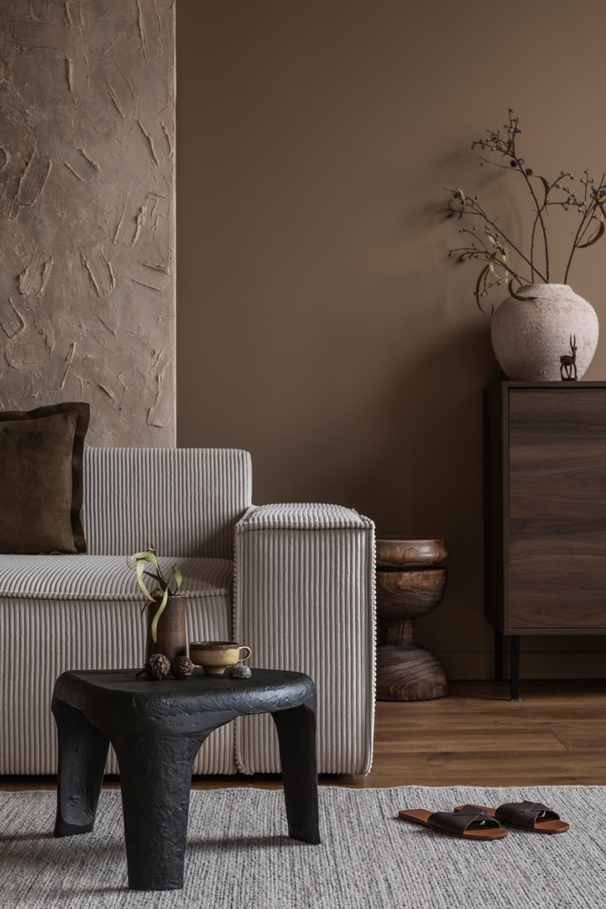
Living Rooms: A moody shade in the living room sets a polished tone that works just as well for hosting friends as it does for a quiet night in. Darker walls pull the space inward, making it feel intimate and grounded without sacrificing style.
Bedrooms: Moody bedroom walls are all about that hotel-suite-at-rest feeling. Deeper hues turn the room into a true retreat, helping you wind down and signal to your brain that it’s time to slow down.
Bathrooms: Drenching a bathroom in a moody color instantly elevates it into spa territory. Rich tones bring depth and a sense of luxury, making even your morning routine feel intentional.
Dining Rooms: A dining room wrapped in a moody hue brings instant occasion to every meal. Deep colors add drama, intimacy, and a candlelit ambiance that lighter shades just can’t replicate.
Home Offices: A moody office helps separate work-mode from the rest of the house. Saturated walls bring focus, polish, and a library-like feel that makes the space feel purposeful instead of pieced together.
How to Style a Room with Moody Paint
Balance is everything when you’re working with deeper shades. Layer in lighter furniture, art, or textiles to keep the room from feeling like it’s closing in. Mirrors, glass, and metallic accents are your best friends here, bouncing light around and adding dimension. And don’t sleep on lighting, both natural and lamp-based, because the right glow completely changes how a moody color reads from morning to night.
Texture and Finish Matter More Than You Think
The finish you choose can make or break a moody room. Matte and flat finishes soften walls and absorb light, creating that velvety, enveloping look everyone is after. Satin and eggshell finishes add subtle depth, while higher-gloss options reflect light for a richer, more dramatic effect. Lean into texture elsewhere too, think bouclé, linen, woven rugs, and vintage wood, to keep moody rooms feeling layered instead of flat.
Mixing Moody Colors for a Layered Look
You don’t have to commit to just one moody shade. Some of the most stunning rooms right now pair deep colors together, like a navy living room flowing into a forest green office, or a charcoal kitchen anchoring a warm brown dining space. The trick is keeping enough contrast and breathing room so the spaces still feel dynamic. Pull in creams, naturals, and metallics to tie it all together.
Final Thoughts on the Moody Color Trend for 2026
These colors aren’t just on trend, they’re shaping how we think about home design right now. Whether you’re drawn to grounded greens, dramatic blacks, soulful blues, or warm cocooning browns, there’s a moody shade that fits your vibe. Paint one accent wall, drench an entire room, or layer them throughout your home, either way, these hues are guaranteed to make your space feel intentional, elevated, and completely you.
OTHER GREAT ARTICLES ABOUT MOODY PAINT:
- 18 Moody Dark Green Bedroom Ideas
- Best Moody Paint Colors of 2025
- 15 Moody Green Paint Colors For Small Rooms