This post contains affiliate links and is a member of the Amazon Services LLC Associates Program. If you make a purchase using one of these affiliate or Amazon links, I may receive compensation at no extra cost to you.
17 Stunning Board and Batten with Wallpaper Above Ideas You’ll Want to Copy
Board and batten with wallpaper above is the wall treatment that keeps showing up in every room I can’t stop pinning — and honestly, it deserves every bit of the attention. There’s something about pairing that structured, architectural lower half with a patterned or textured upper half that just feels intentional. Pulled-together. Like a room that has actual bones. You get the grounded, cozy weight of wainscoting paneling below the chair rail line, and then something a little unexpected — a botanical print, a moody stripe, a hand-painted floral — picks up right where the paint stops.
What you’ll find here are 17 specific ideas, broken down by room, color palette, wallpaper style, and batten height so you can find the version that actually fits your space. Whether you’re working on a half bath that needs a big personality in four square feet, a primary bedroom wall that’s been bare for two years, or a dining room that needs to feel like somewhere people linger — there’s a combo in here for you. These are real looks, not Pinterest fever dreams that cost $40,000 to execute.
A quick note before you start scrolling: the magic of this treatment is the transition line. That horizontal cap rail or top plate between the batten panel and the wallpaper is the thing that makes it look custom versus cobbled together. Don’t skip it.
What Designers Are Saying
Designers and publications tracking 2025–2026 wall treatment trends are paying close attention to exactly this combination — and not just for its looks. According to Livette’s Wallpaper, board and batten is “a versatile wall treatment with historic roots” that has become “a popular design choice in modern interiors for adding texture and interest” — and the publication specifically calls out pairing it with wallpaper as one of the most compelling ways to use it in contemporary spaces. Their recommendation for color-matching is worth noting: if the wallpaper runs busy, keep the batten color muted so the two elements don’t compete for attention.
On the broader wallpaper side of the equation, Living Etc.’s 2026 wallpaper trend roundup notes that the approach to wallpaper this year is “more confident in its application” — designers are no longer treating it as an accent-only element but are thinking about how it works alongside architectural details. That confidence is exactly what makes the board-and-batten-plus-wallpaper combination feel so current: the batten section gives the wallpaper a defined zone to own, which makes even a bold print feel considered rather than chaotic. The trend toward hand-drawn, painterly, and “prints that tell stories” — as Living Etc. frames it — pairs particularly well with the structured, geometric nature of batten paneling below.
1. White Board and Batten with a Moody Floral Wallpaper Above
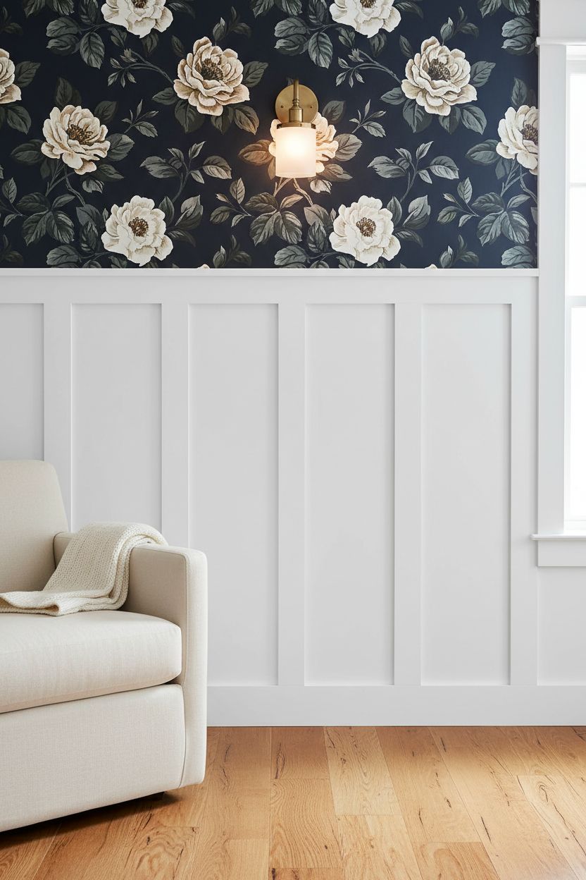
This is the classic contrast move — crisp, bright white batten panels on the lower half and a rich, dark botanical or floral wallpaper above. The white reads as a grounding base, almost like wainscoting in a Victorian home, while the wallpaper does all the personality work up top. It’s a combination that works in nearly any room because the white is doing the heavy lifting of keeping the space from feeling cave-like. Go for a navy, forest green, or deep burgundy floral to really feel the contrast. The higher you take the batten — 48 to 54 inches is the sweet spot — the more generous the wallpaper section feels above it.
Tip: Paint the battens and the cap rail the same bright white so the transition line looks deliberate, not accidental.
2. Sage Green Batten Panels with a Cream Stripe Wallpaper Above in a Bedroom
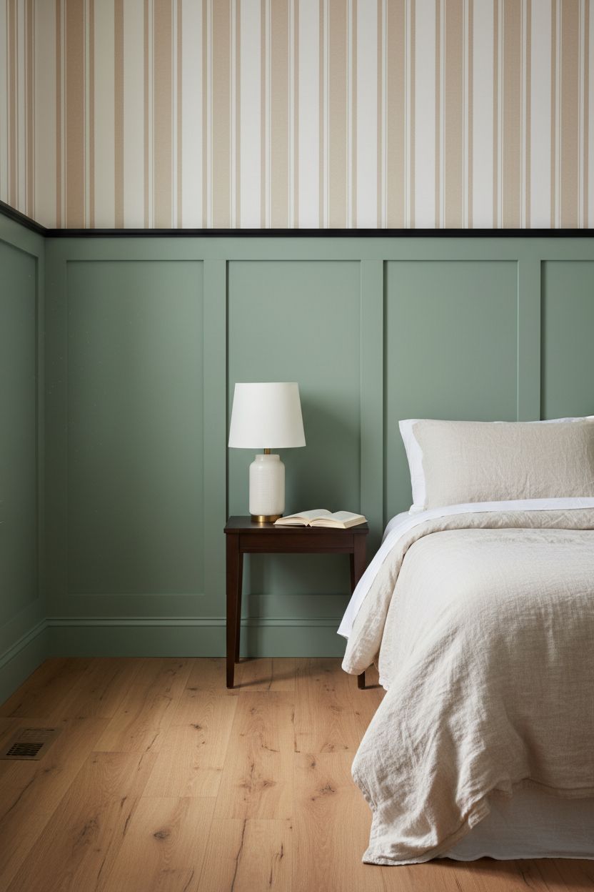
Painted batten panels — not just white — are having a serious moment, and sage green is the shade doing the most right now. Pair sage battens with a simple cream or linen stripe wallpaper above and you’ve got something that reads as calm and layered at once. It works especially well in a primary bedroom because both elements are quiet enough to sleep in but interesting enough that you actually notice the wall. The stripe wallpaper above lets the sage do its job without adding visual noise.
Swap: If you want more warmth, pull the sage one shade darker — something closer to eucalyptus — and choose a warm cream stripe with a barely-there ochre undertone.
3. DIY Board and Batten with Peel-and-Stick Wallpaper Above for Renters
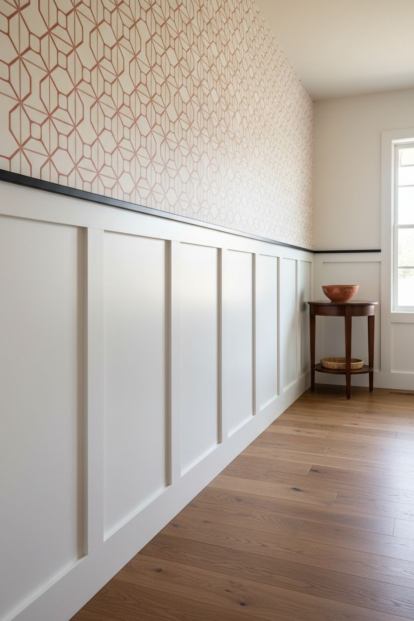
You don’t need to own the place to get this look. Peel-and-stick wallpaper has gotten genuinely good — we’re not talking the stuff from 2015 that bubbled and peeled within a month. Pair it with real MDF batten strips adhered with construction adhesive, and even a rental hallway can look like it belongs in an architecture firm’s portfolio. The key is starting with real boards below so the batten section has actual weight. The removable wallpaper above becomes the part you can swap when you move.
Why it works: The physical battens create shadow and depth that peel-and-stick panels alone can’t replicate — your eye reads it as real paneling from across the room.
4. Black Board and Batten with a Chinoiserie Wallpaper Above in a Dining Room
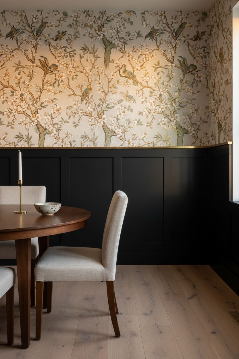
This combination is not shy, and that’s the whole point. Matte black or near-black batten panels — think Tricorn Black or Off Black — on the lower dining room wall create a grounded, formal base. A Chinoiserie or scenic mural-style wallpaper above it reads as decorative and slightly theatrical. The contrast is dramatic without being exhausting because the lower half stays visually clean. Dining rooms can handle it — people sit down at that table, pour wine, and look at the walls. Give them something worth looking at.
Tip: Run the batten section all the way to 60 inches in a dining room so it sits comfortably behind the chair backs without the wallpaper competing with heads at the table.
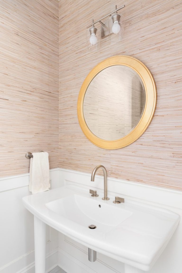
5. Board and Batten with a Grasscloth Wallpaper Above for Texture on Texture
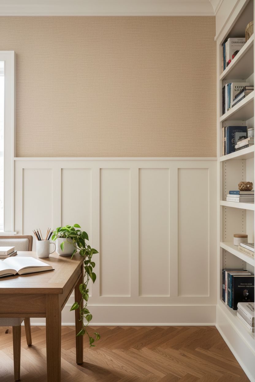
Grasscloth above board and batten is a pairing that’s less about pattern and more about material contrast. You’ve got the crisp, geometric lines of the milled boards below, and then the organic, slightly imperfect weave of grasscloth above. It’s a sophisticated choice. No busy prints, no color shock — just two very different textures having a quiet conversation. Natural grasscloth in warm wheat or sisal tones works especially well with cream or off-white battens. In a primary bedroom or study, it feels genuinely luxurious for a fraction of the cost of other materials.
Why it works: Grasscloth doesn’t reflect light the way paint does, so it adds depth above the batten line without visually competing with it.
6. Board and Batten Bathroom with a Botanical Wallpaper Above
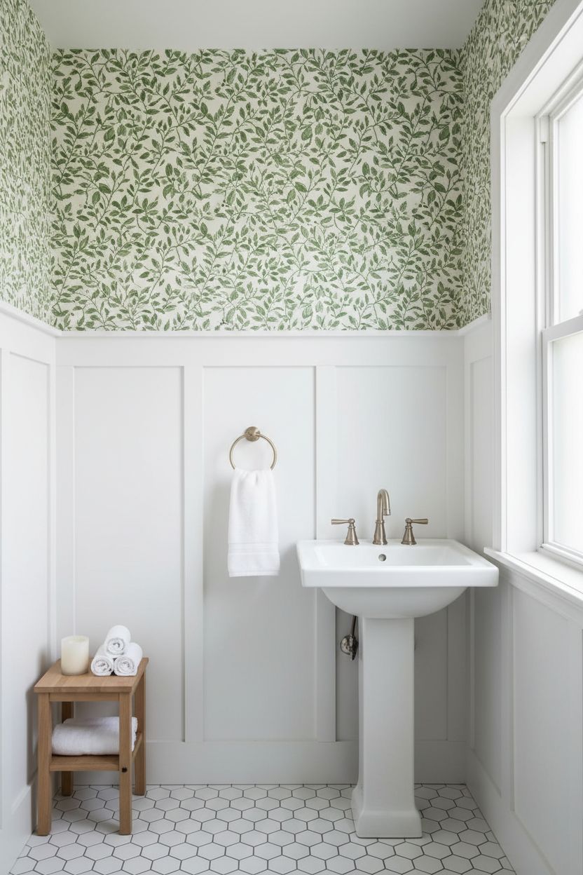
The half bath and primary bath are where board and batten with wallpaper above feels most at home — literally. The scale is contained, the commitment is lower, and the payoff is enormous. A classic white batten panel on the bottom with a leafy green botanical print above it reads as fresh and tailored. You can do it in a small powder room in a weekend. The wallpaper section in a bathroom is usually only a strip between the cap rail and the ceiling, so even a pricier wallpaper stays affordable because you’re buying so little of it.
Tip: In bathrooms, prime and sand the batten boards well before painting — moisture finds every shortcut you took during prep.
7. Cream Battens with a Hand-Drawn Stripe Wallpaper Above in a Nursery
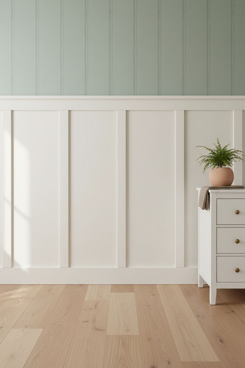
For a nursery or kid’s room, the board and batten with wallpaper above combination is genuinely smart design. The battens are durable and scrubbable at the lower level where grubby hands are most likely to land. The wallpaper sits safely up high, away from the worst of the abuse. Choose a hand-drawn stripe or simple illustrated print — something that can grow with the kid and won’t feel baby-specific in three years. Cream battens with a soft sage or dusty blue stripe wallpaper above threads the needle between sweet and sophisticated.
Swap: Go for a removable wallpaper in the nursery so you can switch prints as the room grows without patching and repainting.
8. Tall Floor-to-Ceiling Board and Batten with a Wallpaper Insert Panel Above
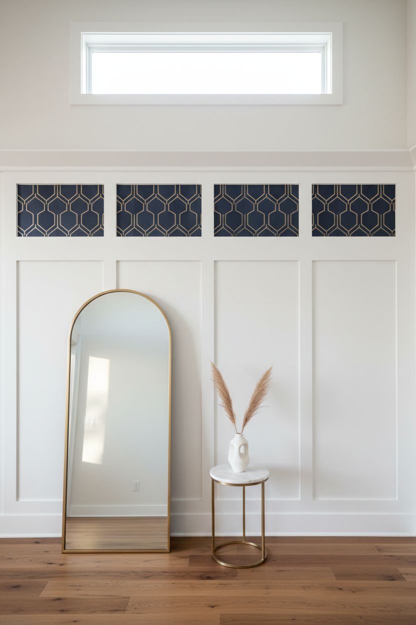
Here’s a less-common variation that looks genuinely custom: run the battens all the way to the ceiling, but create a framed panel zone in the upper section where wallpaper is applied inside the frame. It functions like picture-frame molding with wallpaper insets. The result is something that looks like it was built by a carpenter and an interior designer together — because structurally, it kind of was. It’s more work, but in a formal living room or entryway it’s the kind of detail that makes people think you spent twice what you actually did.
Why it works: The wallpaper is contained inside the molding frame, which means a bold or expensive print stays controlled and graphic rather than overwhelming.
9. Navy Board and Batten with a Warm Terracotta Wallpaper Above
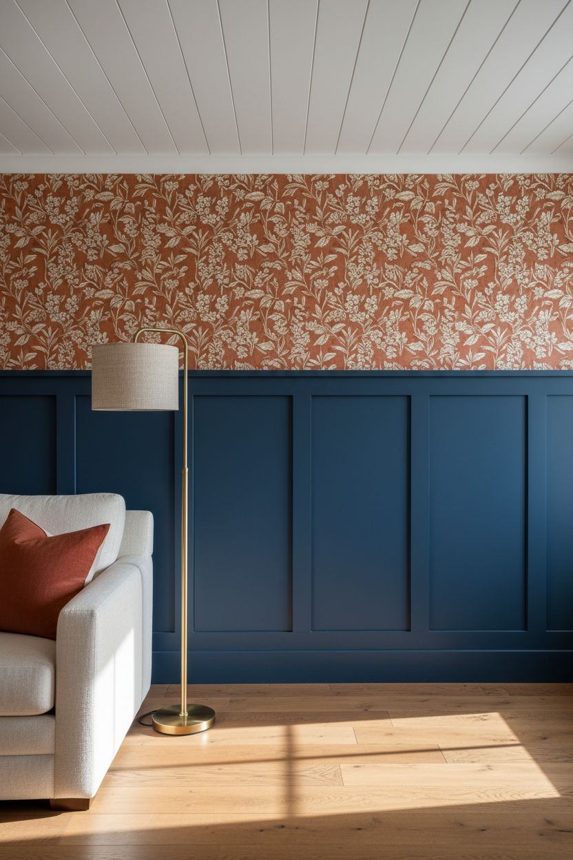
This color combination sounds risky written down. In practice it’s one of the richest-looking rooms you can build. Navy battens — a saturated, medium-depth navy, not a pale one — paired with a terracotta, spice, or warm amber wallpaper above feels unexpected in the best way. The two colors are different in temperature but similar in saturation, so they don’t fight. It works in a living room, a library corner, or a moody dining space. Keep the ceiling white so the room can breathe.
Tip: Pull a terracotta or amber throw pillow into the room’s soft furnishings to tie the wallpaper color down to the furniture level.
10. Horizontal Board and Batten with a Coastal Linen-Texture Wallpaper Above
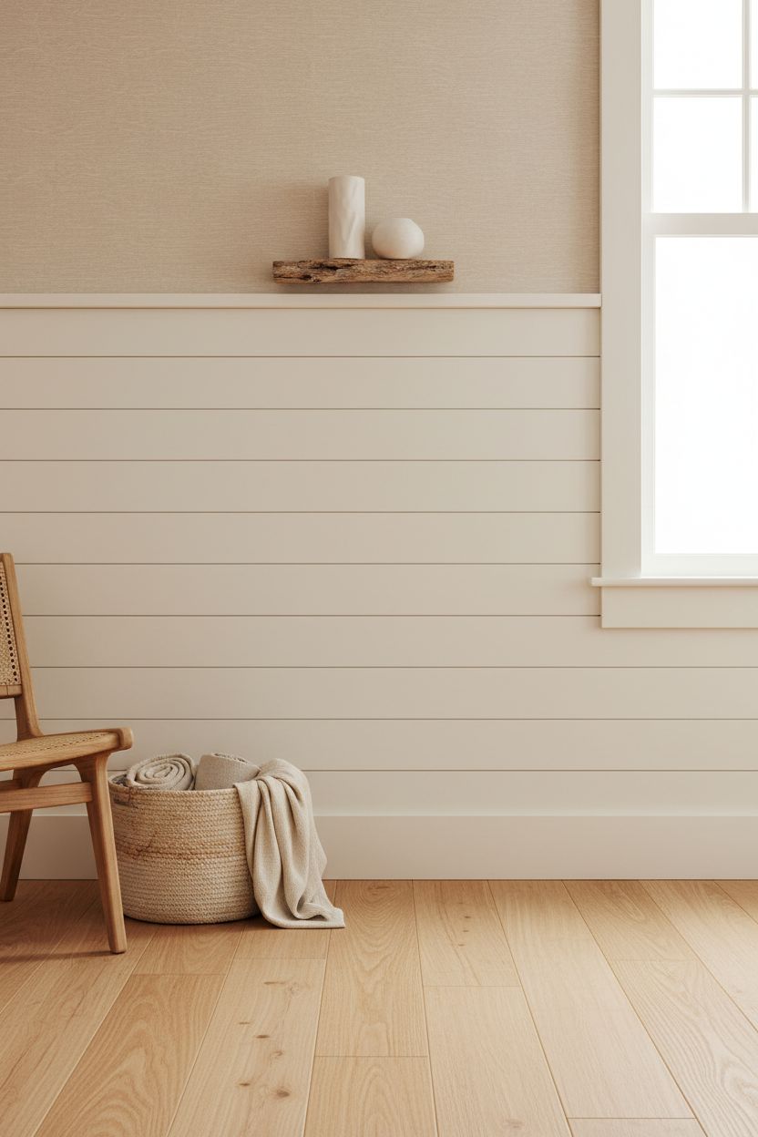
Most people default to vertical battens — understandably, since they add height. But horizontal board and batten has a laid-back, coastal feel that’s genuinely different. Horizontal lines read as relaxed, wide, and grounded rather than formal. Pair horizontal battens with a linen-texture or subtle wave-pattern wallpaper above, and you’ve got something that sits comfortably in a beach house, a lakeside cabin, or a laid-back family room. Paint the battens a warm white or sand color and let the wallpaper’s texture carry the upper half.
Why it works: Horizontal lines widen a narrow room visually — if your hallway or bedroom feels like a tunnel, horizontal battens are your friend.
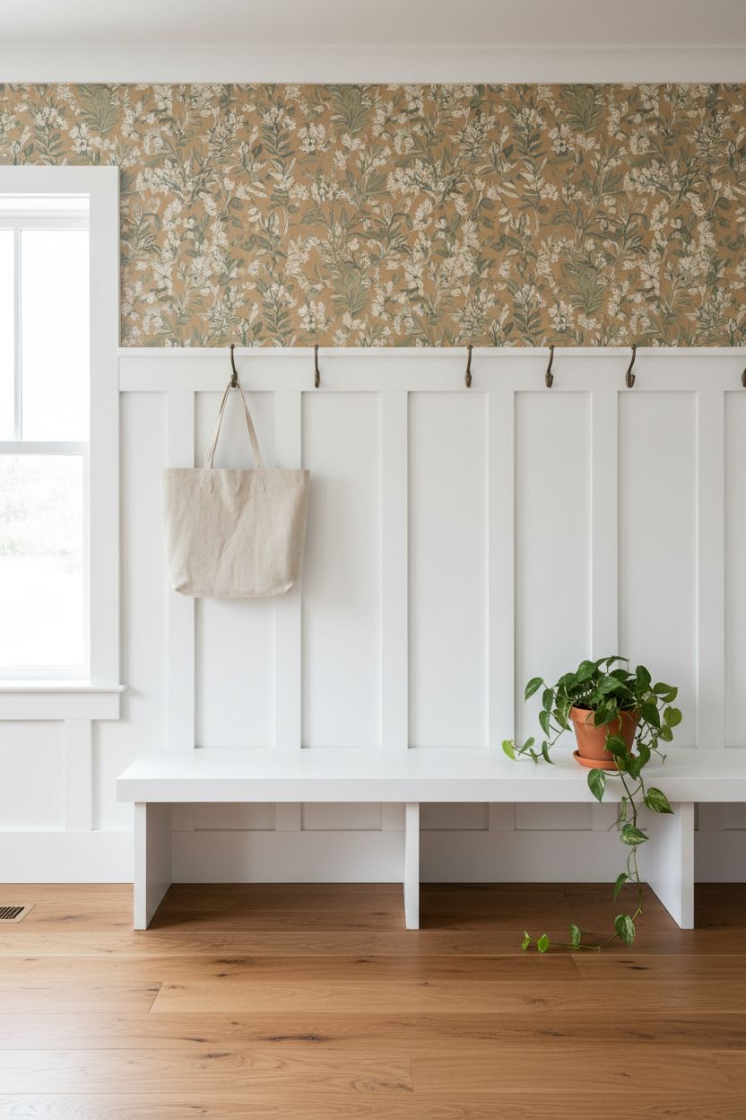
11. Board and Batten in a Mudroom or Entryway with a Graphic Wallpaper Above
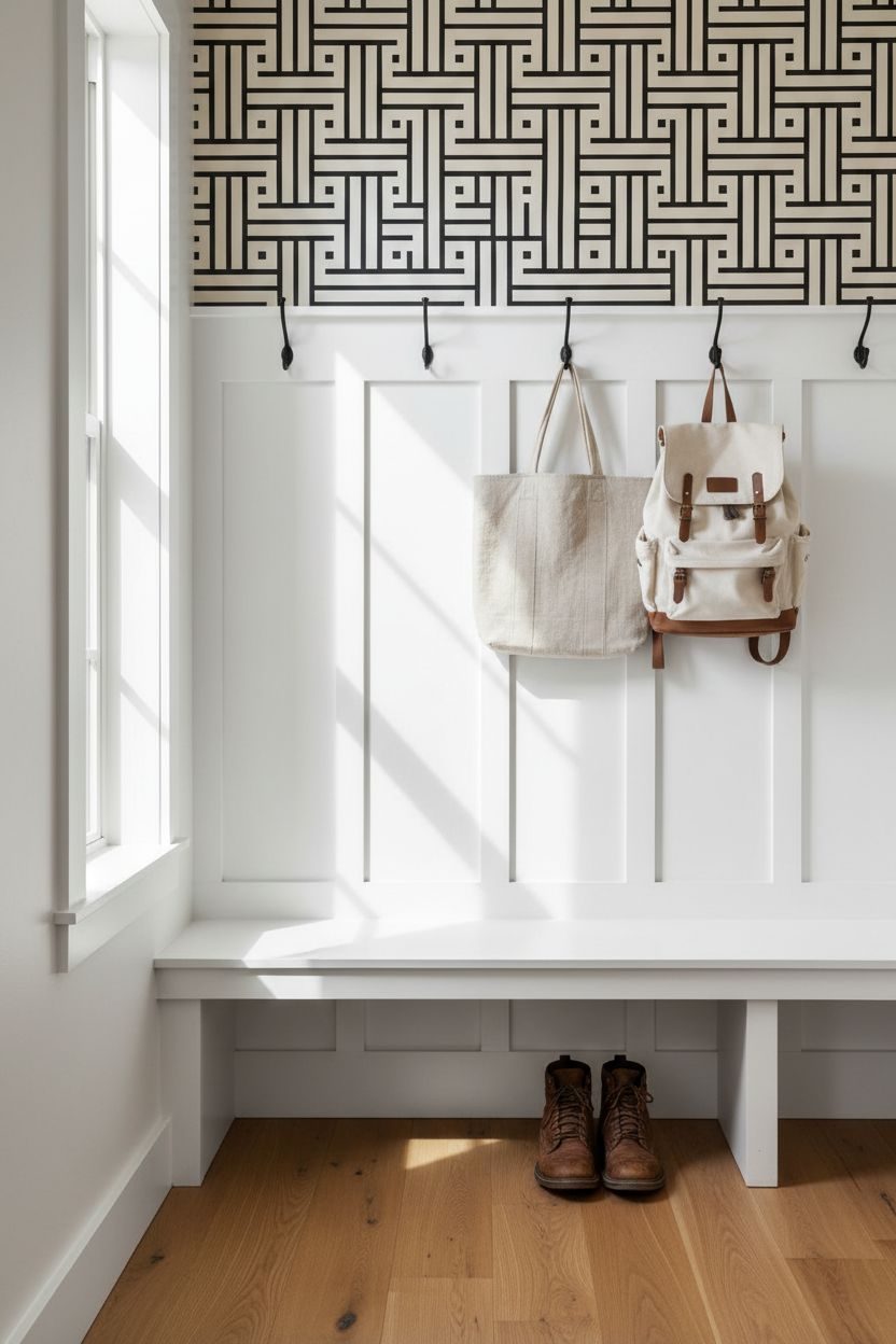
An entryway or mudroom is one of the smartest places to put this treatment. The lower batten section takes the scuffs from boots and backpacks without looking dingy — just repaint it. The wallpaper above gets to be graphic and fun because it’s out of harm’s way. A bold black-and-white geometric or a playful illustrated pattern above the batten line makes a mudroom feel intentional rather than purely functional. It sets the tone for the rest of the house from the first step inside.
Tip: In a mudroom, take the battens to 48 inches minimum — that’s tall enough to protect the wall behind coat hooks and bag pegs.
12. Charcoal Batten Panels with a Hand-Painted Floral Mural Wallpaper Above
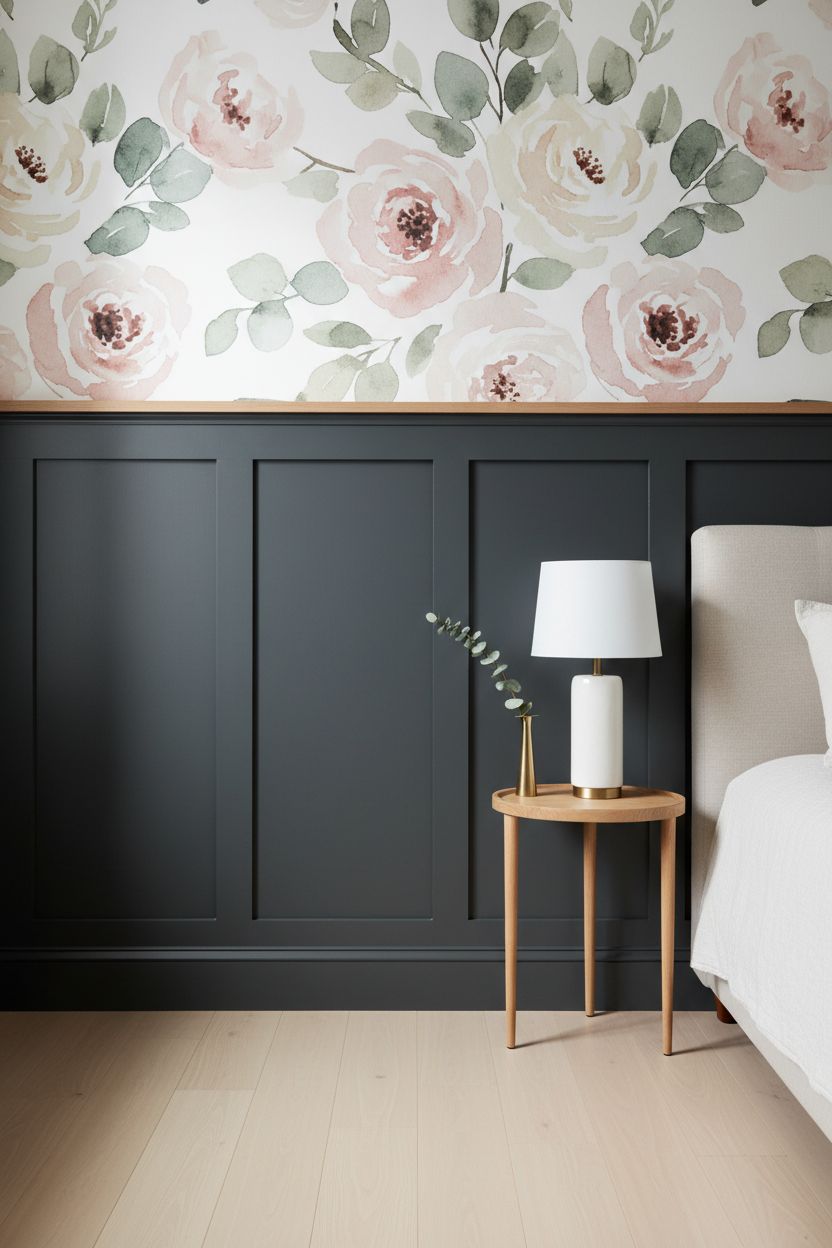
Mural-style wallpaper above the batten line is a different category of statement. It’s not a repeat pattern — it’s an image. A hand-painted-style floral or landscape mural above charcoal or near-black battens creates the effect of a room that was designed by someone who cared very specifically. The charcoal grounds it so the mural doesn’t float. This works particularly well in a primary bedroom or a sitting room where you want one wall to feel like a painting. Buy it by the panel, not by the roll — most mural wallpapers are sized that way.
Why it works: The dark battens below make the mural’s colors pop by contrast — it’s the same principle as a dark mat around a watercolor painting.
13. Low 36-Inch Board and Batten with a Bold Maximalist Wallpaper Above in a Powder Room
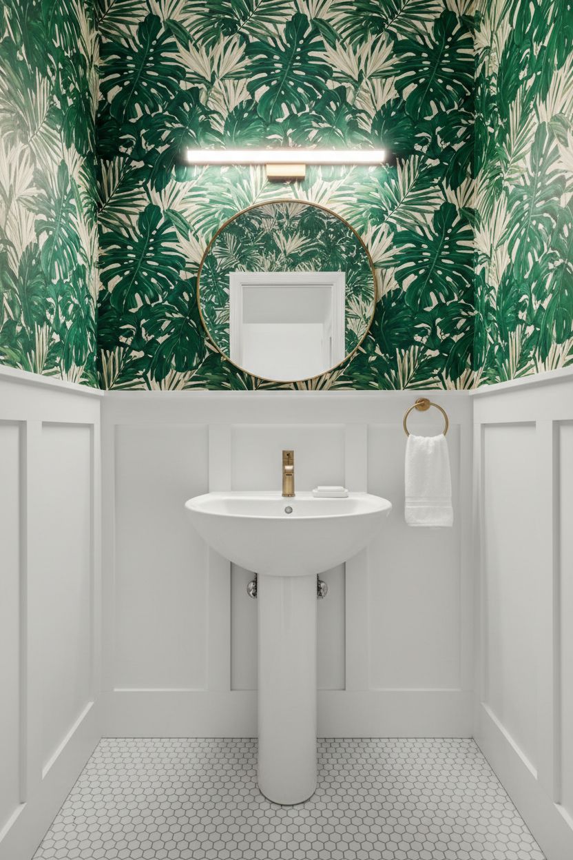
In a powder room, rules mostly don’t apply — and that’s where this idea lives. Keep the batten section low, around 36 inches, so the wallpaper gets the lion’s share of the wall. Then choose the most unapologetically bold wallpaper you’d never dare put in a room you spend more than five minutes in. Leopard print. A giant tropical leaf. An oversized baroque damask. The battens below act as a clean, tailored anchor that stops the maximalist wallpaper from reading as chaotic. Small room, big personality — and guests will talk about it.
Tip: A lower batten height means more wallpaper exposed — perfect for maximalist or mural-style prints that need room to breathe.
14. Painted-to-Match Board and Batten with a Tonal Wallpaper Above for a Moody Cohesive Look
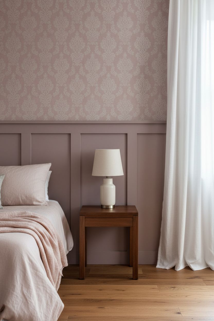
Here’s the quieter version of this trend — and genuinely one of the most sophisticated. Paint the battens the same color family as the wallpaper above, just a shade or two darker or lighter. So if the wallpaper is a dusty mauve with a subtle damask texture, paint the battens a solid muted plum. Tonal dressing like this makes the wall treatment feel architectural rather than decorative. It reads as a deliberate design decision, not a DIY project. This approach works in any room but particularly shines in bedrooms and sitting rooms.
Why it works: Tonal color relationships create depth without contrast, so the eye moves across the wall instead of snapping between two competing elements.
15. Grid-Pattern Board and Batten with a Toile Wallpaper Above
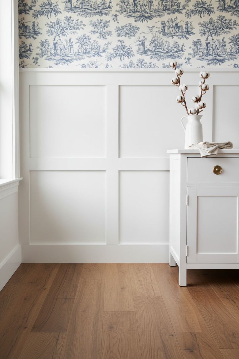
Grid or box-pattern battens — where the boards form a rectangular lattice rather than just vertical strips — are a step up in visual complexity. Paired with a classic toile wallpaper above, it’s a look that leans traditional but doesn’t tip into stuffy. Toile in a soft blue and white, or a classic red and cream, picks up the formal geometry of the grid below and adds a narrative element above. It’s a genuinely great fit in a formal dining room or a guest bedroom where you want to lean into a curated, collected aesthetic.
Tip: With grid-pattern battens, keep the cap rail thick and prominent — at least 3.5 inches wide — so the transition to the wallpaper reads as intentional, not lost.
16. Staircase Board and Batten with a Wallpaper Above the Railing Line
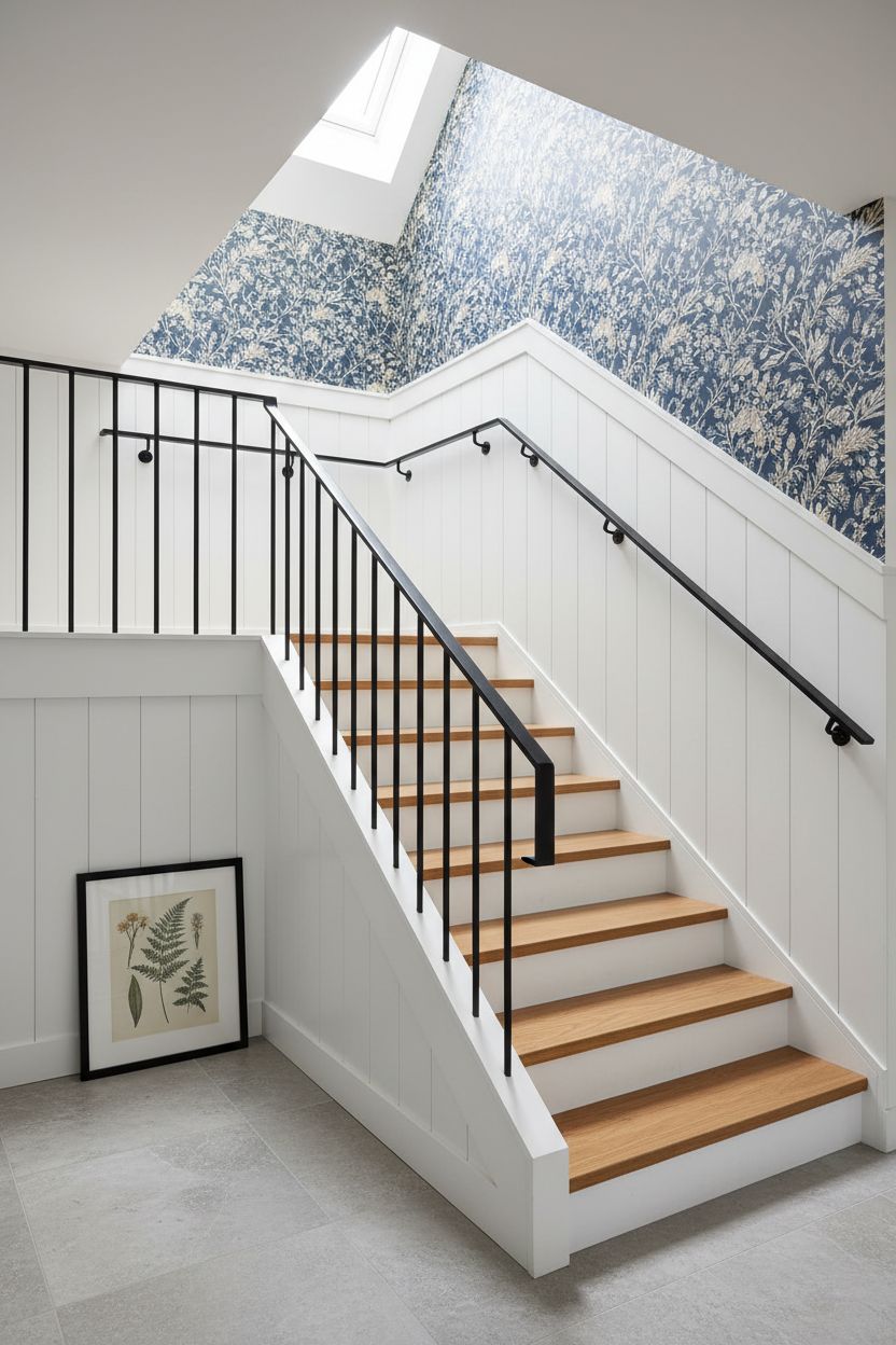
Staircases are one of the most underused canvases in a home. Taking the board and batten treatment up the stair wall — following the angle of the railing — and adding wallpaper above that line is genuinely impressive-looking. It’s more technical to install than a flat wall, so if you’re DIY-ing, read the instructions twice and work slowly. But the result is a stairwell that looks like it belongs in a designer showhouse. Choose a wallpaper with a vertical pattern or an all-over print that doesn’t rely on a specific horizontal horizon line, since stair walls are angled.
Tip: On angled stair walls, cut the batten verticals plumb — perfectly vertical — not parallel to the stair angle, so they look correct to the eye.
17. Shiplap-Style Batten Panels with a Hand-Drawn Illustrated Wallpaper Above in a Kitchen Nook
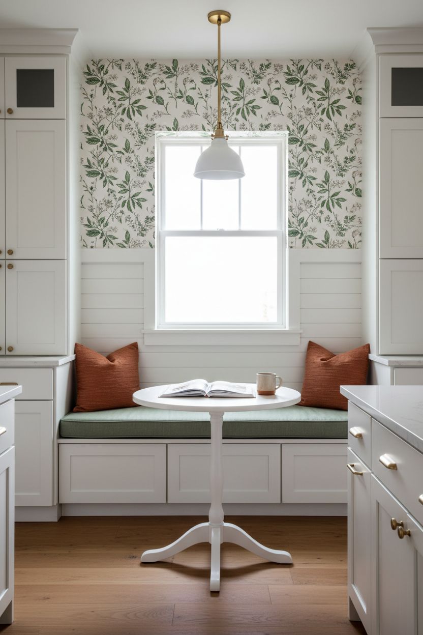
A breakfast nook or kitchen banquette is a smaller, cozier space where this treatment gets to be a little more playful. Shiplap-style horizontal panels — thinner, with narrower reveals than traditional batten — on the lower nook wall, paired with an illustrated or hand-drawn wallpaper above, creates a reading-nook feeling that makes eating breakfast feel like an event. Choose an illustrated map, a hand-lettered botanical, or a quirky animal print. The shiplap below keeps it grounded; the illustrated wallpaper above gives it a storybook quality.
Why it works: Nooks are architecturally enclosed, so bold wallpaper above the batten line feels cozy rather than overwhelming — the room is small enough for the pattern to read as intentional.
Frequently Asked Questions
How high should board and batten be when you’re adding wallpaper above it?
Board and batten with wallpaper above typically looks best when the batten section sits between 42 and 54 inches from the floor — roughly chair rail to mid-wall height. The 48-inch mark is a popular sweet spot because it gives the wallpaper a generous section above while keeping the batten visually grounded. In a small powder room, you can go as low as 36 inches so the wallpaper gets more of the wall to work with.
What kind of wallpaper works best above board and batten?
Almost any wallpaper pattern can work above board and batten wainscoting, but the best choices have some relationship to the batten color — either a complementary tone or a deliberate contrast. Botanical prints, stripes, toile, grasscloth, and hand-drawn illustrated patterns are all consistently strong pairings. If the batten section is bold in color, pull back to a quieter pattern above; if the battens are neutral white or cream, you have full permission to go maximalist with the wallpaper.
Do you need a cap rail between the board and batten and the wallpaper?
A cap rail — the horizontal piece of trim that runs across the top of the batten section — is not strictly required, but skipping it is one of the most common mistakes in this treatment. Without a cap rail, the transition between the batten panels and the wallpaper above looks unfinished. A simple 1×4 or a more decorative chair rail profile at the top of the battens gives the wallpaper a clean edge to butt up against, and it’s what makes the whole wall read as intentional rather than improvised.
Can you do board and batten with wallpaper above in a bathroom?
Board and batten with wallpaper above is one of the most popular bathroom wall treatments precisely because the battens handle the moisture-prone lower zone while the wallpaper stays high and dry. In a bathroom, prime and paint the batten boards with a semi-gloss or satin finish for moisture resistance. Choose a wallpaper labeled for humid environments, or apply a wallpaper sealer over standard paper in a half bath. The strip of wallpaper between the cap rail and the ceiling in a small bathroom is often only 18–24 inches tall, which means even a pricey wallpaper stays surprisingly affordable.
Is board and batten with wallpaper above hard to DIY?
The flat-wall version of this treatment is genuinely beginner-friendly — many people complete a standard board and batten accent wall in a single weekend for well under $200 in materials. The batten installation comes first: mark your stud locations, cut your boards, attach them with construction adhesive and finish nails, caulk the seams, prime, and paint. The wallpaper goes up after the battens are fully painted and cured. Staircase walls and arched walls are the exceptions — those require more precision and patience, and hiring a pro for the paneling portion is worth considering.