
This post contains affiliate links and is a member of the Amazon Services LLC Associates Program. If you make a purchase using one of these affiliate or Amazon links, I may receive compensation at no extra cost to you.
17 Stunning Master Bedroom Accent Wall with Paint Only Ideas Worth Saving
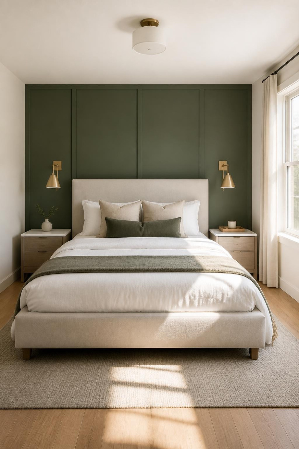
A master bedroom accent wall with paint only is the most honest design move you can make — no contractor, no wallpaper paste, no Pinterest project that takes three weekends and ends in regret. Just a wall, a roller, and the right color. That’s it. And yet somehow people still overthink it, pick the wrong wall, or bail and go back to greige. Don’t.
This list covers 17 specific paint-only accent wall ideas that actually work in a primary bedroom — from moody deep hues that make the room feel like a boutique hotel to soft earthy tones that feel calm without being boring. You’ll get color direction, finish advice, and the little tricks that separate a wall that looks intentional from one that just looks like you ran out of paint. Whether you’re renting or renovating, there’s something here you can do this weekend.
One thing worth knowing before you scroll: the wall behind the headboard is almost always the right call. It frames your bed as the focal point, reads beautifully in natural morning light, and gives you the biggest visual payoff for the least amount of effort.
What Designers Are Saying
What designers are saying in 2025–2026 makes a strong case for staying paint-only — and being intentional about it. The conversation has shifted away from loud accent walls toward something more considered.
Design trends have seen an overwhelming shift toward spaces that embrace warmth and tell a personal story, with bedroom paint color trends clearly echoing this as designers say homeowners are seeking more inviting, atmospheric spaces that evoke calm. According to Good Housekeeping’s 2026 designer roundup, Stacy Garcia of Stacy Garcia Design Studio notes that “softer, more atmospheric tones like whisper greens, muted blues, and warm earth hues” are replacing the bold, trend-chasing colors of prior years — colors that date quickly and become visually tiring.
Accent walls aren’t completely dead in 2026 — they’re just changing. The basic idea still works, but experts are pushing beyond simply painting one wall a different color. According to FacadeColorizer’s 2026 Room-by-Room Accent Wall Guide, sourced from Sherwin-Williams and Benjamin Moore forecasts plus Houzz designer data, a single accent wall remains “the highest-impact paint decision you can make in 2026 for under $250” — provided you pick the right wall and the right finish. The guidance is consistent: headboard wall, matte or eggshell finish, and a color that’s anchored to something already living in the room.
1. Deep Dusty Sage Behind the Headboard
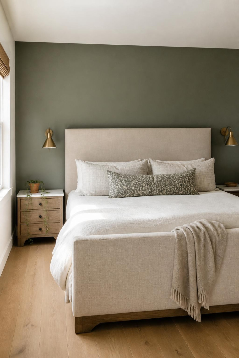
Sage is everywhere right now, but there’s a version that’s soft and forgettable, and then there’s the dusty, gray-leaning sage that makes a bedroom feel genuinely grounded. The latter is what you want on your accent wall. It reads as a neutral from across the room but has enough depth to anchor the whole space. Muted sage greens are currently more popular than darker, traditional greens — and on a single headboard wall, that muted quality keeps it from feeling trendy in a way that’ll age badly. Pair it with warm white on the other three walls and brushed brass hardware on your light fixtures. Try Sherwin-Williams Evergreen Fog or Benjamin Moore Granite Peak for a sage that leans warm instead of cool.
2. Terracotta Accent Wall for Warm, Earthy Bedroom Vibes
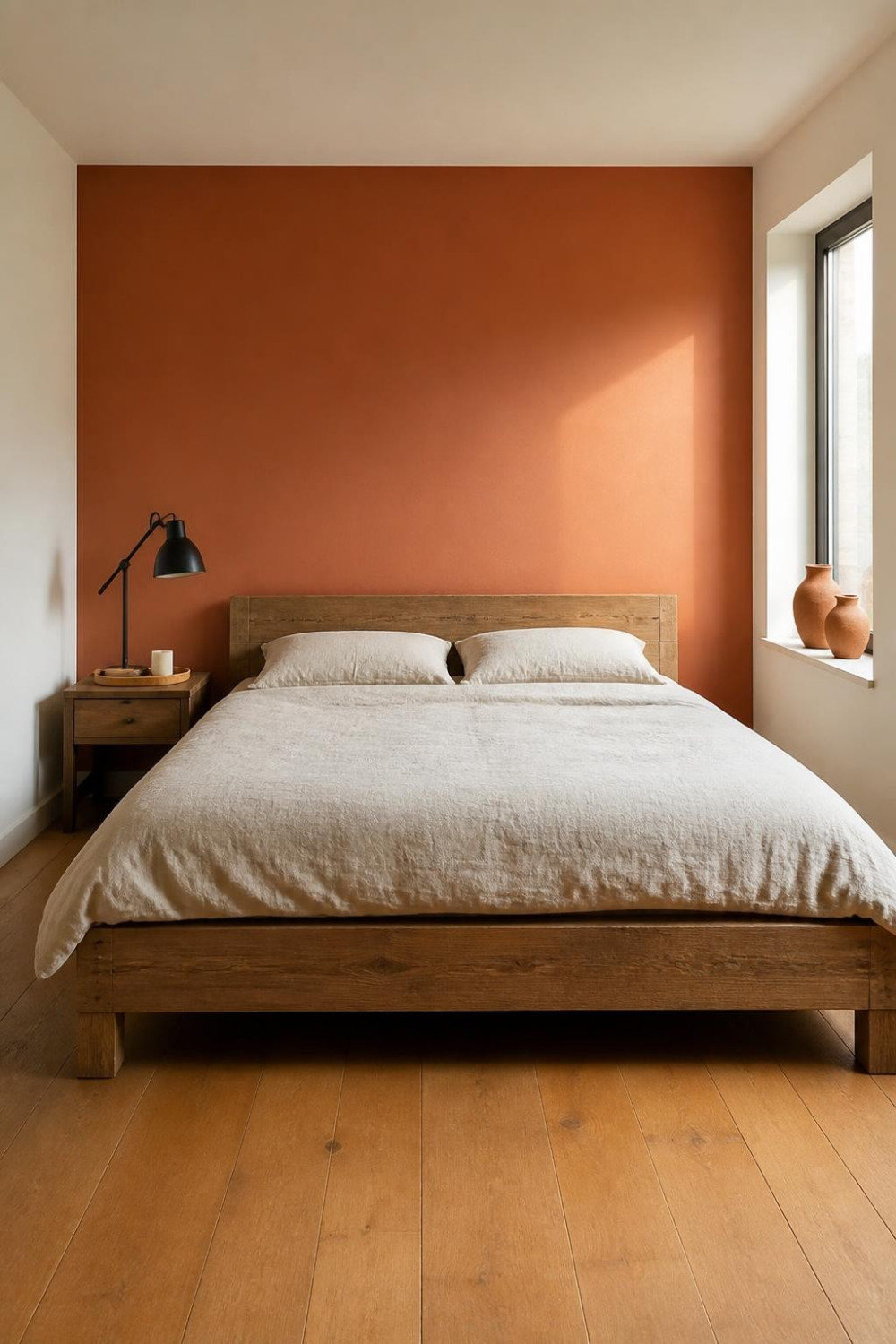
A single accent wall in terracotta brings instant warmth to a master bedroom without overwhelming the space, especially when paired with neutral bedding and light wood furniture. It’s one of those colors that photographs beautifully and feels even better in person — there’s a warmth to it that no greige can compete with. It works best in rooms with good natural light, since it can read muddy in north-facing bedrooms with limited windows. Keep the remaining walls in a warm white or soft cream, not a stark white — stark white will fight the terracotta instead of supporting it. Farrow & Ball’s Red Earth or Benjamin Moore’s Pueblo are good starting points; test them on a 12-inch patch first.
3. Inky Navy Blue That Makes the Room Feel Like a Retreat
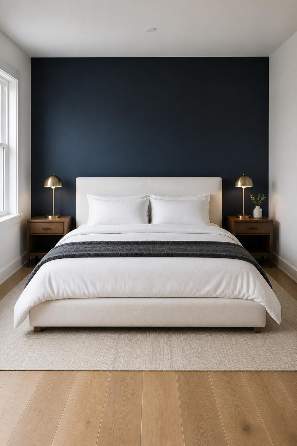
Dark colors bring about intimacy and work well in bedrooms — and navy is the dark color that almost always delivers. A deep, slightly muted navy on the headboard wall reads sophisticated without being aggressive. It’s not a color that shouts; it’s one that makes you want to stay in bed on a Sunday morning. Dark walls can make small bedrooms feel cozy instead of cramped, which runs counter to every rule you learned growing up. Pair it with crisp white linen bedding and let that contrast do the work. Use a matte or eggshell finish — matte or eggshell absorbs light and deepens rich colors like navy, which is exactly the effect you want here.
4. Warm Cocoa Brown — the Color That Replaced Greige
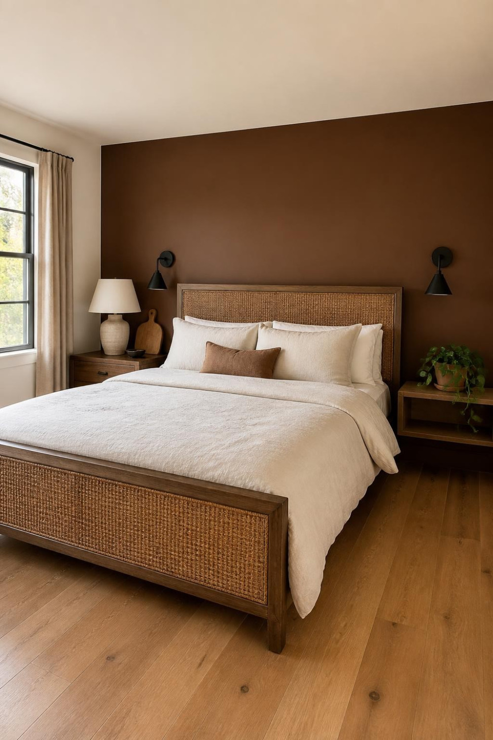
Warm brown is having a serious moment — Mocha Mousse was Pantone’s 2025 Color of the Year, and cocoa browns are clearly here to stay. On an accent wall it reads rich and enveloping, like the bedroom equivalent of a cashmere sweater. The key is going warm and slightly muted — not the chocolate brown of a 2005 Pottery Barn catalog, but something more nuanced with a hint of red or clay in it. Designers are noting that bedrooms need to feel more like sanctuaries, and richer color palettes with warm browns are being introduced to do exactly that. Works particularly well with natural linen, rattan accents, and warm-toned wood furniture. Benjamin Moore’s Clove or Sherwin-Williams’ Kaffee are worth sampling if you want brown that feels current, not dated.
5. Moody Charcoal That Skips the Gloom
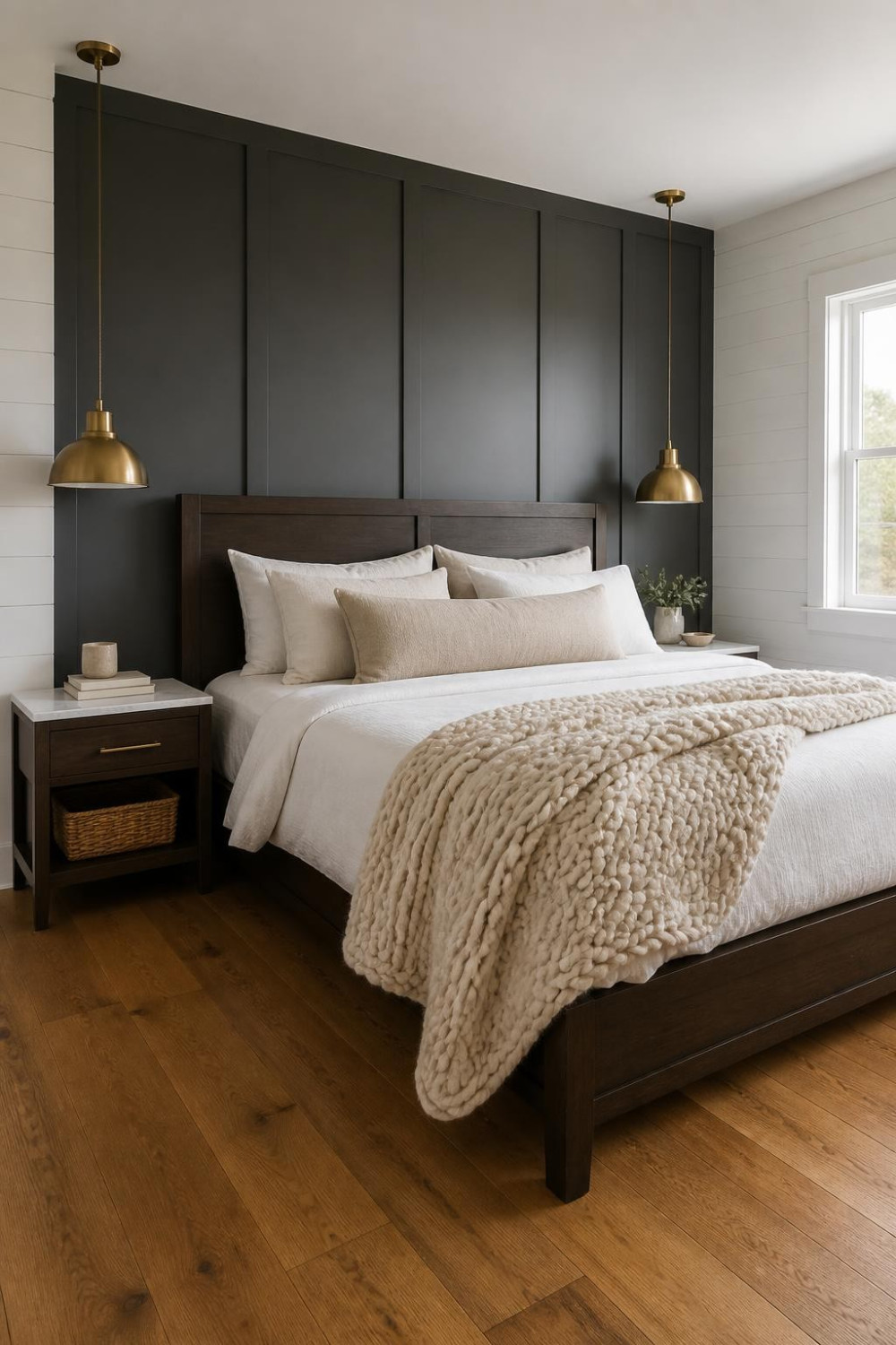
Dark accent walls are still popular, but the shades have shifted — instead of pure black, homeowners now choose softer dark colors that feel richer and warmer. A charcoal with a warm or brown undertone hits that sweet spot. It’s dramatic without feeling like a cave. The mistake people make is going true black, which reads flat on drywall. Go one step lighter — think of it as black with 20% warmth stirred in. Many interior designers now pair dark accent walls with textured fabrics rather than glossy surfaces, so lean into chunky knit throws and linen rather than silk or satin bedding. The accent wall wrapping about an inch onto each adjacent wall — painting the inside edges of neighboring walls 1-2 inches makes the corner shadow disappear and the wall look intentional, not abrupt.
6. Soft Black Arch Painted Behind the Bed
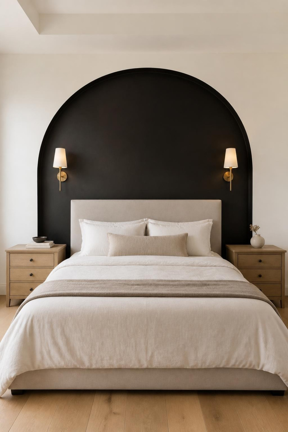
This one takes the basic concept of a headboard accent wall and adds a shape. You paint a wide arch — think 6 to 8 feet across and ceiling-height at the center — directly onto the wall behind the bed in a deep matte black or near-black hue. The remaining wall stays your base color. A painted shape like an arch behind a bed rather than the full wall is renter-friendly because the rest of the wall stays your original color. It’s also one of the most Pinterest-searched bedroom paint looks right now and costs almost nothing to execute. All you need is a pencil, a long piece of string as a compass, and steady tape lines. The arch works best when the outer edges of the bed roughly align with the outer edges of the painted shape — keep the proportions tight.
7. Earthy Rust Red for a Master Bedroom With Personality
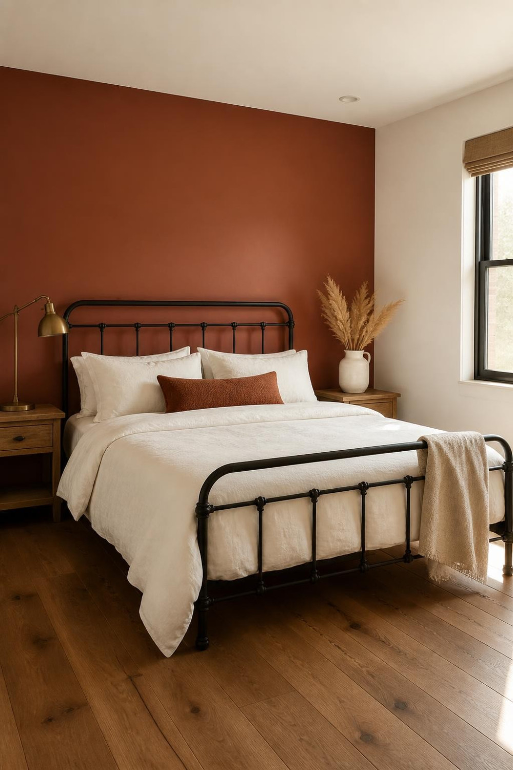
Rust red — not fire-engine, not barn red, but the kind of rust that looks like something you’d see on ancient adobe walls — is one of those colors that makes a room feel lived-in and specific. This year’s trends lean into earthy tones and unexpected darks that make small changes feel significant. On a single wall it’s confident without being a commitment you’ll regret in six months. The secret is going slightly muted — look for a rust with a brown or gray base, not a true red. It pairs brilliantly with off-white bedding and anything in warm brass or aged bronze. Sample it in both daylight and evening lamplight before committing — rust can shift dramatically under warm artificial light.
8. Dusty Plum Accent Wall for a Master Bedroom That Feels Grown-Up
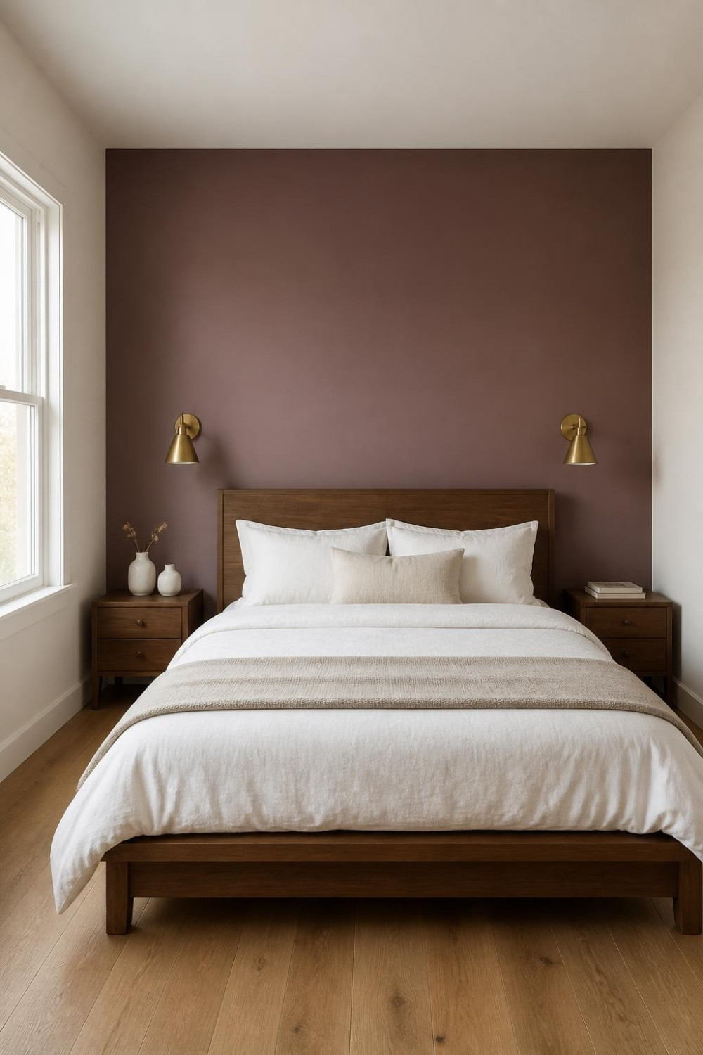
Interior designer Daniel Chenin notes that in 2026, entire rooms are being saturated in a single hue — clay pinks, dusty plums, and deep sages — with tonal shifts across walls, textiles, and furniture. Dusty plum on a single headboard wall is the approachable version of that idea. It’s not purple — it’s a muted, gray-leaning plum that reads almost as a neutral in dim light. The color has enough personality to make the room feel intentional without screaming for attention. Deep plum is among the unexpected bedroom paint color trends getting serious attention right now. Layer it with warm white bedding and natural wood to keep the room from feeling heavy. A matte finish is non-negotiable here — sheen in any dark, saturated color makes it look cheap.
9. Half-Wall Two-Tone Paint Technique — the Dark Bottom, Light Top Split
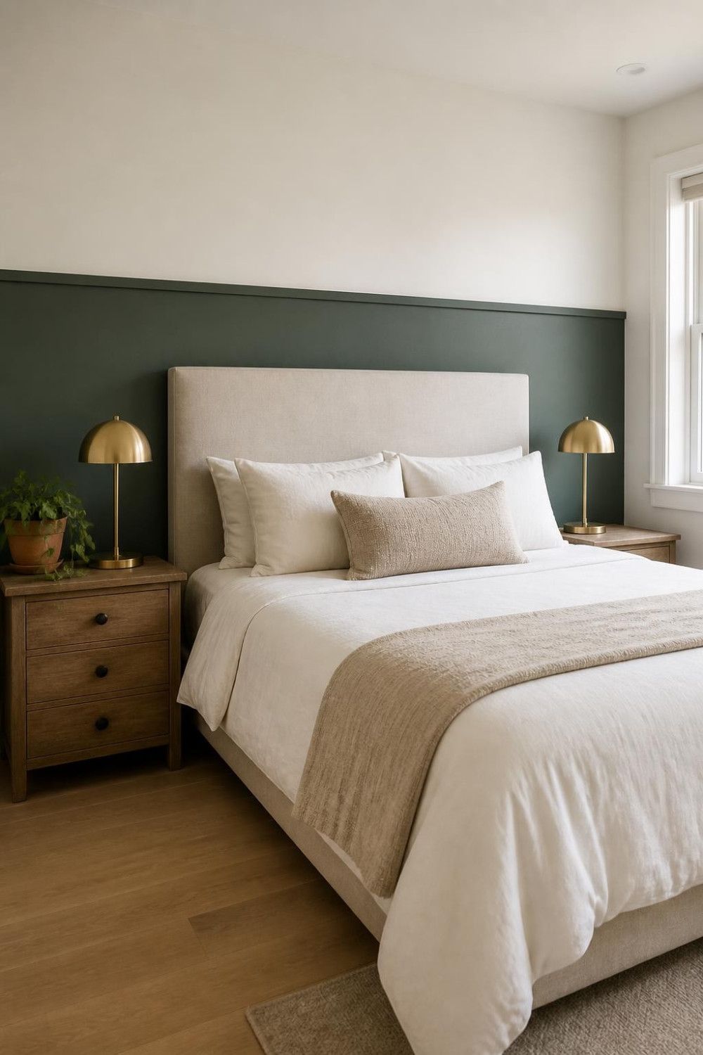
This is the paint-only version of a chair rail moment. You divide the wall horizontally — usually somewhere between 40 and 48 inches from the floor — and paint the lower half a deep, saturated color while the upper half stays the same as your other walls. It looks like architecture even without any molding. The dark bottom grounds the room, makes furniture pop, and gives the space a collected, layered feel. You don’t need a chair rail trim piece to pull it off, though adding a simple piece of 1×2 flat molding along the seam line and painting it the same as the upper wall makes it look genuinely custom. The split line should fall just above the top of your mattress when viewed from the doorway — that proportion reads most naturally.
10. Color-Drenched Headboard Wall Including the Ceiling Plane Above It
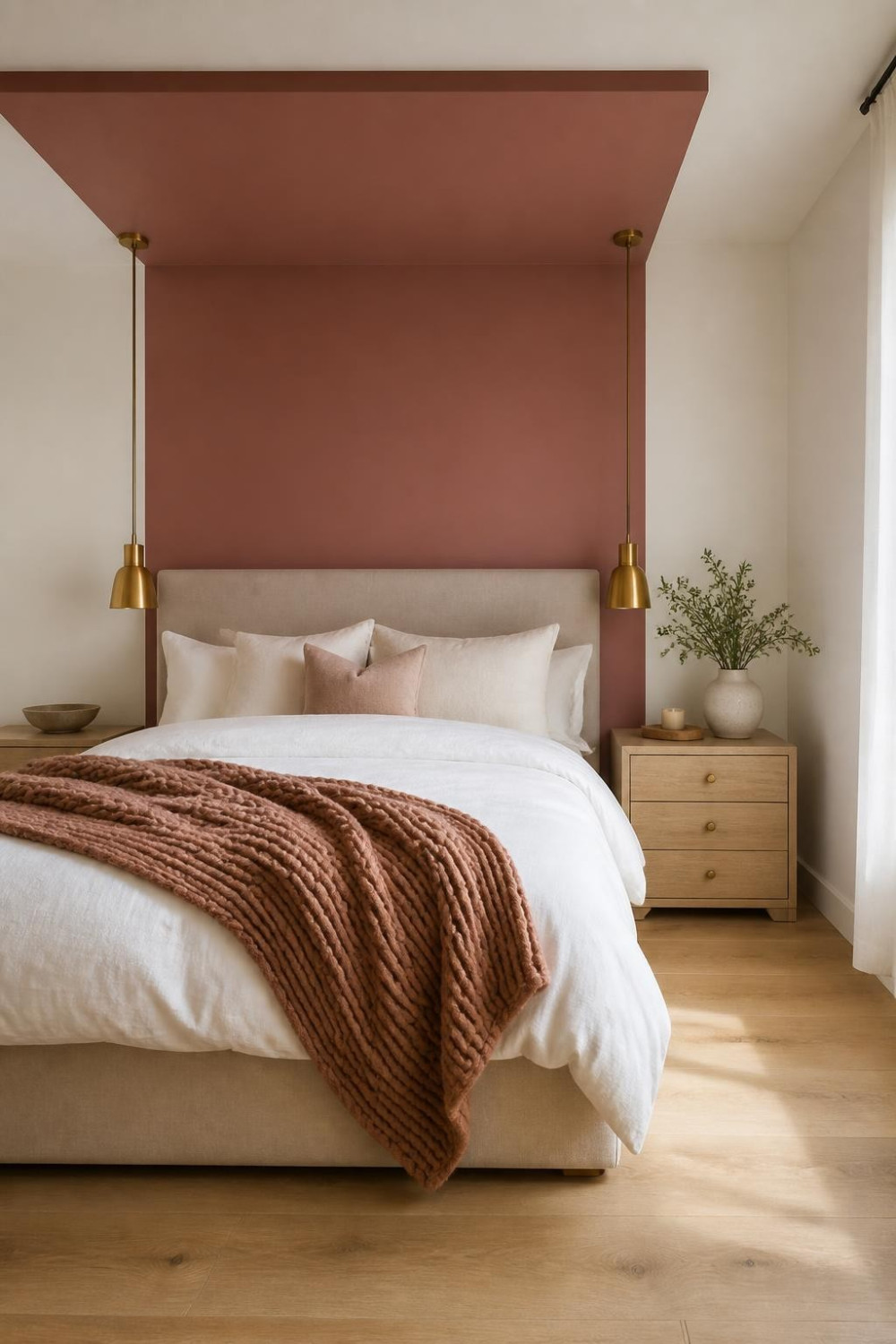
Painting an entire room one color including the ceiling creates a cohesive, intentional atmosphere — and in 2026, this idea is being taken further with bolder hues and nuanced layering, with entire rooms saturated in a single shade like clay pinks, dusty plums, and deep sages. You don’t have to go full room to feel the effect. Paint the headboard wall and continue the color onto the ceiling plane directly above the bed — about 3 to 4 feet into the room. It creates a cocooning effect that feels intentional and architectural. No trim, no tape tricks, just a confident extension of the color upward. Start with one confident hue and layer textures in the bedding to keep the look from feeling flat.
11. Painted Rectangle Panel Behind the Bed — No Trim Needed
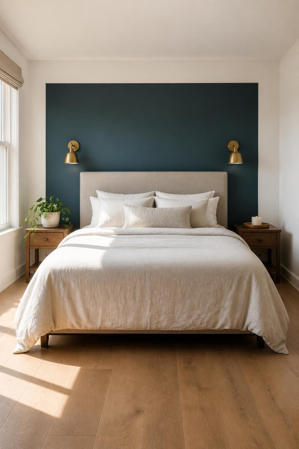
Take your accent color and paint it as a tall centered rectangle on the headboard wall, leaving the perimeter of the wall in the base color. The rectangle sits like a large framed piece of art behind the bed — except it’s the wall itself. No actual trim or molding required. The reveal between the colored rectangle and the base wall acts as its own frame. This look costs about $30 in paint and an afternoon of your time. It’s one of the most renter-friendly master bedroom accent wall ideas because the shapes are geometric and clean, so repainting over them is straightforward. Make the rectangle about 6 inches wider than your headboard on each side, and take it all the way to the ceiling — stopping short makes it look unfinished.
12. Warm Greige That’s Deeper Than It Looks on the Sample Chip
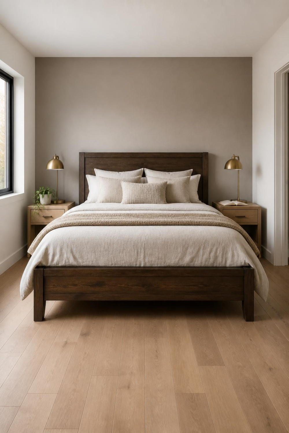
Many homeowners and renters are still gravitating toward greige and taupe — snuggled between gray and beige, they’re great for those who need transitional colors. But there’s a version of greige that’s richer and deeper — the kind that reads as a proper accent wall rather than a safe backup color. The trick is going two to three shades darker than what you think you want. On the sample chip it’ll look almost brown. On the wall behind your bed, it’ll look like exactly the right amount of warmth. Choosing a color without a fabric anchor in the room leaves the wall floating — pull the accent color from something already in the space, like your rug or curtain fabric. Deep greige works in any light direction, which makes it the safest choice if you can’t predict how your windows behave throughout the day.
13. Midnight Forest Green for a Moody Master Bedroom Look
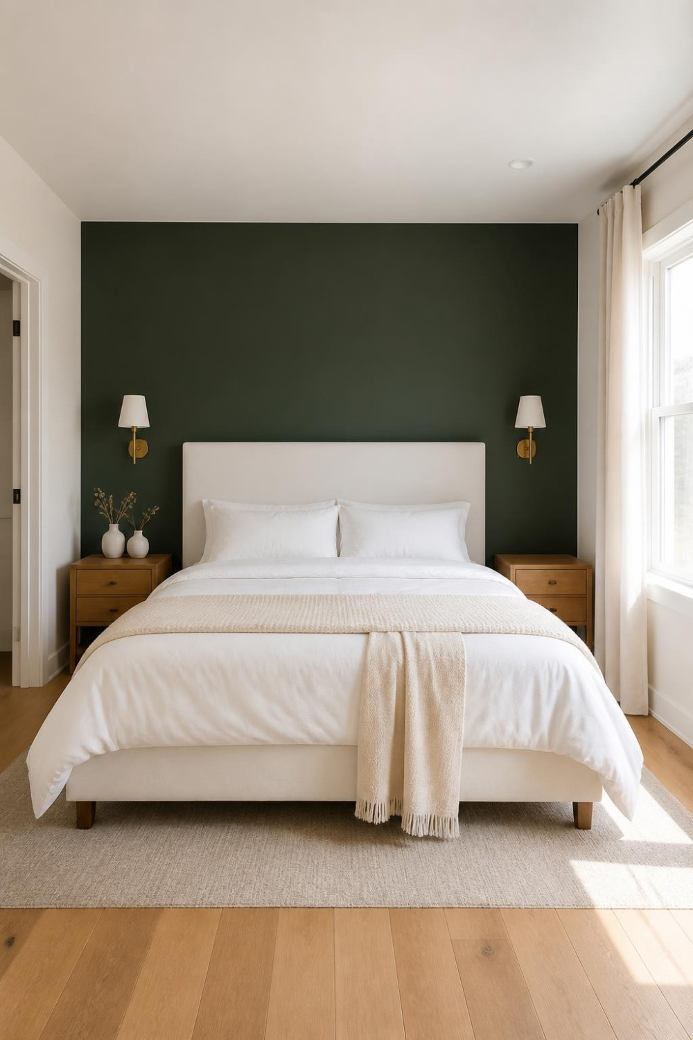
Forest green on a headboard wall is having a cultural moment that’s genuinely earned. This isn’t the kelly green of a kindergarten classroom — it’s a deep, near-black green that absorbs light and makes a bedroom feel like a proper escape. Muted tones are popular this year while bold shades like emerald are used on one wall to create balance and depth. The depth of forest green means it reads differently at 7am with sun pouring in versus 10pm with just a bedside lamp. Both are good. Keep everything else in the room light — white or cream bedding, natural wood, no competing dark elements. Forest green is one of those accent colors where the finish really matters — go flat or matte and it reads moody and intentional; go satin and it reads dated.
14. Warm White Color-Blocking With a Tonal Cream Accent Wall
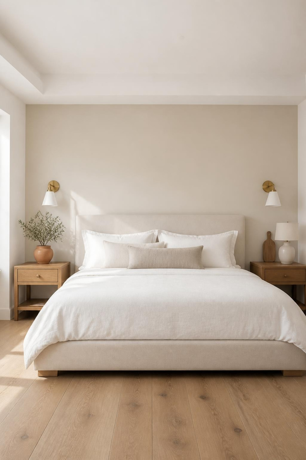
Not every accent wall needs contrast. A tonal approach — painting the headboard wall in a shade that’s two to three steps warmer or deeper than the rest of the room — creates subtle depth that you feel more than you see. It’s the quieter, more sophisticated version of the accent wall concept. Interior designer Ghazal Malik notes that warm neutrals make spaces feel calmer and more layered compared to pure white. This approach works especially well in primary bedrooms that already have a lot going on — interesting furniture, layered textiles, art — and don’t need one wall screaming for attention. The tonal accent wall is also the safest possible move for resale — it reads as thoughtful design to buyers rather than a bold statement they’ll want to paint over.
15. Clay Pink That Reads Warm Instead of Girly
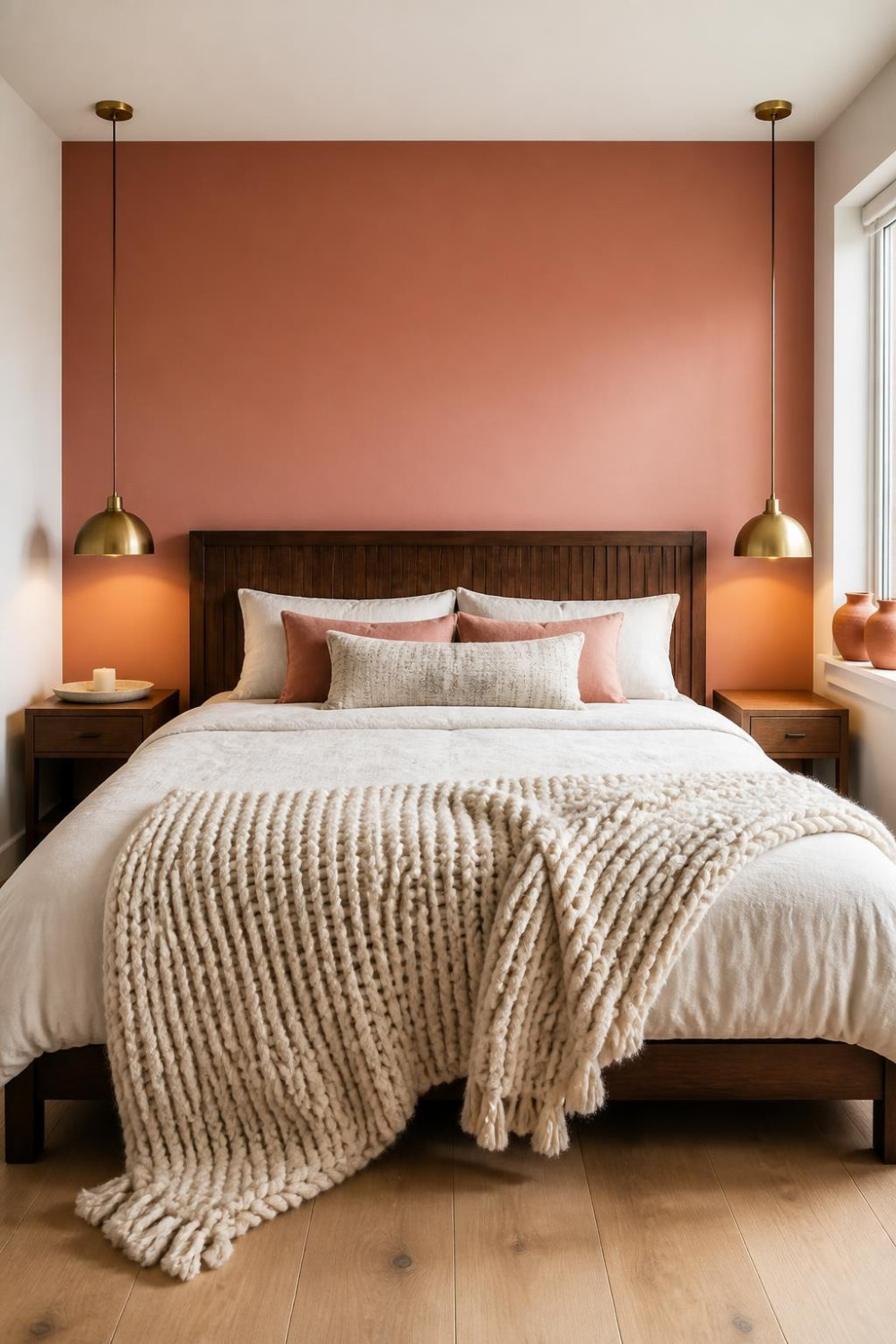
These clay tones can make a bedroom feel layered, calm, and comfortably lived-in without ever feeling flat — and for clay-colored looks, Sherwin-Williams’ Sunbaked Hues collection is worth exploring. The distinction between a clay pink that works and a pastel pink that ages badly comes down to the undertone. Designer Stacy Garcia has noted that cold, overly bright pastels — especially icy blues or washed-out pinks — will feel dated in 2026. You want a pink with brown and red mixed into it, not pink with white. Clay pink on a headboard wall pairs well with warm wood, brass, and natural linen — the room ends up feeling grounded and specific, not precious. Sample it against your actual bedding before committing — clay pink can shift dramatically depending on whether your textiles pull warm or cool.
16. DIY Geometric Diamond Grid Painted Directly on the Accent Wall
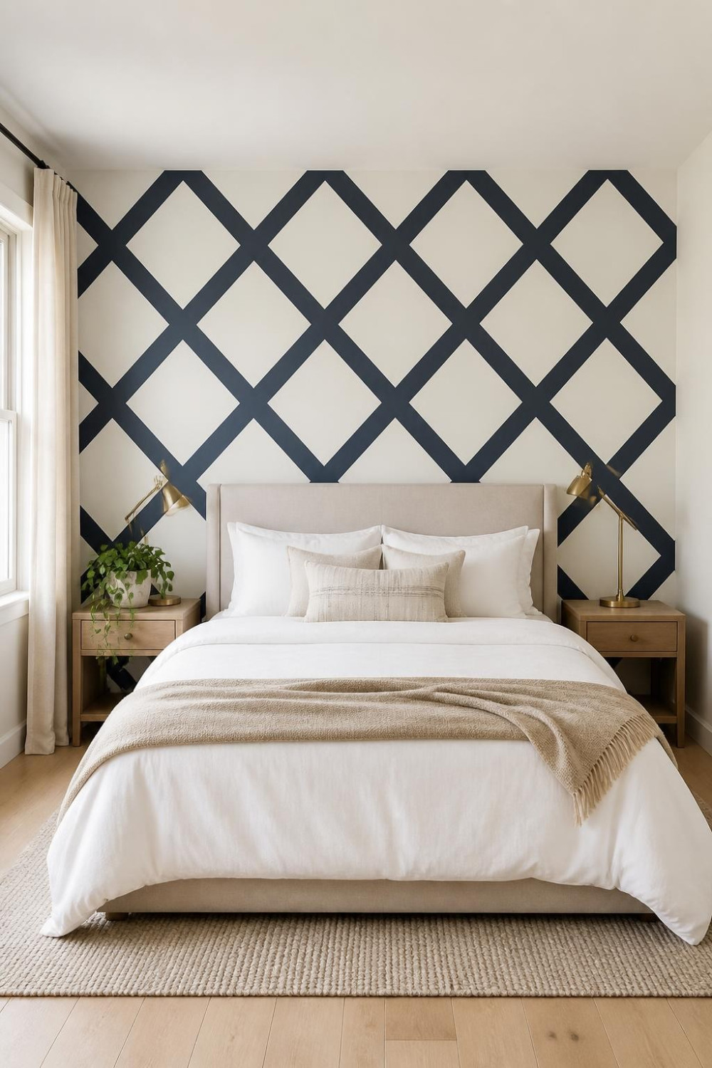
This is the paint-only version of a statement wall that doesn’t require a single piece of peel-and-stick anything. You tape off a repeating diamond grid pattern on the headboard wall and paint the interior of alternating diamonds in a contrasting shade. The result looks like expensive geometric wallpaper. Geometric trim walls remain among the most searched wall design ideas in the US, using patterns created directly on the wall surface. For paint-only execution you just need painter’s tape and patience — no molding, no tools beyond a level and a pencil. Keep the two tones close in value (like navy and deep teal, or charcoal and warm white) for a subtle effect, or go high-contrast for something bolder. Budget runs about $100–$180 total, and the approach is very renter-friendly since the rest of the wall stays your original color.
17. Eucalyptus Green — the Paint Brand Color of the Year Everyone’s Sleeping On
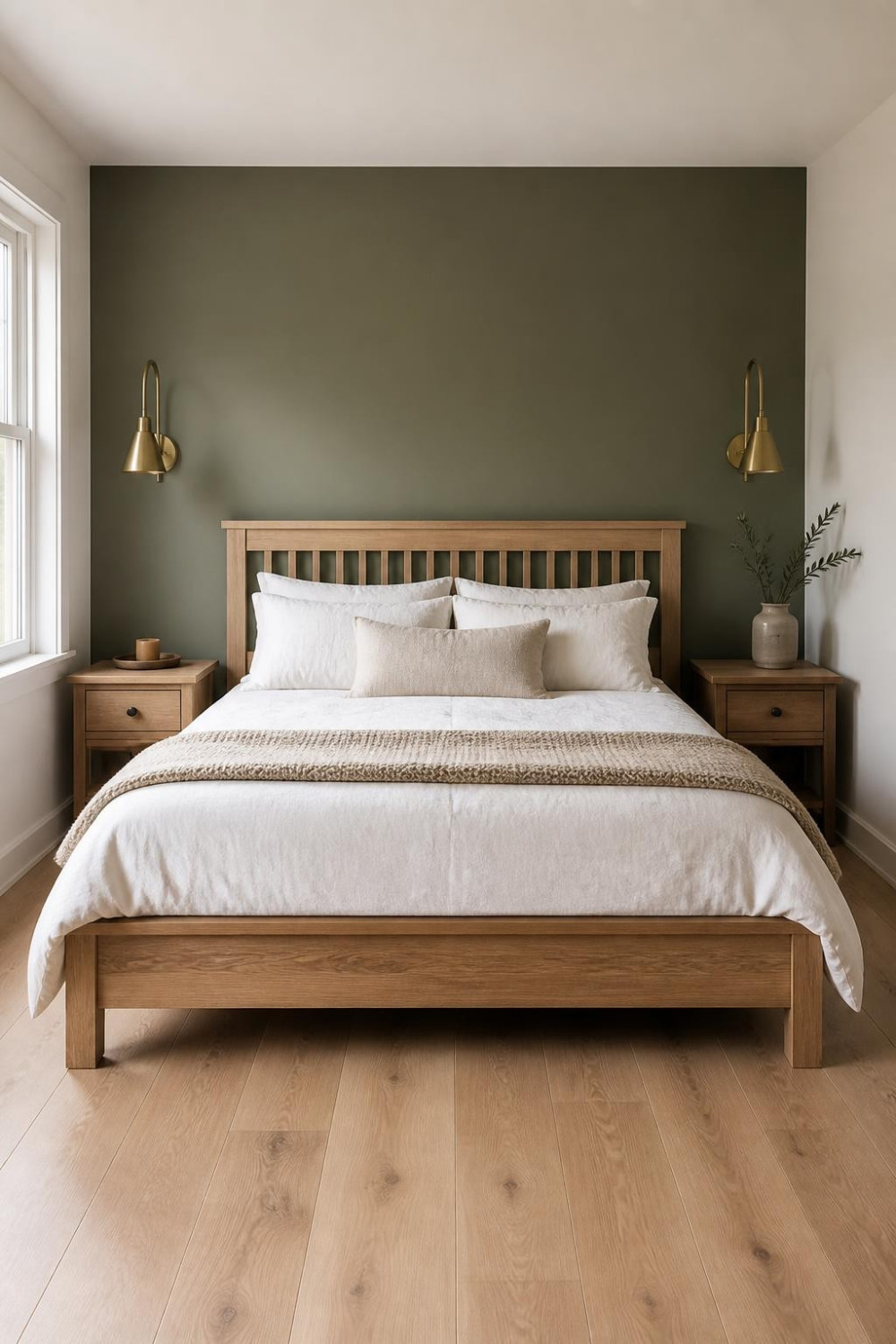
Valspar declared warm eucalyptus their 2026 color of the year — a natural green tone with a soft hint of gray that sits beautifully in a bedroom. It’s not as dark as sage and not as cold as seafoam. It’s that specific green that feels like a living thing — organic, calm, and genuinely restful. On a headboard accent wall it creates a backdrop that makes white bedding look crisp and warm wood furniture look rich. Designer Stacy Garcia has explained that trends are shifting toward softer atmospheric tones like whisper greens that feel restorative and enduring. It’s a color you won’t be tired of in three years, which is a real thing to consider when you’re staring down an accent wall decision. Pair it with warm brass and raw wood — cool metal finishes like chrome or nickel will fight the warmth in this green.
Frequently Asked Questions
Which wall should I paint as the accent wall in a master bedroom?
The master bedroom accent wall with paint only should almost always be the wall behind your headboard. Most US interior designers follow this rule in 2026 — the headboard wall frames the bed as the hero and reads beautifully in morning light. Avoid walls that are broken up by large windows or doors, since the color block works best on an uninterrupted surface.
What paint finish should I use for a bedroom accent wall?
Matte or eggshell are the right choices for bedroom accent walls — they absorb light and deepen rich colors like navy and emerald. Never use high-gloss on a full accent wall — it reflects every drywall imperfection. Matte is the most forgiving and gives the wall that expensive, editorial quality you see in design magazines.
What are the most popular master bedroom accent wall paint colors in 2026?
In 2026, trending bedroom colors include earthy greens, warm browns, soft blues, and muted pastels that bring a calm, natural feel. On the bolder end, shades like berry, navy, and emerald are being used on a single wall to create balance and depth. The most consistently recommended colors across design sources are dusty sage, deep forest green, warm terracotta, clay pink, and muted navy.
Can I do a master bedroom accent wall with paint only in a rental?
Yes — a single paint-only accent wall is one of the most renter-friendly ways to personalize a bedroom, since you’re only dealing with one wall when it’s time to repaint at move-out. Painted shape techniques — like an arch or a rectangle panel — are especially renter-friendly because the rest of the wall stays in the original color. Stick to colors in the mid-range (not extreme darks) if you want to minimize the repainting effort later.
How do I make my bedroom accent wall look intentional rather than random?
Choosing a trendy color without a fabric anchor in the room leaves the wall floating — always pull the accent color from something already in the space, like a rug, a throw, or your curtain fabric. Also paint the inside edges of adjacent walls by 1 to 2 inches — when the accent wraps slightly onto the neighboring wall, the corner shadow line disappears and the feature wall looks intentional, not abrupt.


