
This post contains affiliate links and is a member of the Amazon Services LLC Associates Program. If you make a purchase using one of these affiliate or Amazon links, I may receive compensation at no extra cost to you.
12 Stunning Moody Bedroom Accent Wall Colors Worth Saving

Moody bedroom accent wall colors are having a serious moment, and honestly, they never really left. There’s something about walking into a room wrapped in deep, saturated color that feels instantly intentional — like the space was designed with actual conviction instead of defaulting to greige and hoping for the best. Dark accent walls create that cocooning effect that every bedroom desperately needs but most people are too nervous to commit to.
This post gives you twelve real, usable ideas for dark and moody wall color inspiration — the kind that work in real homes, not just magazine shoots lit by twelve softboxes. You’ll find options that lean warm, some that run cool and atmospheric, and a few that live in that interesting middle ground. Whether you’re drawn to deep jewel tones, dramatic earth tones, or classic dark neutrals, there’s a direction here for your space.
One thing worth knowing upfront: a single accent wall almost always does more work than painting the whole room dark, especially in smaller bedrooms. It concentrates the drama where you want it — usually behind the headboard — without swallowing the light entirely. That’s the approach most of these ideas lean into.
What Designers Are Saying
Where moody bedroom accent wall colors are heading right now is less about picking one signature shade and more about how that shade is applied. Stylists are leaning hard into textured finishes over flat paint — limewash, plaster, and matte chalky finishes that catch light unevenly and give dark colors a sense of movement. A flat painted wall in forest green reads one way. The same color in a limewash finish reads about ten different ways depending on the hour of day. That dimensionality is what’s showing up over and over in showhouses and rental flips that are actually getting attention.
There’s also a visible shift away from the single-wall drama play toward more immersive approaches — painting the ceiling the same shade as the accent wall, or wrapping the wall color into a built-in bookcase or alcove. The effect is less “feature wall” and more environmental, like the color belongs to the architecture rather than sitting on top of it. Designers keep posting this treatment because it photographs exceptionally well and it reads intentional in a way that a standard painted rectangle behind the bed simply doesn’t.
What’s quietly fading is the super-saturated jewel tone as a standalone move. Teal and plum still have a place — you’ll see that in this list — but the more interesting iteration of those colors right now runs darker and more complex. Less saturated, more layered. The rooms that feel genuinely current are the ones where the wall color reads like something that settled into the space over time rather than something chosen from a mood board in an afternoon.
1. Ink Navy Behind the Headboard
Navy is the color that convinced a generation of people that dark walls were actually livable. It reads sophisticated without trying too hard. On an accent wall behind the bed, a true ink navy — not the washed-out coastal version — creates serious depth while still working with almost every other color in the room. Warm whites, natural linen, brass hardware, rattan, wood tones. All of it plays nicely. The key is going dark enough that it reads as a deliberate choice rather than a navy that chickened out halfway through the mix.
Tip: Pair ink navy with warm-toned wood furniture rather than cool grays — it keeps the room from going cold and corporate.
2. Forest Green Moody Bedroom Accent Wall for a Nature-Inspired Feel
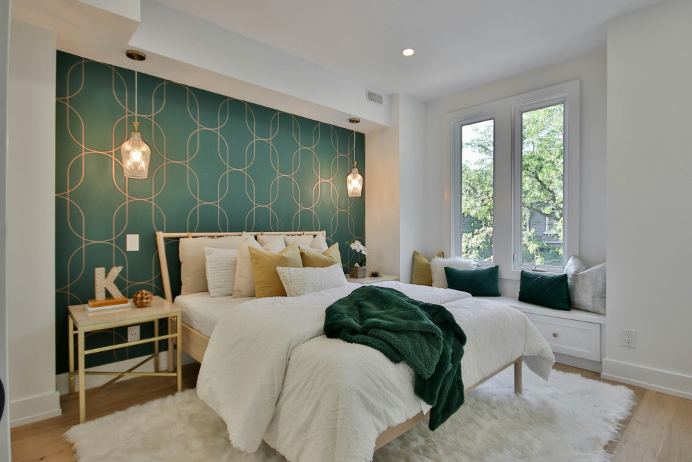
Deep forest green might be the single most requested moody bedroom wall color right now, and for good reason. It borrows from the natural world — dark canopy, moss, shadow — and brings that quiet into a sleep space. It’s warm enough to feel enveloping but not so saturated that it feels aggressive. Unlike jewel-toned greens that run bright, forest green sits back and lets the rest of the room breathe. Works especially well with linen bedding, terracotta accents, and any wood that has warmth in its grain.
Swap: If forest green feels too expected, try a deeper version with more blue in the base — it reads more complex and shifts with the light in interesting ways.
3. Charcoal Black with Warm Undertones
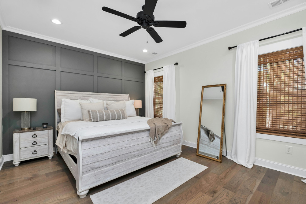
True black walls scare people, and I get it. But a charcoal with warm undertones — something that reads almost-black with a slight brown or green cast — is far more livable and far more interesting than flat black. It acts like a shadow. The room contracts around the wall in a way that feels intentional and moody without the harshness of a pure black. This shade is particularly good in bedrooms with high ceilings or crown molding because it makes architectural details read incredibly crisp against it.
Why it works: The warm undertone keeps the room from feeling like a cave — it’s the difference between cozy dark and oppressive dark.
4. Plum and Aubergine for a Jewel-Toned Bedroom
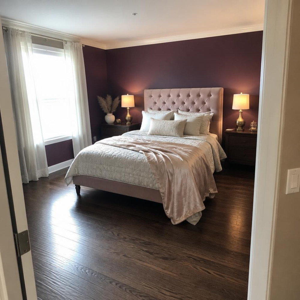
Plum is the moody bedroom wall color that people rediscover every few years and then wonder why they ever left it. A dark aubergine — not the faded lavender version but something with real depth, closer to a bruised berry — reads incredibly luxurious against velvet textures and gold hardware. It’s one of those shades that looks completely different under warm artificial light versus cool daylight. That shift is a feature, not a flaw. Bedrooms lit by lamps at night are where plum absolutely earns its place.
Tip: Keep the rest of the bedding in warm neutrals — ivory, champagne, camel — so the plum wall stays the star.
5. Warm Terracotta Brown with a Dark Edge
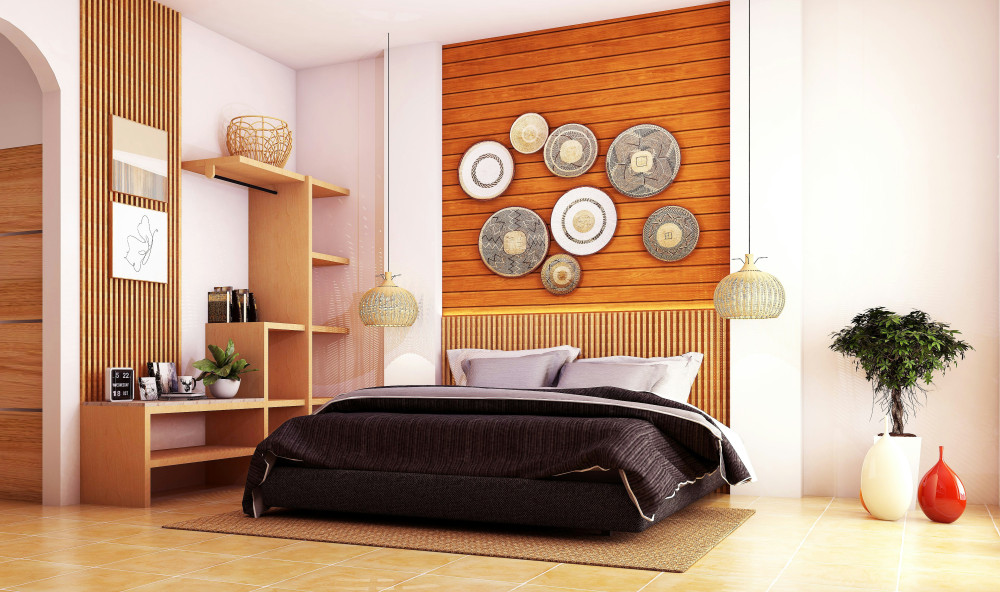
This is not your grandmother’s terracotta. A deep, almost espresso-leaning terracotta — something that sits between brown and rust with just enough warmth to glow — functions as a moody wall color that still feels earthy and grounded rather than gothic. It’s a surprisingly good bedroom choice because it responds beautifully to candlelight and warm lamp bulbs. The whole room takes on an amber quality in the evening that’s genuinely hard to replicate with any lighter palette. Works best with lots of natural texture: jute, raw linen, unfinished wood.
Why it works: Deep terracotta reads as a neutral to the eye while still delivering major drama — it’s low-risk, high-reward for commitment-phobes.
6. Slate Blue-Gray for a Cool Moody Atmosphere
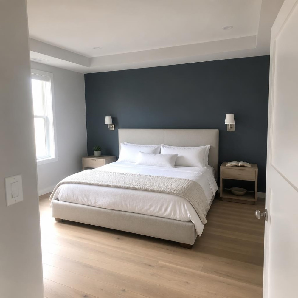
Slate blue-gray sits in that perfect zone between a color and a neutral. It’s not committing to blue, not retreating to plain gray — it holds both at once, and in low light it reads almost indigo. As a bedroom accent wall, it creates a calm, atmospheric mood that’s perfect for people who want drama without anything that feels high-contrast or bold. Cool tones in a bedroom can feel restful in a way warm tones don’t always manage. Pair with silver and pewter hardware, crisp white trim, and textured white bedding for the full effect.
Swap: Trade standard white trim for warm white or off-white — it softens the cool slate and keeps the room from reading too stark.
7. Dark Sage Green for a Sophisticated Earth Tone Look
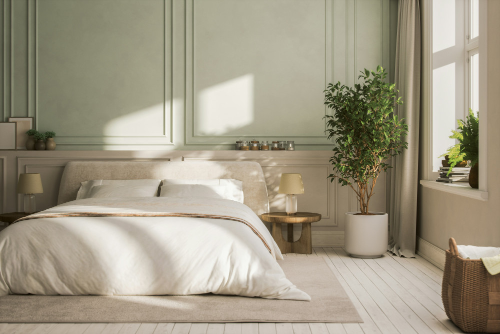
Dark sage is different from forest green — it’s dustier, more muted, and it carries a grayed-down quality that reads somewhere between green and linen. On an accent wall, it’s one of the easiest moody bedroom colors to live with because it flatters almost every skin tone in the room’s mirror, it photographs beautifully, and it adapts to both natural and artificial light without much drama. It’s also exceptionally forgiving of mismatched furniture. Honestly, dark sage might be the most universally flattering bedroom wall color in this whole list.
Tip: Dark sage works hardest when you don’t over-coordinate — let the other colors in the room just be whatever they are.
8. Oxblood Red Accent Wall for a Dramatic Bedroom Statement
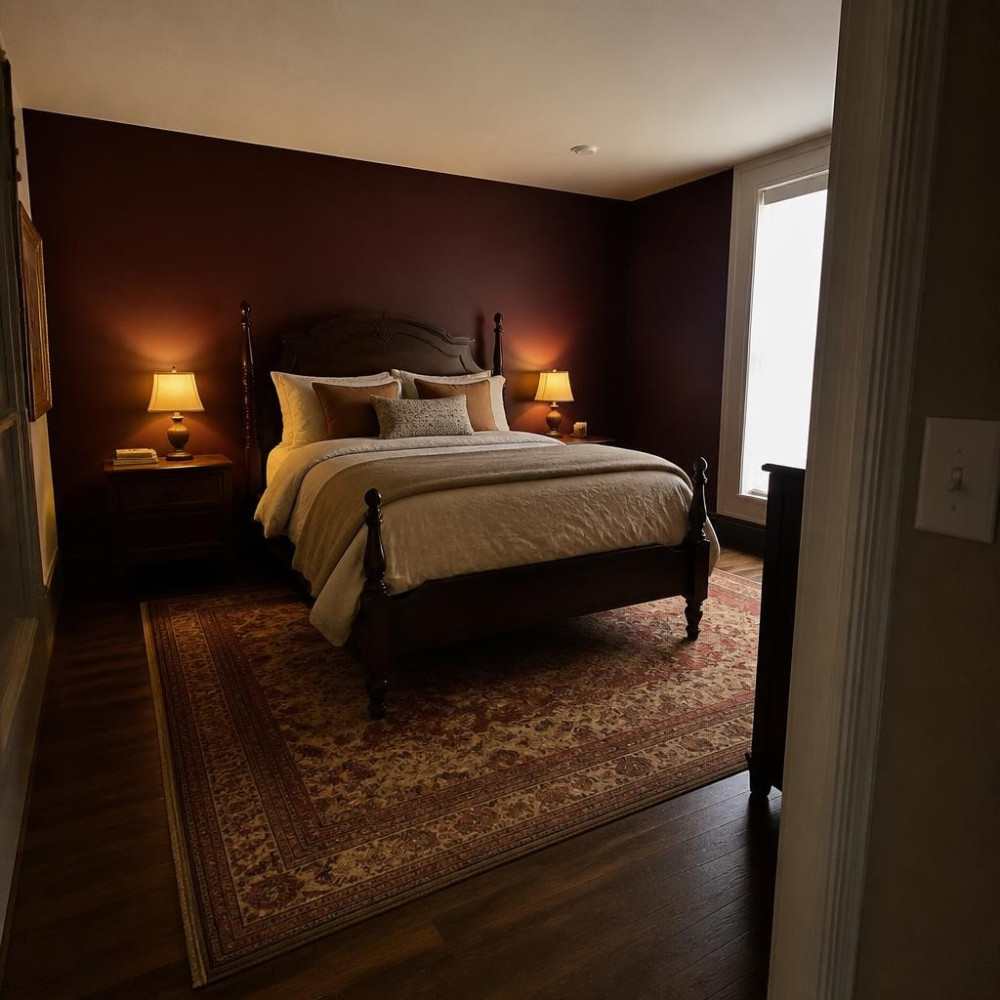
Oxblood is not for the faint of heart, and that’s exactly the point. It’s a deep, brownish red — not fire engine, not maroon, but something richer and more complex, closer to wine that’s been sitting in a dark bottle. On an accent wall behind the bed it commands the entire room. It’s a color with actual presence. The rooms I’ve seen it work best in have warm wood floors, a lot of natural texture, and lighting that’s entirely lamp-based — overhead lighting is the enemy of oxblood because it flattens out all that beautiful depth.
Why it works: Oxblood is a historical color — it appears in libraries, studies, formal dining rooms — and it brings that gravitas directly into the bedroom.
9. Midnight Teal for a Jewel-Toned Bedroom Accent Wall Color
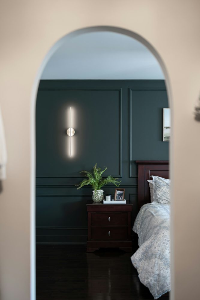
Midnight teal is forest green’s cooler, more mysterious sibling. It has enough blue in it to feel crisp and enough green to stay warm, and in a bedroom it creates that underwater-cave quality that’s genuinely atmospheric. As a moody bedroom accent wall color, teal reads differently depending on what you put in front of it. Against brass and wood it goes warm and cozy. Against silver and white it gets crisp and editorial. That flexibility makes it a strong choice for anyone who redecorates frequently because it cooperates with a wide range of other choices.
Tip: If midnight teal feels risky, start with it on a single wall — the back of a closet or alcove — before committing to the full headboard wall.
10. Moody Lavender That Reads Almost Gray
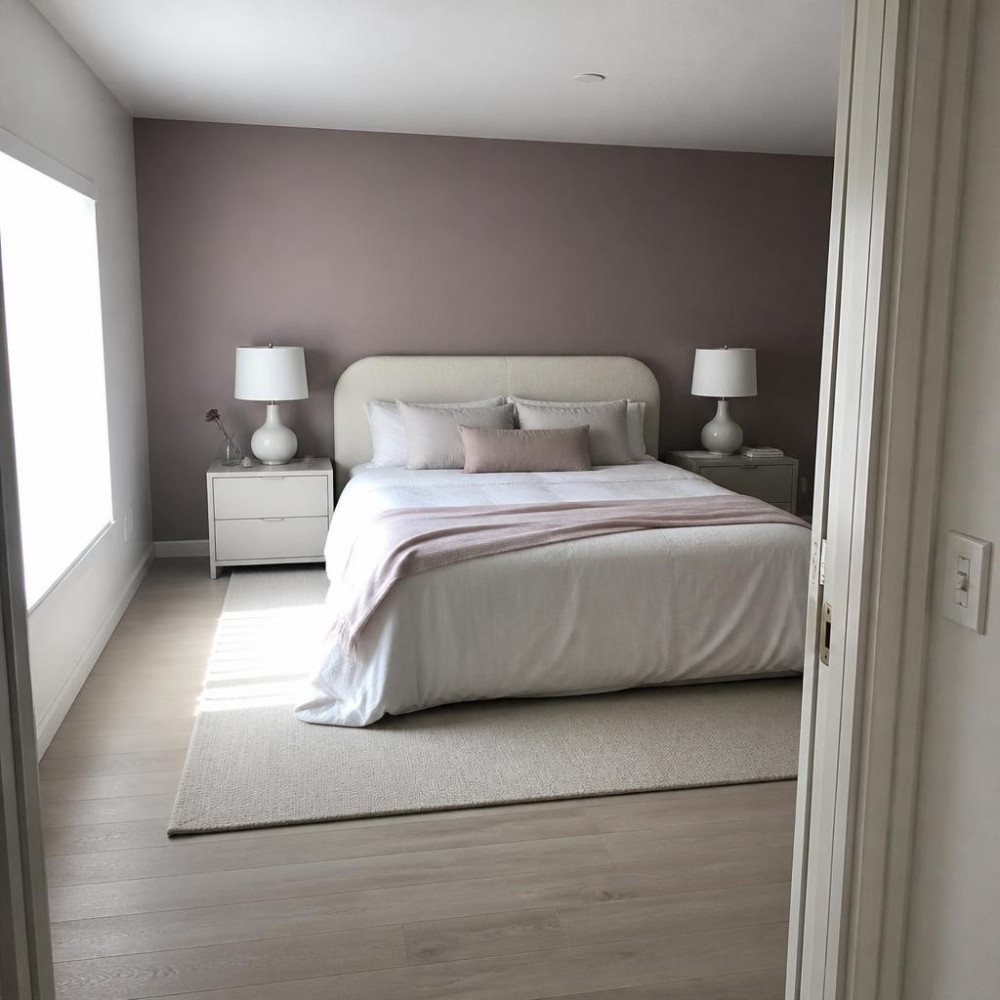
This is not the lavender you painted your childhood bedroom. A deep, desaturated lavender — so dark it nearly reads as a warm gray until the light catches it — is a legitimately sophisticated moody bedroom wall choice. It’s unexpected without being jarring, and it has the peculiar quality of making white bedding look incredibly clean against it. It’s also one of those colors that shifts significantly between morning light and evening light, which gives the room a sense of life that static neutrals never quite manage. Underrated. Full stop.
Why it works: The gray base keeps it from reading sweet or juvenile — it’s lavender for people who think they don’t like lavender.
11. Warm Mushroom Brown with a Moody Depth
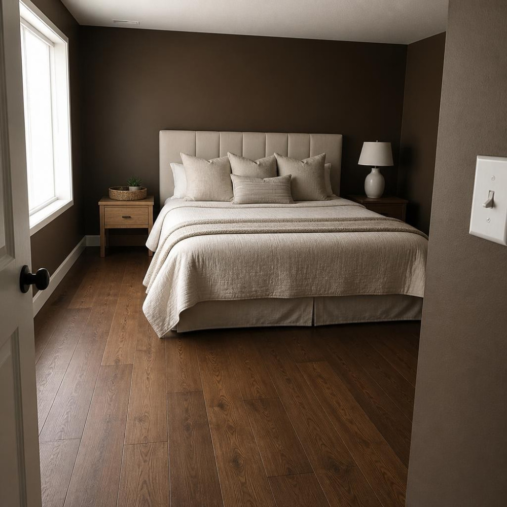
Mushroom brown sounds quiet, and in its lighter forms it is. But push it darker — past the greige comfort zone and into something with real brown-gray warmth and a hint of green — and it becomes something genuinely compelling. This shade functions as the most livable version of moody you can get. It’s not trying to be dramatic. It just creates a quiet, enveloping quality that makes a bedroom feel like it has interior life. People who think they can’t pull off dark walls usually do just fine with this one.
Swap: Use this instead of a standard greige if you want warmth with depth — it has all the ease of a neutral with a fraction more character.
12. Graphite and Warm Black for a Minimalist Moody Bedroom
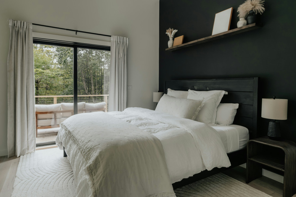
Graphite sits in a very specific and very useful spot between charcoal and true black. It’s dark enough to read dramatically in photos and in real life, but it has just enough warmth to avoid feeling like a void. On an accent wall in a minimalist bedroom — clean lines, little clutter, quality textiles — graphite acts as a kind of visual anchor. Everything else in the room looks more deliberate against it. Furniture silhouettes become sculptural. Bedding textures get readable. It’s one of those background colors that makes the foreground better.
Tip: Graphite works hardest in rooms with at least one warm light source — a lamp, a candle, anything that cuts the cool undertone after dark.
Frequently Asked Questions
What are the best moody bedroom accent wall colors for small rooms?
Moody bedroom accent wall colors actually work well in small rooms when you apply them correctly — the key is staying on a single wall rather than going all four sides. Deep slate blue-gray, dark sage, and warm mushroom brown tend to read best in compact spaces because they don’t create the high contrast that can make a small room feel choppy. Keep the remaining walls in a lighter version of the same hue or a warm white to maintain some visual breathing room.
Do dark accent wall colors make a bedroom feel smaller?
A dark bedroom accent wall doesn’t automatically shrink the room — it actually creates the illusion of depth on that wall, which can make the space feel more intentional and layered. The rooms that feel small with dark color are usually the ones where the dark paint goes on all four walls without enough contrast from trim, bedding, or light sources. One well-placed dark accent wall behind the headboard rarely causes problems.
What colors go with a moody dark accent wall in a bedroom?
Moody accent wall colors pair best with warm neutrals in the surrounding space — ivory, cream, warm white, oatmeal, and natural wood tones. These warm neutrals stop the dark wall from feeling isolated. Hardware and lighting finishes matter a lot too: brass and aged bronze tend to warm up cool-toned dark walls like navy and teal, while nickel and pewter keep cool walls reading crisp and clean.
Is limewash or flat paint better for a dark moody bedroom wall?
Limewash finishes are genuinely worth considering for dark moody bedroom walls because they add a natural variation that flat paint can’t replicate. A flat coat of forest green is a flat coat of forest green. The same pigment in a limewash reads differently from every angle and in every light condition, which adds a lot of life to what would otherwise be a static surface. That said, limewash is harder to touch up and requires more skill to apply evenly, so flat paint is the lower-maintenance choice.
Should the ceiling match a dark moody accent wall?
Matching the ceiling to a dark moody bedroom accent wall is one of the more committed design moves you can make, and it pays off in rooms with enough height to handle it — roughly eight feet or more. When the ceiling meets the back wall in the same dark color, the whole sleeping nook feels like a canopy, which is genuinely cozy in the best way. In rooms with lower ceilings, keeping the ceiling light and letting the accent wall carry the drama is the safer and usually smarter call.


