This post contains affiliate links and is a member of the Amazon Services LLC Associates Program. If you make a purchase using one of these affiliate or Amazon links, I may receive compensation at no extra cost to you.
17 Best Moody Blue Gray Bedroom Colors in 2026
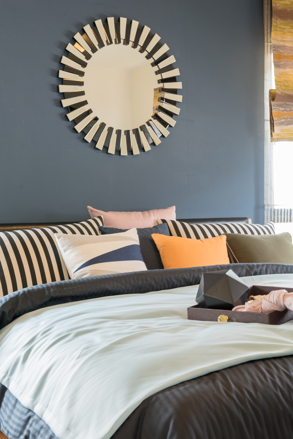
The ultimate guide to moody blue gray bedroom colors — 17 sophisticated shades with real paint formulas and honest styling tips.
Moody blue gray bedroom paint colors have serious staying power — and unlike those trending sage greens, this color family actually earns its reputation. They’re complex enough to feel sophisticated but calm enough to wake up with every morning.
The trick is finding the right balance between too blue (which reads cold) and too gray (which can feel flat). The best moody blue grays shift subtly in different light, showing their true personality without overwhelming your space.
The Exact Paint Colors You Need for Moody Blue Gray Bedrooms
Test in your actual lighting. Moody blue grays look completely different in north-facing versus south-facing rooms — order samples from Benjamin Moore or Sherwin Williams first.
Choose eggshell or satin sheen. Matte looks chalky on bedroom walls, while semi-gloss reflects too much light and ruins the moody vibe.
Paint the ceiling. Going tone-on-tone with a lighter version of your wall color (try 50% tint) creates that cocooning effect these colors are famous for.
Budget $45-65 per gallon. Benjamin Moore Advance and Sherwin Williams ProClassic are worth the upcharge — cheap paint won’t give you the depth these colors need.
Consider the undertones carefully. Blue grays with green undertones (like Storm Cloud) work in traditional spaces, while purple-leaning ones (like Nimbus Gray) suit modern rooms better.
1. Benjamin Moore Rocky Coast — The Designer Favorite
This is hands down my #1 pick for moody blue gray bedroom walls. Rocky Coast reads deeply sophisticated without feeling heavy, and it’s complex enough to look expensive even in budget-friendly spaces.
Perfect for master bedrooms with good natural light — it needs those windows to show its subtle blue undertones. Fair warning, it can look almost charcoal in north-facing rooms, so test first if your bedroom doesn’t get much sun.
2. Sherwin Williams Moody Blue — The Name Says It All
This color delivers exactly what you’d expect from its name — pure moody sophistication. SW 6221 has enough gray to feel grounded but enough blue to avoid that flat, institutional look you get with straight grays.
Works beautifully in bedrooms with white trim and brass hardware. The key is pairing it with warm neutrals like Sherwin Williams Creamy SW 7012 for bedding and window treatments to balance the cool undertones.
3. Benjamin Moore Nimbus Gray — The Modern Choice
This is my go-to for contemporary bedrooms that need something more interesting than plain gray. Nimbus Gray has these subtle purple undertones that read almost lavender in certain light — gorgeous with black furniture.
Best for bedrooms with lots of white and clean lines. If your style leans traditional or farmhouse, skip this one — it needs minimal, modern elements to really shine.
4. Sherwin Williams Storm Cloud — The Transitional Winner
Storm Cloud strikes the perfect balance between blue and gray with just enough green undertones to feel organic. It’s one of those colors that works with everything — traditional brass, modern black hardware, even warm wood tones.
Ideal for bedrooms that need to feel both calming and sophisticated. This one’s foolproof if you’re nervous about going too moody — it reads as a sophisticated neutral that happens to have personality.
5. Benjamin Moore Cloudy Sky — The Soft Drama
Think of this as the gentler cousin of darker moody blues. Cloudy Sky gives you that sophisticated blue-gray look without the commitment of something truly dark — perfect for commitment-phobic decorators.
Great for smaller bedrooms or guest rooms where you want impact without overwhelming the space. Pairs beautifully with white bedding and natural wood furniture for that Scandi-meets-moody vibe.
6. Sherwin Williams Distance — The Dusty Blue Alternative
Distance is what happens when dusty blue grows up and gets sophisticated. It’s got more gray than typical dusty blues, which means it won’t look juvenile or overly sweet in a master bedroom.
Perfect for bedrooms that get lots of natural light — this color needs sun to show its complexity. In dim lighting, it can read flat, so consider your exposure carefully before committing.
7. Benjamin Moore Philipsburg Blue — The Historic Choice
This color has serious historical pedigree — it’s been around forever because it just works. Philipsburg Blue is deeper than most blue-grays on this list, almost approaching navy territory, but the gray keeps it from feeling too maritime.
Best for traditional bedrooms with architectural details like crown molding or chair rails. Modern minimalist rooms can’t handle this much character — it needs traditional elements to ground it.
8. Sherwin Williams Krypton — The Cool Contemporary
Krypton is what you get when you want something genuinely moody but still livable. It’s got these cool, almost silver undertones that photograph beautifully but might feel too stark if your bedroom doesn’t have warm accents.
Requires commitment — this isn’t a safe choice. You need to embrace the drama with rich textures like velvet pillows, faux fur throws, and definitely some brass or gold accents to warm it up.
9. Benjamin Moore Newburyport Blue — The Classic Depth
This is blue-gray for people who want something with real presence. Newburyport Blue is definitely on the darker end of the spectrum, which means it creates that cocooning bedroom vibe but demands excellent lighting.
Perfect for master bedrooms with multiple windows and white or cream bedding. Honestly, this look only works if you have the natural light for it — in a dark room, it’ll feel like a cave.
10. Sherwin Williams Misty — The Gentle Giant
Don’t let the name fool you — Misty has more backbone than you’d expect. It’s a blue-gray that leans heavily gray but keeps enough blue to feel fresh rather than flat.
Great for bedrooms where you want color without drama. This works especially well with natural linen bedding and light wood furniture — think California casual meets East Coast sophistication.
11. Benjamin Moore Buxton Blue — The Saturated Statement
Buxton Blue is for people who want to go full moody without apology. This color is saturated and rich — think navy’s sophisticated older sibling who went to art school.
Not for the faint of heart or small bedrooms. This needs space to breathe and plenty of white trim to keep it from overwhelming. But when it works, it’s absolutely gorgeous — like sleeping in a jewel box.
12. Sherwin Williams Waterloo — The Balanced Beauty
Waterloo splits the difference between blue and gray so perfectly that it chameleons with your lighting throughout the day. Morning light brings out the blue, evening light emphasizes the gray — it’s like getting two paint colors in one.
Ideal for bedrooms that serve double duty as reading nooks or home offices. The color is interesting enough to inspire creativity but calm enough for good sleep.
13. Benjamin Moore Grayish — The Sophisticated Neutral
Grayish is what happens when gray gets just enough blue to become interesting. It’s sophisticated without being dramatic — perfect for people who want a grown-up bedroom that still feels peaceful.
This is my pick for bedrooms that need to coordinate with an open floor plan. It’s neutral enough to flow with adjoining spaces but has enough character to define the bedroom as its own zone.
14. Sherwin Williams Slate Tile — The Architectural Choice
Slate Tile has this wonderful mineral quality that feels like natural stone in paint form. It’s blue-gray with definite green undertones, which makes it incredibly sophisticated with natural materials.
Perfect for bedrooms with exposed brick, reclaimed wood, or stone accents. This color needs texture to really sing — smooth, minimal spaces can’t support its complexity.
15. Sherwin Williams Interesting Aqua — The Unexpected Twist
This isn’t your typical blue-gray — Interesting Aqua leans slightly toward teal but keeps enough gray to feel sophisticated rather than tropical. It’s definitely the wildcard on this list.
Perfect for people who want something unique but not crazy. This works beautifully with brass accents and white oak furniture — just avoid anything too matchy or beachy with it.
How to Style Moody Blue Gray Bedrooms
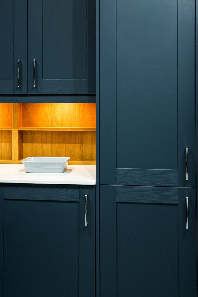
White bedding is non-negotiable with these paint colors — it keeps the moody walls from feeling overwhelming and creates that sophisticated contrast you see in design magazines. Skip busy patterns or bold colors that compete with your walls.
Brass or warm gold hardware brings out the best in blue-gray paint. Think brass picture frames, gold lamp bases, and warm metal curtain rods — these warm tones prevent the space from feeling too cold or sterile.
Layer in natural textures like jute rugs, linen curtains, or a chunky knit throw. The organic materials balance the sophisticated paint color and add the warmth these cooler tones need to feel inviting.
Keep window treatments simple and light-colored. Heavy dark curtains will make your moody walls feel cave-like — opt for white linen or light gray panels that let in maximum natural light.
What to Know Before Painting
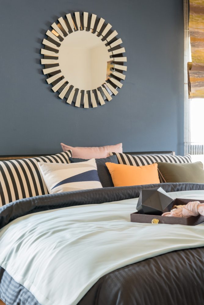
Prime your walls properly, especially if you’re going from light to dark. Benjamin Moore Fresh Start or Sherwin Williams ProBlock will prevent your old color from bleeding through and ensure true color payoff.
Order quart samples and paint large swatches — at least 2×2 feet — on different walls. Moody blue grays shift dramatically based on light exposure, and tiny paint chips won’t show you the full story.
Paint your ceiling a lighter tint of your wall color rather than stark white. Use your wall color mixed at 25-50% strength — it creates depth and that cocooning effect without making the room feel smaller.
Plan for two coats minimum, possibly three with darker colors like Buxton Blue or Philipsburg Blue. Don’t try to save money by stretching one coat — moody colors need full saturation to look their best.
The Best Paint Finishes and Tools
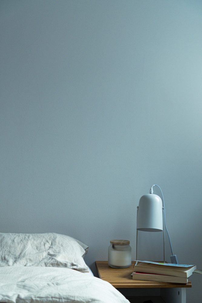
- Eggshell or satin sheen — gives you easy cleanability without the glare that ruins the moody effect
- High-quality brushes and rollers — invest in Purdy or Wooster tools for smooth, even coverage
- Benjamin Moore Advance or Sherwin Williams ProClassic — premium paints that give you the depth and richness these colors deserve
- Proper ventilation — dark colors show roller marks and brush strokes more easily, so work in good light
- Paint extender — add Floetrol to your paint to slow drying time and reduce visible brush marks
- Quality primer — don’t skip this step, especially with dramatic color changes
Which Moody Blue Gray Is Calling Your Name?
The best moody blue gray bedroom paint color is the one that makes you want to spend time in your space — not just sleep there. Trust your gut when you see it on your walls, and don’t be afraid to go darker than you initially planned.
These colors reward commitment, so pick the one that genuinely excites you rather than playing it safe. Pin your favorites for later!