This post contains affiliate links and is a member of the Amazon Services LLC Associates Program. If you make a purchase using one of these affiliate or Amazon links, I may receive compensation at no extra cost to you.
15 Moody Green Paint Colors For Small Rooms
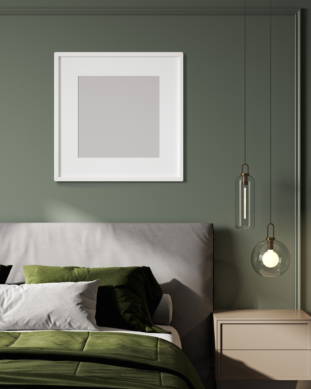
Moody green paint colors for small rooms that actually make them feel bigger — 15 designer-approved shades with real formulas and space-maximizing tricks.
Small rooms painted in moody green don’t have to feel like caves — they can feel like jewel boxes instead. The key is choosing the right undertones and pairing them with smart lighting tricks that make walls recede rather than close in.
I’m partial to deeper greens over trendy sage because they have more personality and hide imperfections better. Plus, they photograph beautifully on social media, which let’s be honest, matters when you’re showing off your space.
Before You Begin
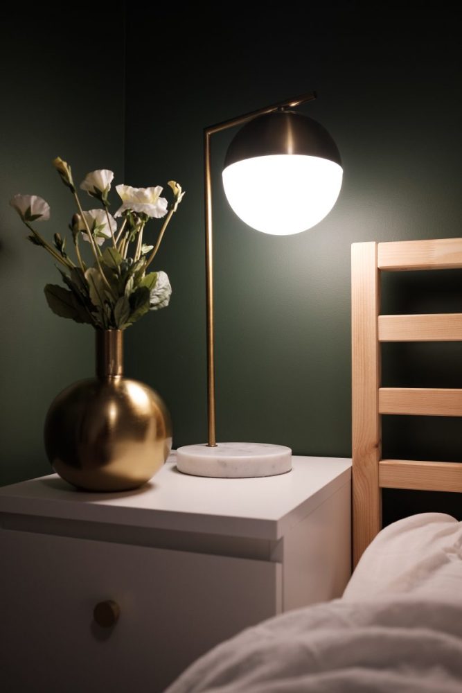
Pick the right undertone. Benjamin Moore Hunter Green 2041-10 has blue undertones that recede visually, while Sherwin Williams Evergreen Fog SW 9130 has gray undertones that feel less overwhelming in tight spaces.
Use eggshell or satin finish. Semi-gloss reflects too much light and highlights wall imperfections, while flat paint absorbs light and makes rooms feel smaller — eggshell is the sweet spot for depth without glare.
Paint the ceiling the same color. This trick makes walls disappear and creates the illusion of infinite height — I’ve seen 8-foot ceilings look 10 feet tall with this method.
Sample in different lights. Moody greens look completely different under warm LED bulbs versus cool daylight — test paint swatches near your light sources before committing.
Budget $80-120 per gallon. Premium paints like Benjamin Moore Advance or Sherwin Williams ProClassic have better color saturation and coverage, especially important with darker hues that require perfect application.
1. Deep Forest Green With Brass Accents
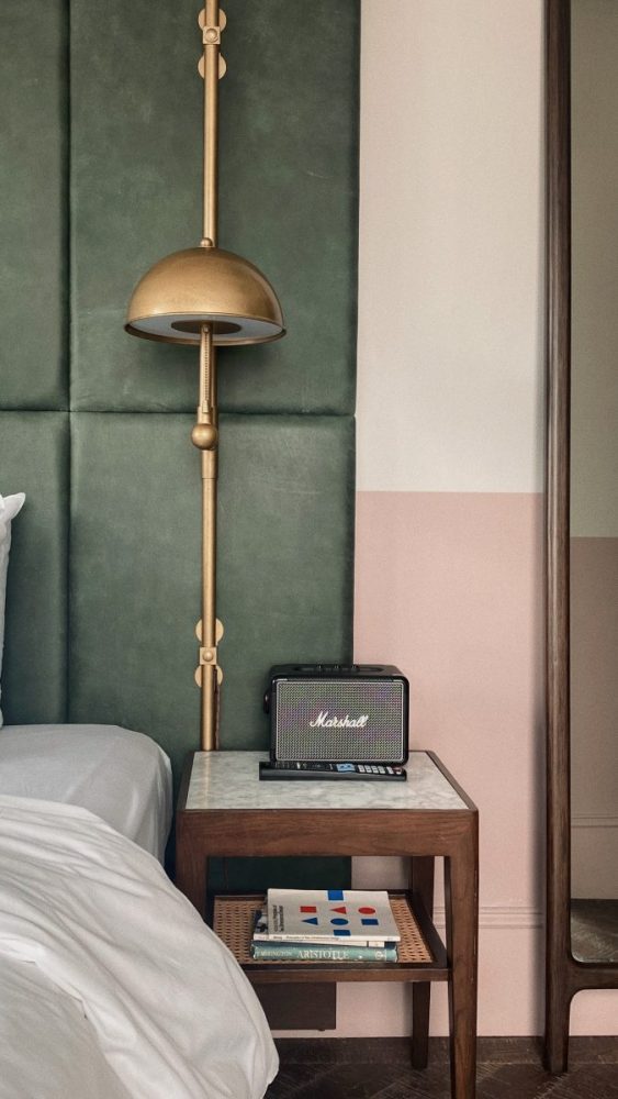
Benjamin Moore Forest Green 2047-10 paired with warm brass hardware creates serious drama without feeling heavy. The blue undertones keep it from reading too yellow, and brass fixtures reflect light beautifully against the dark walls.
This works best in bedrooms or dining nooks where you want intimate vibes. Skip this if your room faces north — it needs warm southern light to prevent cave-like feelings, and add plenty of white or cream textiles to balance the intensity.
2. Navy-Green Hybrid for Maximum Sophistication
Sherwin Williams Pewter Green SW 6208 is hands down my favorite on this list — it’s neither fully navy nor forest green but something more complex. This color reads as almost black in dim light but reveals rich green undertones in brighter moments.
Perfect for powder rooms or home offices where you can get away with bold choices. The only downside is it requires excellent lighting — invest in good sconces or you’ll regret how cave-like it feels in the evenings.
3. Sage Green That Actually Has Personality
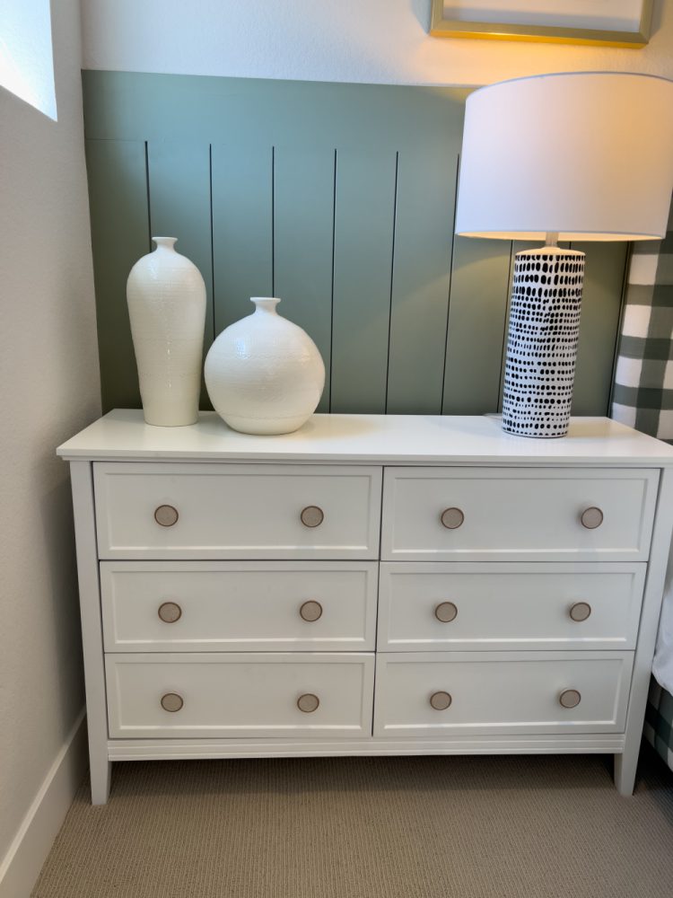
Clare Current Mood is sage green for people who think regular sage is boring — it has enough gray to feel sophisticated but enough green to make a statement. Unlike trendy Sherwin Williams Clary Sage, this one won’t look dated in five years.
Ideal for bedrooms or living rooms where you want calm energy without sacrificing style. Works especially well with natural wood tones and linen textures, though it can feel cold without warm accent colors.
4. Hunter Green for Vintage Masculinity
Benjamin Moore Hunter Green 2041-10 gives serious English library vibes — rich, sophisticated, and timeless. It pairs beautifully with dark wood furniture and leather accents for that vintage masculine aesthetic everyone’s trying to achieve.
Best for studies, bedrooms, or dining rooms where you want to feel cocooned. Fair warning: this color requires commitment and looks terrible with cool-toned metals — stick to brass, bronze, or warm wood finishes only.
5. Olive Green With Earthy Undertones
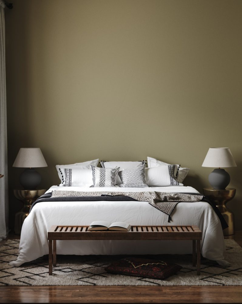
Sherwin Williams Olive Grove SW 7734 is the grown-up version of trendy olive green — less yellow, more sophisticated. It feels grounded and natural without screaming “Pinterest trend,” and it photographs beautifully in both natural and artificial light.
Works in almost any room but especially kitchens and living spaces. The earthy undertones play nicely with terracotta, cream, and natural materials, though it can feel muddy if you don’t have enough contrast in your furniture.
6. Dramatic Dark Green for Statement Walls
Benjamin Moore Dark Harbor CSP-720 is almost black with green undertones — perfect for creating a moody accent wall that doesn’t overwhelm the entire room. It’s sophisticated enough for grown-up spaces but dramatic enough to satisfy your Instagram aesthetic.
Use this on one wall only, preferably behind a bed or sofa. It requires excellent lighting and light-colored furniture to prevent the room from feeling like a dungeon — think white bedding and brass lighting for balance.
7. Muted Green With Gray Balance
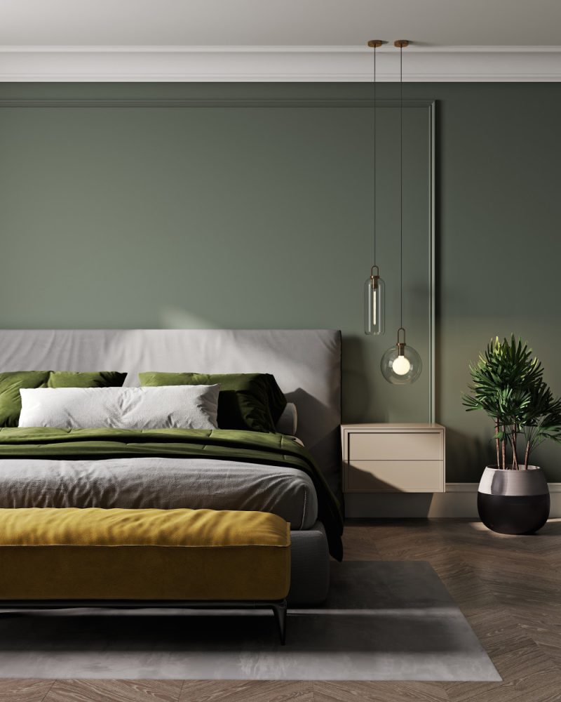
Farrow & Ball Green Smoke No. 47 has enough gray to feel sophisticated without being boring. It’s pricey at $110 per gallon, but the depth of color is unmatched — cheaper alternatives like Benjamin Moore Retreat AF-435 come close for half the price.
Perfect for living rooms or bedrooms where you want subtle drama. This color works with both warm and cool metals, making it easier to decorate around than more saturated greens.
8. Deep Sage for Cozy Minimalism
Benjamin Moore Saybrook Sage HC-114 is deeper than typical sage but lighter than forest green — it’s the goldilocks of moody greens. It feels calming without being boring and works beautifully with minimalist decor and natural textures.
Ideal for bedrooms or reading nooks where you want to feel relaxed. It pairs perfectly with white oak furniture and linen textiles, though it needs warm lighting to prevent feeling clinical.
9. Jewel-Toned Emerald for Luxury Vibes
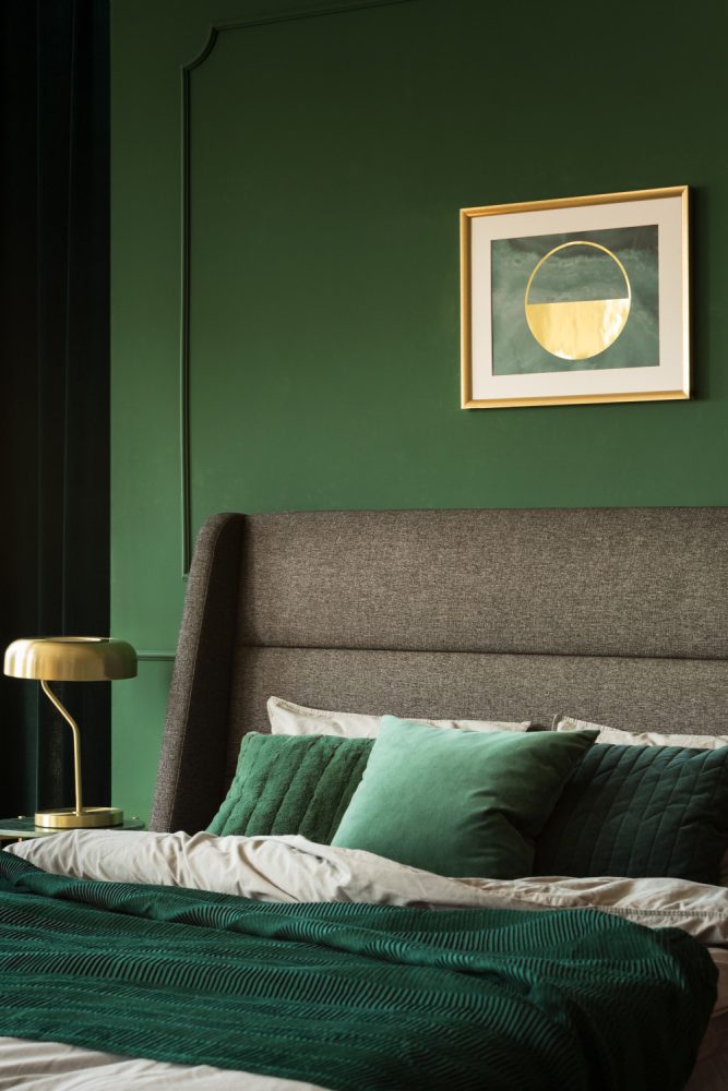
Sherwin Williams Emerald Isle SW 2039 is unapologetically bold — pure emerald green that makes small rooms feel like expensive hotel suites. It’s not for the color-shy, but when done right, it’s absolutely stunning with gold accents and rich fabrics.
Best in powder rooms or dining rooms where you can handle maximum drama. Skip this if you have kids or pets — it shows every fingerprint and scuff, requiring frequent touch-ups to maintain that luxury look.
10. Cottage Green for Timeless Appeal
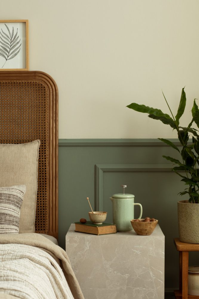
Magnolia Home Cottage Grove is Joanna Gaines’ go-to moody green — it has enough complexity to feel sophisticated but enough softness to work in family-friendly spaces. It’s navy-green hybrid that photographs beautifully and feels timeless rather than trendy.
Works in any room but especially shines in kitchens and living areas. The color is forgiving with different lighting conditions and pairs well with both modern and traditional furniture styles.
11. Smoky Green for Sophisticated Spaces

Benjamin Moore Cushing Green HC-125 has serious staying power — it’s been popular for decades because it works. The smoky undertones prevent it from feeling too fresh or spring-like, making it perfect for year-round appeal.
Excellent for home offices or libraries where you want to feel focused and calm. It works with both warm and cool color palettes, though it really sings when paired with warm wood tones and brass details.
12. Forest Green for Nature-Inspired Rooms
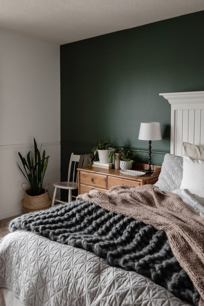
Behr Fig Tree (custom formula) creates that perfect forest-like feeling without being too literal about it. It has enough brown undertones to feel grounded and earthy, making it ideal for creating nature-inspired spaces that don’t feel themed.
Perfect for bedrooms or living rooms where you want to bring the outdoors in. Pair with natural wood furniture and plants for maximum impact, though it needs good natural light to prevent feeling too dark.
13. Muted Forest for Subtle Drama
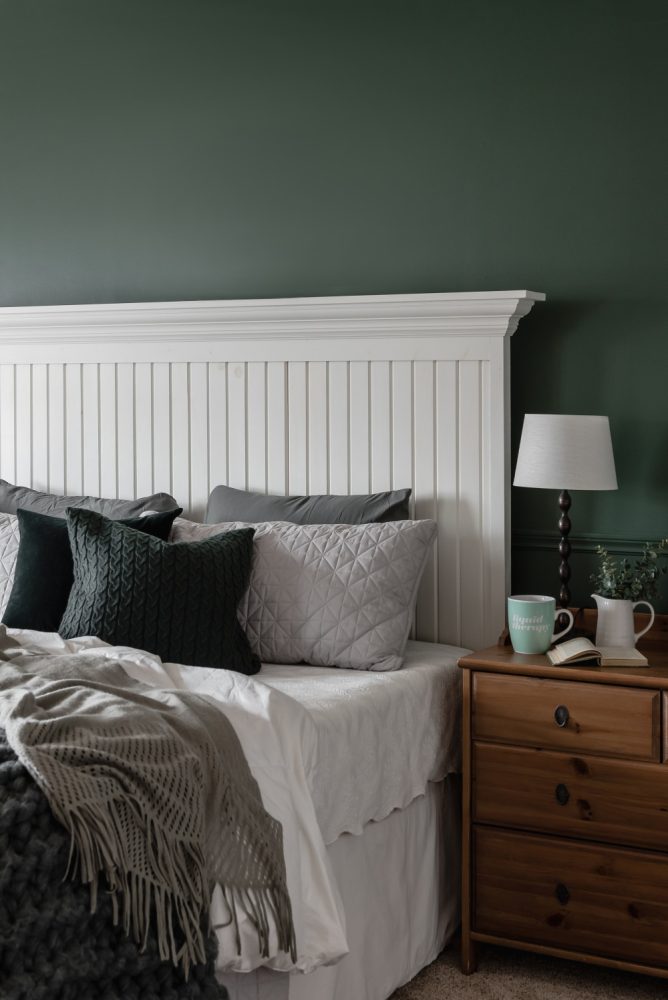
Sherwin Williams Rosemary SW 6187 is forest green’s sophisticated cousin — all the richness with more restraint. It’s complex enough to feel expensive but muted enough to work with colorful artwork and accessories.
Works beautifully in dining rooms or bedrooms where you want subtle sophistication. It’s easier to live with than bolder greens and works well with both vintage and modern furniture pieces.
14. Deep Sage for Modern Farmhouse
Benjamin Moore Backwoods 469 bridges the gap between sage and forest green — deeper than trendy sage but softer than traditional forest green. It feels modern and fresh while still having enough depth to create moody vibes.
Perfect for kitchens or family rooms where you want farmhouse appeal without the cliché factor. It pairs beautifully with shiplap and natural wood, though it works equally well with sleek modern fixtures.
15. Charcoal Green for Ultimate Sophistication
Sherwin Williams Jasper SW 6216 is practically black with the faintest green undertones — it’s for people who want maximum drama with subtle complexity. This color makes small rooms feel like expensive hotel suites when paired with the right lighting and accessories.
Best reserved for powder rooms or accent walls where you can handle serious intensity. It requires professional-grade lighting and light-colored furnishings to prevent feeling oppressive, but the payoff is pure luxury.
Making Moody Green Work in Tiny Spaces
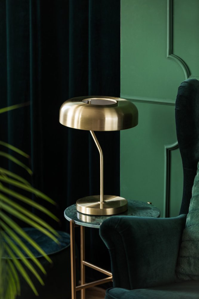
Light is everything with dark paint colors. Add table lamps, floor lamps, and wall sconces — overhead lighting alone will make moody green feel oppressive rather than luxurious.
Use mirrors strategically to bounce light around the room. A large mirror opposite a window doubles your natural light and creates the illusion of more space — I’ve seen 10×12 bedrooms feel twice as large with this trick.
Keep furniture light and low to the ground. White or cream upholstery prevents the room from feeling too heavy, while low-profile furniture maintains sight lines and makes ceilings appear higher.
Add white or cream trim and molding for contrast. Benjamin Moore White Dove OC-17 in semi-gloss creates crisp lines that define the space and prevent walls from feeling like they’re closing in on you.
What to Expect: Cost and Timeline Breakdown
Budget $250-400 for a small room (10×12). This includes premium paint ($80-110/gallon), primer ($45-60/gallon), supplies ($30), and professional painting if you hire out ($200-300 labor).
Plan for two coats minimum with dark colors. Moody greens require excellent coverage to look professional — cheap paint will look streaky and uneven, especially in small spaces where imperfections are more noticeable.
Timeline is 2-3 days for DIY or 1 day for professionals. Dark colors show brush marks and roller lines more easily, so take your time with application or hire someone experienced with bold colors.
Consider the resale impact in bedrooms and main living areas. Moody colors are polarizing — they’re perfect for powder rooms and home offices but might limit buyer appeal in master bedrooms or main living spaces.
Shopping List: Where to Buy Everything You Need
- Premium paint: Benjamin Moore from local dealers ($80-110/gallon) or Sherwin Williams ProClassic ($75-95/gallon) — avoid big box store paint for bold colors
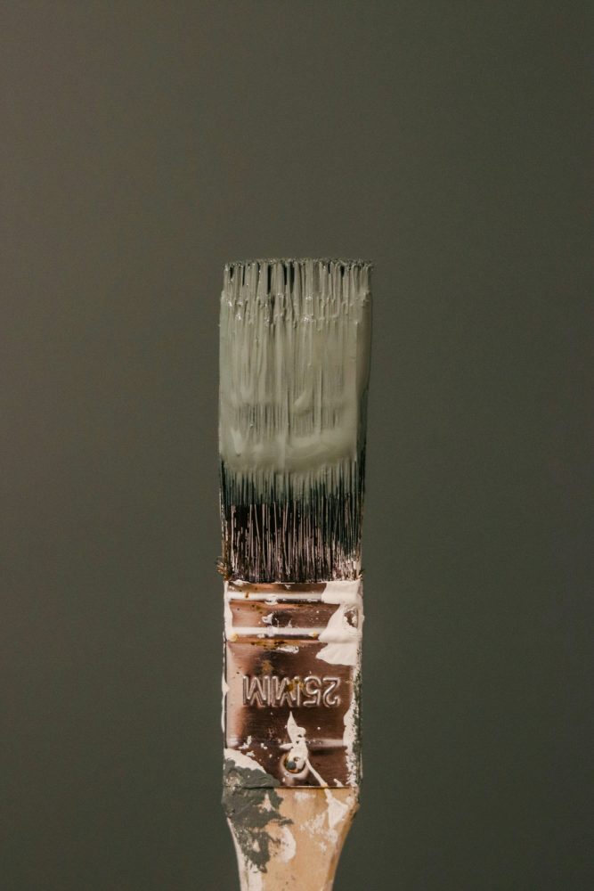
- Quality brushes and rollers: Purdy or Wooster brushes ($15-25 each) and microfiber rollers ($8-12) for smooth application without texture marks
- Lighting fixtures: West Elm brass sconces ($99-199), CB2 table lamps ($79-149), or Target’s Threshold brass collection ($39-89) for budget options
- Light-colored textiles: Pottery Barn white linen curtains ($79-129), IKEA cream throws ($19-39), or Anthropologie ivory pillows ($48-78) to balance dark walls
- Mirrors for light reflection: CB2 round brass mirrors ($199-299), IKEA large rectangular mirrors ($49-79), or vintage finds from Facebook Marketplace ($30-100)
Which Moody Green Are You Trying First?
The beauty of moody green paint is how it transforms ordinary small rooms into sophisticated retreats — just remember that lighting and contrast are your best friends. Start with one accent wall if you’re nervous, or go all-in if you’re ready for maximum impact.
I’d love to see how your space turns out — tag us when you share your before and after photos. Pin your favorites for later!