This post contains affiliate links and is a member of the Amazon Services LLC Associates Program. If you make a purchase using one of these affiliate or Amazon links, I may receive compensation at no extra cost to you.
17 Best Organic Modern Neutral Paint Colors In 2025

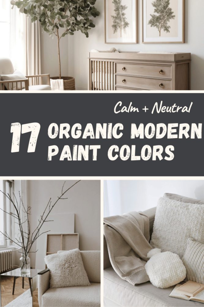
Not all neutrals are created equal—and if you’re going for an organic modern look, you want tones that feel grounded, not flat. Think soft earth tones, creamy off-whites, and warm grays that bring texture and depth without overwhelming the space. These are the colors that make white oak floors pop, boucle sofas feel extra plush, and plaster walls look like art.
Whether you’re repainting a whole home or just updating a hallway, these 19 organic modern neutral paint colors deliver that calm, curated vibe we always save on Pinterest—but in real life, they actually work.
What Makes a Neutral Feel “Organic Modern”?
The secret is in the undertone.
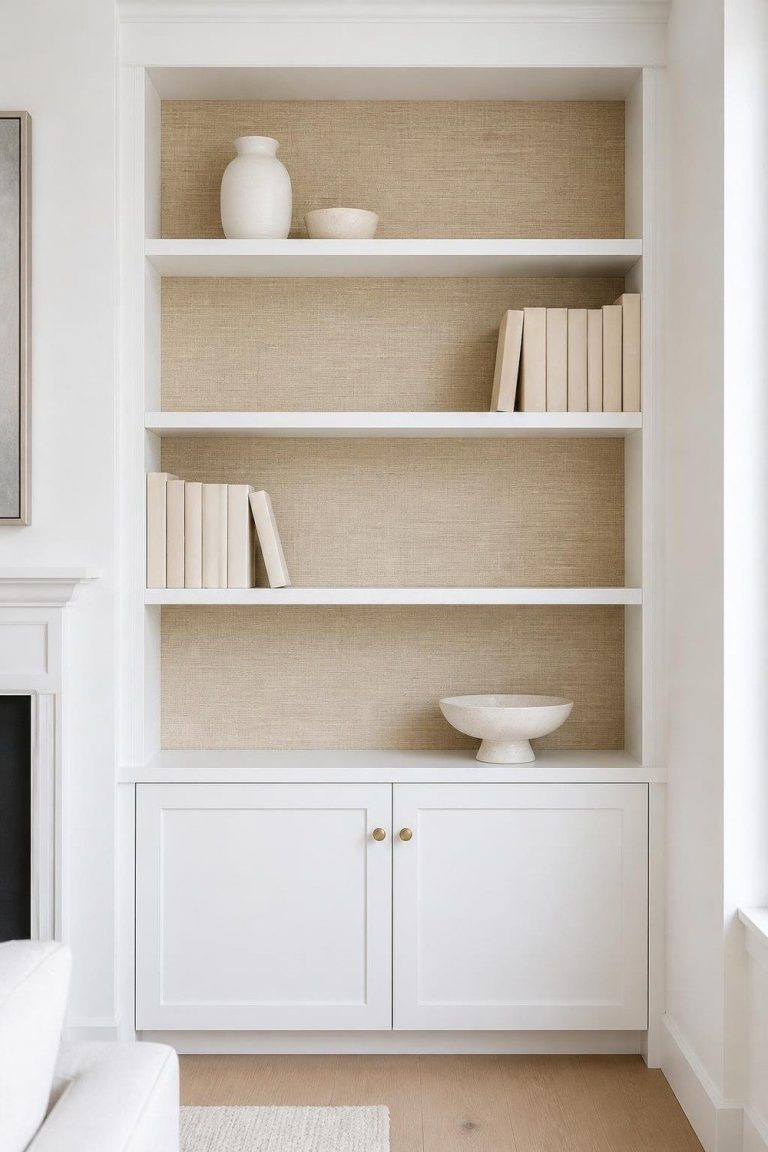
Organic modern spaces thrive on warmth, subtle contrast, and a lived-in sense of minimalism. You want neutrals that lean slightly warm, earthy, or sandy—not cold or sterile. Look for shades that pair beautifully with natural materials like linen, oak, leather, and stone. These are the colors that create depth without drama.
1. Swiss Coffee by Benjamin Moore
This is the go-to for a reason—it’s creamy, soft, and never stark.
We love how it shifts throughout the day, looking cozy in the morning and glowing by afternoon light.
It’s one of those off-whites that doesn’t wash out your furniture, but complements everything around it.
If you want an elevated gallery vibe without the chill, this one delivers.
RELATED: Timeless Organic Modern Color Palette Ideas
2. Shoji White by Sherwin-Williams
Shoji White has just enough beige to feel warm but still reads clean.
There’s a hint of gray underneath, which keeps it from leaning yellow or too traditional.
We’ve seen this shade bring so much softness to modern spaces—it’s especially good with pale wood or black accents.
Perfect for anyone who’s scared of white walls but still wants that light, neutral look.
3. Pale Oak by Benjamin Moore
This one is a warm greige that somehow goes with everything.
It plays well with both cool and warm tones, which makes it wildly versatile.
We love it in open floor plans where you want cohesion without feeling too matchy.
It has that barely-there sophistication that looks luxe without trying too hard.
4. White Duck by Sherwin-Williams
Don’t let the name fool you—this is far from a basic white.
It has a soft, muted warmth that feels like linen curtains or handmade ceramics.
There’s something very organic about it, especially in rooms with natural light.
We’ve seen it make even builder-grade trim feel intentional.
5. Wind’s Breath by Benjamin Moore
A soft, warm greige that feels like fog over a quiet field.
There’s just enough pigment here to add interest, but it still reads neutral.
It’s especially stunning in bedrooms or transitional spaces where you want calm without blandness.
Pair it with clay-colored textiles or black iron for that full organic modern contrast.
6. Edgecomb Gray by Benjamin Moore
This is a classic designer favorite for a reason.
It’s a light greige that feels earthy without being heavy—like taupe with a breath of fresh air.
It works beautifully in both modern and traditional spaces, which makes it ideal for layered styles.
We’ve seen this paired with rattan, cane, and stone textures and it always hits.
7. Accessible Beige by Sherwin-Williams
If beige is back, this is the one leading the comeback.
There’s a soft taupe-gray undertone that gives it a modern, grounded feel.
It feels fresh in rooms with a lot of natural light and doesn’t skew too yellow or pink.
Think earthy, not old-school.
8. Alabaster by Sherwin-Williams
Warm, creamy, and ridiculously versatile—this is white with soul.
We love how it softens harsh lines in ultra-modern spaces without compromising the clean look.
It’s a favorite for walls, trim, and even cabinetry in organic modern homes.
It plays beautifully with warm wood tones and textured fabrics.
9. Natural Cream by Benjamin Moore
There’s something about this soft neutral that feels calmly expensive.
It’s the perfect in-between of gray and beige, with a milky quality that adds depth.
In north-facing rooms, it holds its warmth and never looks dingy.
Pair it with sculptural lighting and minimalist décor for full effect.
10. Classic Gray by Benjamin Moore
Despite the name, it’s actually more of a warm off-white.
It’s subtle, almost like a whisper of color—but that’s exactly what makes it so chic.
We’ve seen this shade elevate small spaces, hallways, and even ceilings.
It’s a minimalist’s dream that doesn’t feel cold or flat.
11. Canvas Tan by Sherwin-Williams
This is a true beige, but with the softness turned way up.
It feels like a sun-washed clay pot or a sandy trail—very grounded, very natural.
We love it for rooms that get tons of light, where it brings warmth without overpowering.
It’s also gorgeous next to deep greens or charcoals.
12. Seapearl by Benjamin Moore
Muted, earthy, and effortlessly cool.
Seapearl walks the line between warm gray and creamy stone—it’s perfect for modern kitchens or open spaces.
There’s a natural mineral vibe to it that gives subtle texture to flat walls.
We especially love it with matte black fixtures and brushed brass hardware.
13. Aesthetic White by Sherwin-Williams
The name fits—it’s a neutral that feels designed, not default.
It leans beige, but softly, with just enough gray to make it feel intentional.
It’s one of those colors that doesn’t announce itself but quietly makes the whole room better.
Use it when you want your space to feel fresh but never trendy.
14. Balboa Mist by Benjamin Moore
Cooler than Pale Oak, but still warm enough for organic interiors.
Balboa Mist gives a refined softness to living rooms, entryways, and anywhere you want a little polish.
We love how it shifts subtly with changing light—always elegant, never stark.
It’s a go-to backdrop for curated spaces that lean minimal but cozy.
15. Oyster White by Sherwin-Williams
A super-soft warm white with serious staying power.
This one feels creamy and calm, like a sun-faded linen slipcover.
We’ve seen it used in both new builds and historic renovations—and it works in both.
It’s also beautiful with textured plaster or limewash accents.
16. Revere Pewter by Benjamin Moore
An old favorite that still works in the right context.
Revere Pewter leans a little moodier than the newer greiges, which can be a good thing in cozy spaces.
It has a classic, grounded quality that feels solid—especially with darker wood or black trim.
Use it when you want depth, but don’t want to fully commit to a dark neutral.
17. Simply White by Benjamin Moore
Bright, clean, and still somehow warm—this is a true white that doesn’t feel clinical.
It’s ideal for trim, ceilings, or even whole rooms if you’re going for contrast with natural textures.
There’s just a hint of softness to it, which keeps it from veering into stark territory.
We love it as a backdrop to bold ceramics, sculptural furniture, or organic art.
The Takeaway
Neutral doesn’t mean boring—not when you choose the right ones.
The best neutral paint colors for an organic modern look are all about balance: soft warmth, layered texture, and timeless tones that actually make your space feel lived in, not staged. Save your favorites, test big swatches, and let the light tell you which ones are meant for your space. Because when you get the right neutral on the wall, everything else just clicks.
PIN FOR LATER: