This post contains affiliate links and is a member of the Amazon Services LLC Associates Program. If you make a purchase using one of these affiliate or Amazon links, I may receive compensation at no extra cost to you.
19 Paint Colors That Make A Room Look Bigger (Without Going Full White)
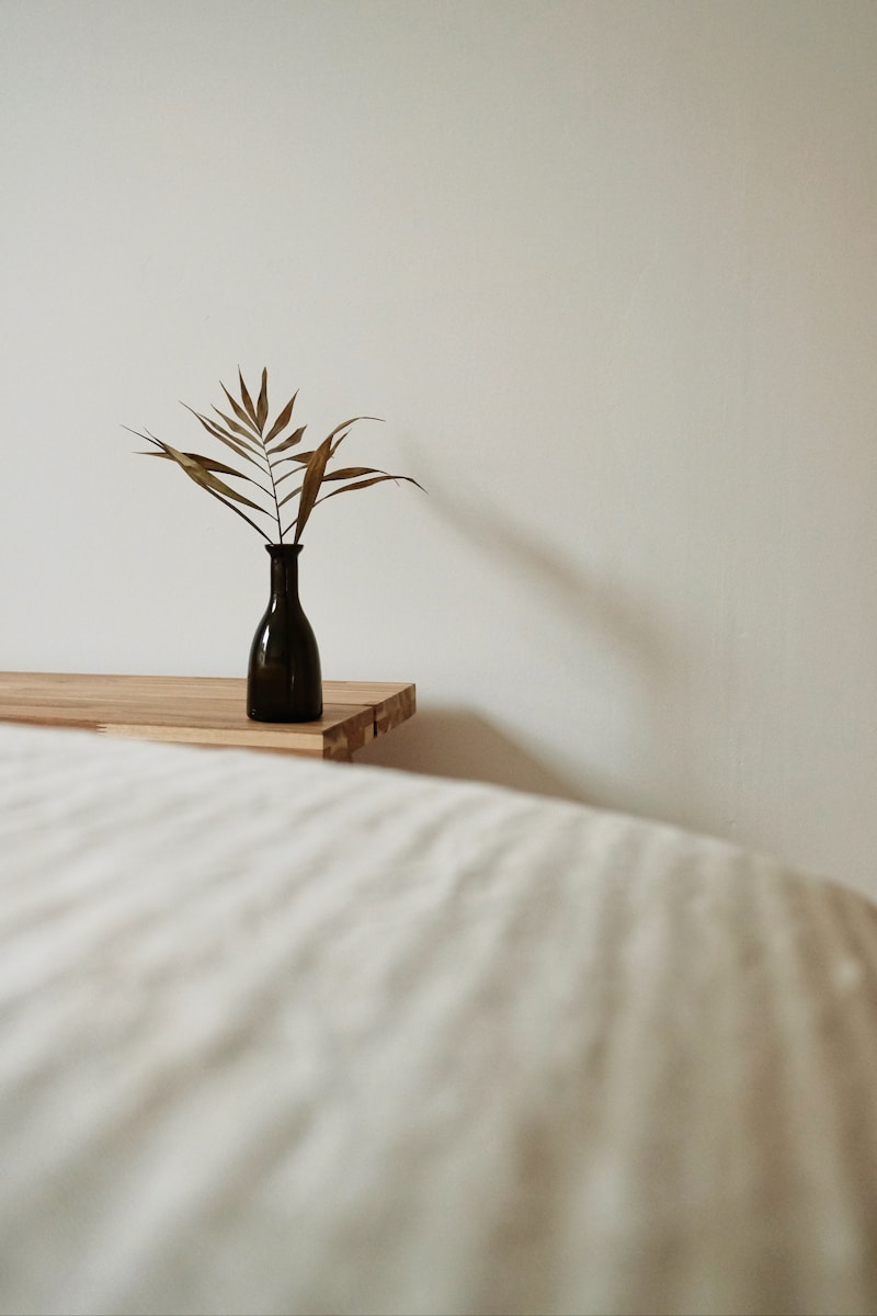
Let’s be honest—most of us aren’t living in open-plan lofts with 12-foot ceilings and endless natural light. But the right paint color? Total game-changer. The best paint colors that make a room look bigger don’t just “brighten things up”—they soften edges, reflect light, and add depth without stealing space.
This list is your cheat sheet to rooms that feel airier, calmer, and more put-together—even if you’re working with a 10×10 rental bedroom or a shadowy hallway. Some are crisp, some are cozy, but all of them do one thing really well: they open up a room without making it feel cold or forgettable.
What Makes a Color Expand a Room?

Think of paint like lighting—it shifts the mood, flattens or enhances edges, and can trick the eye into seeing more space than there actually is. Lighter tones reflect light better, but too much brightness can feel sterile. Soft neutrals, misty tones, and nuanced mid-tones often work better than stark white.
Look for undertones: a warm blush will soften a space, while a cool greige can push walls outward without flattening everything. And yes, darker tones can make a room look bigger—when used intentionally. It’s all about contrast, finish, and flow.
1. Pale Mushroom
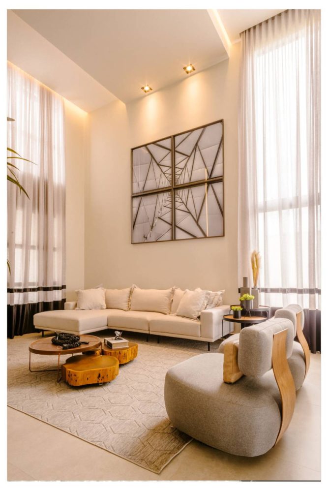
This is the quiet luxury of paint colors—subtle, soft, and a little unexpected.
It has the airiness of white but with a grounded warmth that makes rooms feel calm, not clinical.
We love it in small bedrooms where you want light, but also want to sleep.
Add soft linens and minimal contrast to lean into the cocoon effect.
RELATED: 17 Best Organic Modern Neutral Paint Colors In 2025
2. Dusty Lavender
A little bit moody, a little bit magical—this shade gives off light, but keeps things dreamy.
It plays surprisingly well with neutrals, like taupe or stone, and makes walls recede in a soft-focus kind of way.
Perfect for guest rooms or powder rooms that could use some personality without feeling cramped.
It also photographs beautifully, which we didn’t expect.
3. Classic Soft White
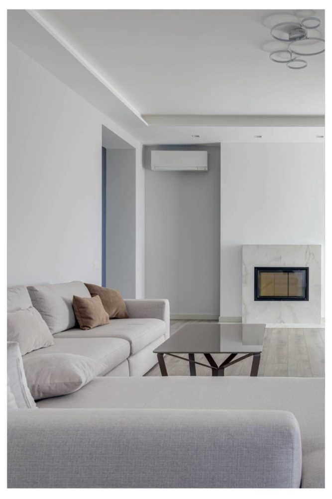
Let’s be clear—there is a right kind of white.
Look for one with just a whisper of warmth (think almond milk, not paper).
It bounces light around like crazy, but still feels inviting.
Use it with matte finishes for a more modern, less builder-basic effect.
4. Misty Blue-Gray
Cool without feeling cold, this is the color equivalent of a cloud with structure.
It opens up space with a touch of color, especially in rooms with limited daylight.
We love it in bathrooms or north-facing living rooms that need a little lift.
Bonus: it pairs well with chrome, marble, and all the cool-toned materials.
5. Pale Greige
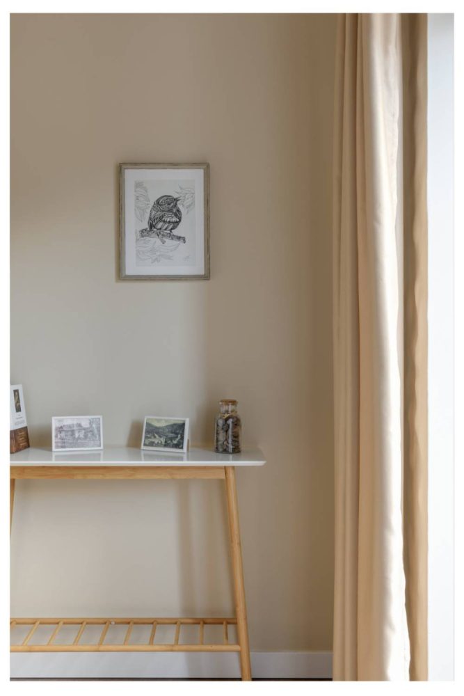
If you can’t decide between gray and beige—don’t. This neutral walks the line beautifully.
It softens hard edges and expands tight rooms without drawing attention to itself.
It’s especially good in open layouts where you want cohesion without everything looking the same.
Also a smart choice for hallways, since it works with every adjoining room.
6. Soft Sage
Green, but barely. This hint-of-herb tone brings in a whisper of color while still reading neutral.
It’s the kind of shade that makes small kitchens or offices feel fresh, not flat.
It also reflects natural light beautifully, especially against white trim.
If your space needs a subtle lift, this is a go-to.
7. Pale Peach
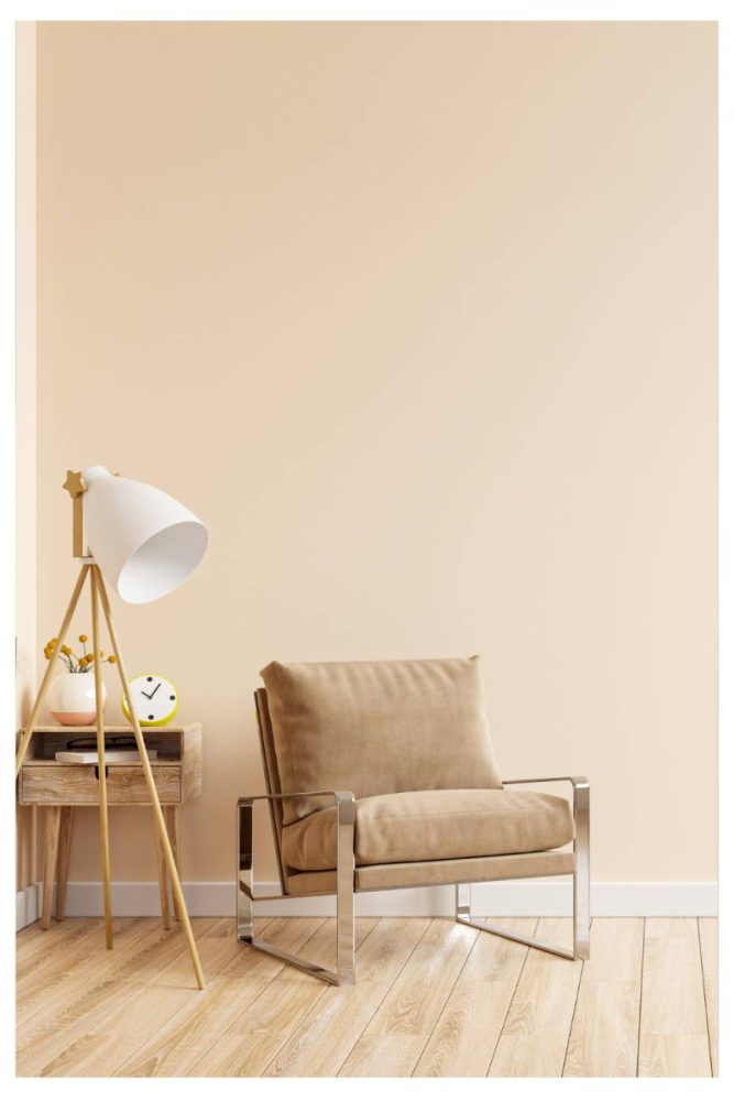
Hear us out—this is not the ‘80s peach you’re picturing.
Today’s version is ultra-sheer, like skin after a day in the sun.
It adds glow to dark rooms and warmth to sterile ones, without reading pink.
Try it in a breakfast nook or powder room and prepare to be surprised.
8. Soft Taupe
Like a good concealer, it blurs lines and unifies everything without stealing focus.
It makes walls feel further away, even in tighter spaces.
We especially love this in living rooms with layered textures—linen, wood, boucle.
Use it with low-contrast decor to keep the whole space feeling expansive.
9. Sky Blue
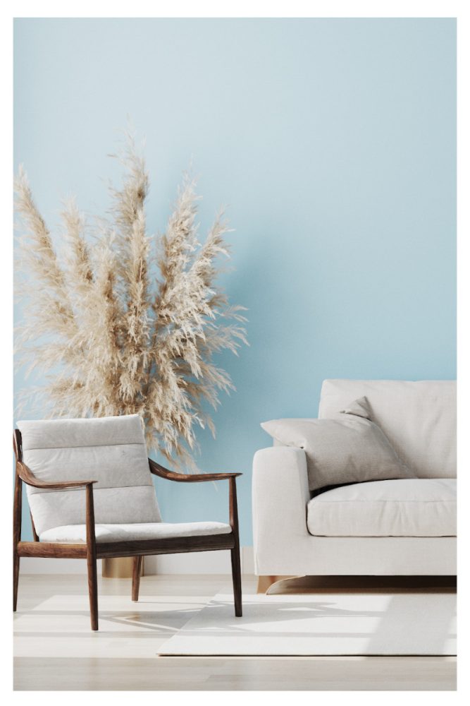
There’s something about this shade that lifts the ceiling and the mood.
It’s a natural light magnifier and works especially well in spaces with big windows.
We’ve seen it transform tight attic bedrooms into serene little retreats.
If you want soft color that still reads “airy,” this is a slam dunk.
10. Off-White with Gray Undertones
This is what you paint when pure white feels too bright, but beige feels too bland.
It has a subtle coolness that makes walls feel further away and corners less sharp.
Great for modern spaces, especially when paired with natural woods and black accents.
It’s also rental-friendly, but looks a lot more elevated than your standard “apartment eggshell.”
11. Blush Beige
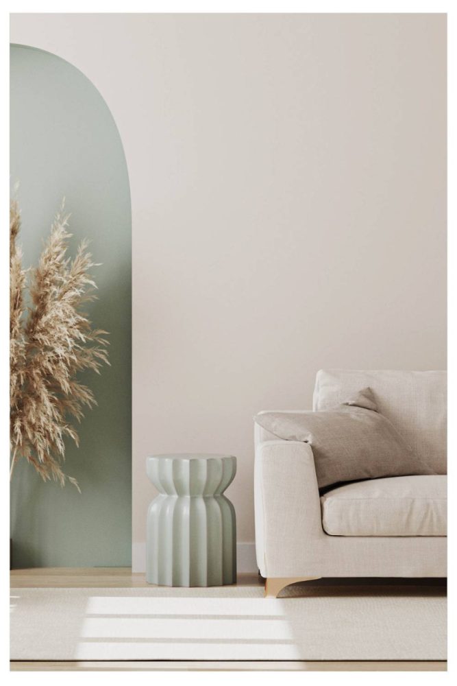
Somewhere between millennial pink and greige—and it works surprisingly well.
This shade brings in light, warmth, and softness all at once.
We love it in nurseries or small dining spaces where you want a cozy-but-chic vibe.
It feels fresh, not fussy, especially with minimal styling.
12. Cool Mint
Barely-there green with a breath of blue—cool mint is crisp, clean, and just different enough.
It makes tight bathrooms or entryways feel more open, almost like they’re exhaling.
Pair it with white or light wood tones to keep the palette breezy.
This is also one of those colors that looks more high-end than you’d expect.
13. Warm Ivory
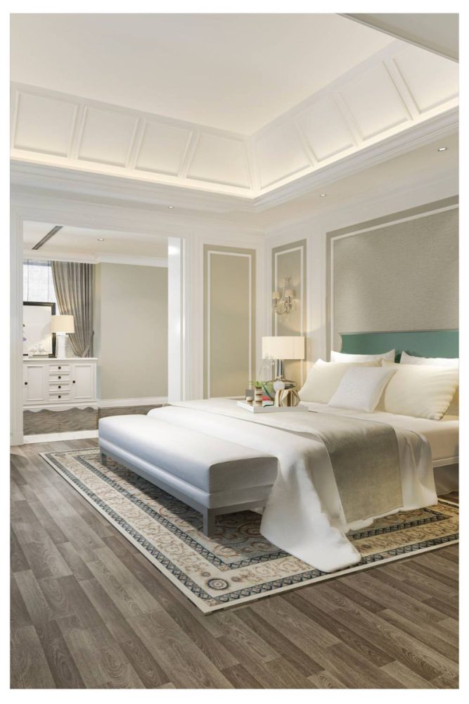
Think candlelight, not vanilla—this off-white has a soft, cozy glow.
It keeps small spaces feeling bright, but without the starkness of gallery white.
It’s especially lovely in bedrooms or home offices where you want a gentle warmth.
Try it with brass hardware or darker wood for contrast.
14. Soft Charcoal
Yes, dark can work—if the finish is matte and the rest of the room is low-clutter.
This moody tone makes the edges disappear, which can actually expand a room visually.
We like it best in bedrooms or dens where you want to lean into the intimacy.
Add in layered textures and soft lighting for maximum effect.
15. Barely Blue
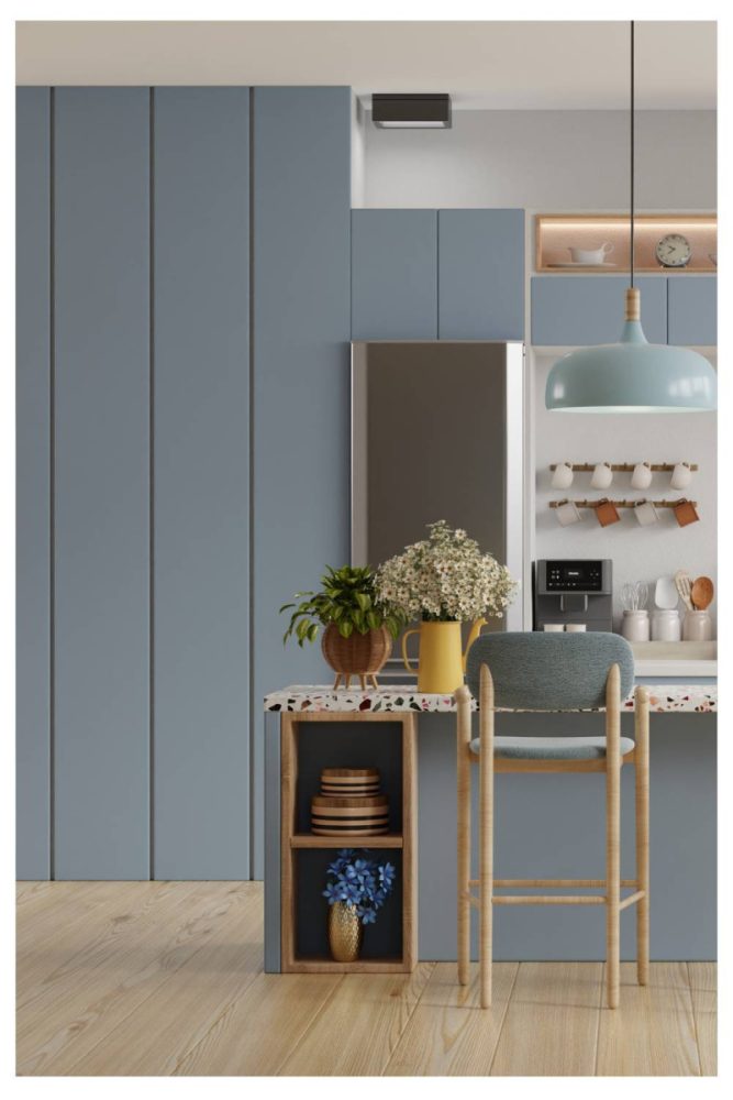
This one’s so subtle, you might miss it—but that’s the point.
It’s just enough cool tone to push the walls outward, but still reads like a neutral.
Great for ceilings, too, if you want that traditional “sky effect.”
It pairs well with white trim and coastal or cottage-inspired spaces.
16. Pale Putty
An architectural classic—understated, soft, and a little luxe.
This shade is like a chameleon, adapting to both warm and cool spaces.
It opens up small living rooms and hallways, especially with natural light.
Use it when you want quiet polish without going full minimalism.
17. Cloud White
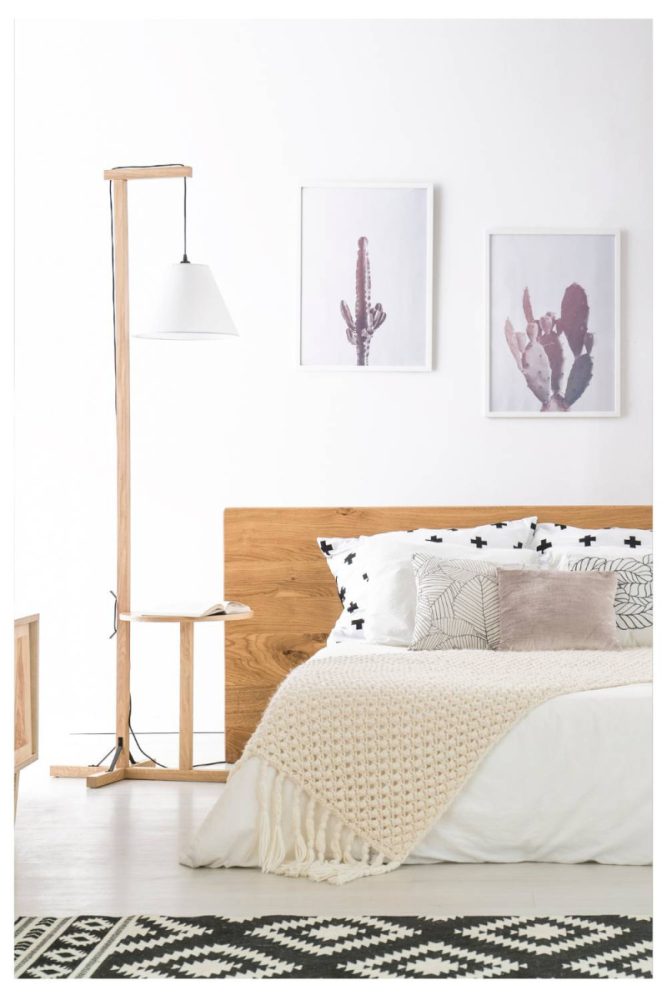
There are a million white paints, but Cloud White has a softness others don’t.
It’s creamy but not yellow, and reflects just enough light to make walls pull back.
We love it in kitchens or sunrooms where you want clean but not cold.
It also layers beautifully with both warm metals and cool stone.
18. Soft Lilac Gray
This might be the most underrated color for small rooms.
It looks gray at first glance, but has a lavender undertone that lifts the space.
Perfect for bedrooms or bathrooms where you want subtle charm without overt color.
Pair it with light wood or silver accents to keep it airy.
19. Pale Sand
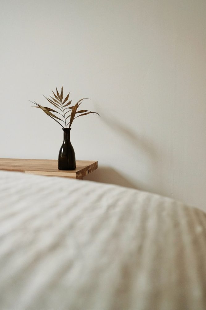
Sun-bleached and beachy, this color brings instant openness with a relaxed, lived-in feel.
It’s warmer than white but still incredibly light-reflective.
Try it in living rooms or dining areas that feel a little too shadowy.
Add texture (jute, rattan, soft linen) and the whole thing just glows.
It’s Not Just About “Light” Colors
The right paint color doesn’t just reflect light—it shapes it. The best shades for making a space look bigger have depth, softness, and a little bit of soul. Whether you go pale and misty or subtly warm, it’s the nuance that makes the magic happen.