
This post contains affiliate links and is a member of the Amazon Services LLC Associates Program. If you make a purchase using one of these affiliate or Amazon links, I may receive compensation at no extra cost to you.
17 Stunning Two Tone Board and Batten Wall Paint Ideas Worth Saving
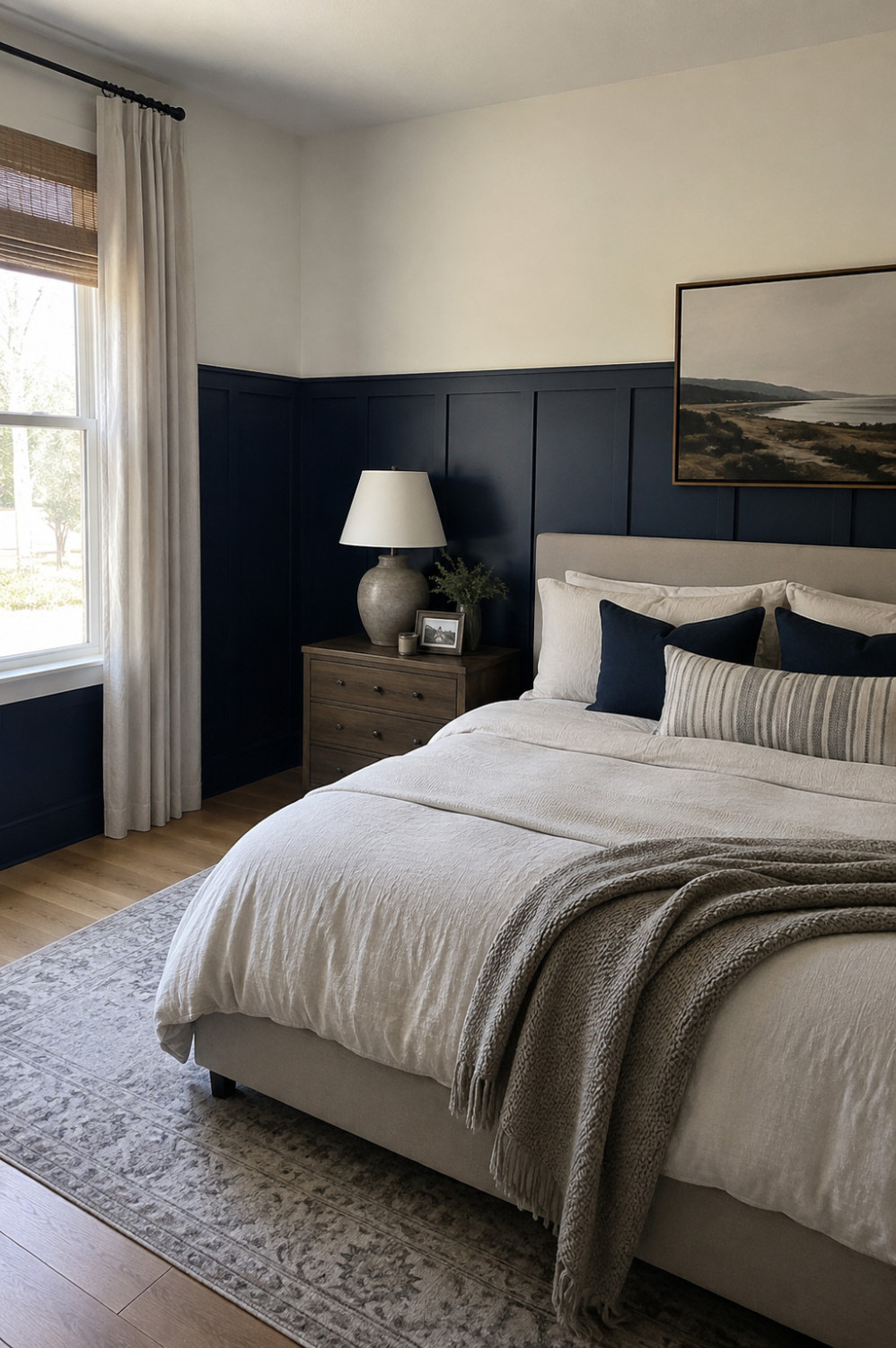
Two tone board and batten wall paint ideas are having a serious moment right now — and honestly, it’s not hard to see why. That crisp horizontal divide between a deep, moody lower panel and a lighter upper wall is one of the most architectural things you can do to a room without swinging a single sledgehammer. It’s the kind of detail that makes people walk in and say, “wait, did you do something to this room?” Yes. Yes, you did.
This post is full of real, specific color combinations for every room in your house — bedroom accent walls, entryways, living rooms, bathrooms, and more. You’ll find paint name suggestions you can take straight to the store, tips on where to stop the rail height so the proportions actually work, and ideas that range from soft and subtle to genuinely moody. No vague inspiration, just the stuff you need to actually make a decision.
One quick note before you scroll: two tone board and batten isn’t just a wainscoting treatment anymore. The half-wall approach is the classic, but designers are now running the paneling two-thirds up the wall, painting battens a contrasting color from the flat board behind them, or even reversing the whole thing and putting the dark color on top. There’s a lot of room to play here.
What Designers Are Saying
So where does the design world actually stand on two tone board and batten wall paint ideas in 2026? Pretty confidently, as it turns out — though the conversation has shifted. According to the Irish Examiner’s April 2026 design report, “shaker, board-and-batten grids are still trending” and the focus has moved toward more intentional, richer color choices rather than the white-on-white farmhouse look that dominated a few years ago. The piece notes that taking paneling “to the more definite colours trending in 2026” is the move for anyone who wants the treatment to feel current rather than dated.
On the color front, Homes & Gardens’ 2025 paint trend report quoted Andy Greenall of Paint & Paper Library saying that “both consumers and designers are turning to color combinations that add drama and intrigue to a space” — which maps perfectly onto the two tone approach. The shift away from single-color, all-white treatments toward deliberate color pairings with real contrast is exactly what’s driving the two tone board and batten trend forward. Designers aren’t abandoning the treatment; they’re making it more sophisticated.
1. Navy Lower Panel + Crisp White Upper Wall
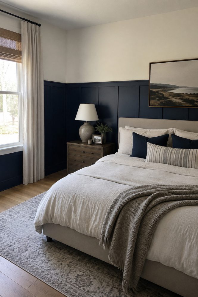
This is the pairing that basically started the two tone board and batten trend on Pinterest, and it’s still earning its keep. A deep navy — Benjamin Moore Hale Navy is the classic choice — on the paneled lower section reads incredibly rich against a clean white upper wall. The horizontal cap rail becomes a built-in piece of architecture, almost like a thick chalk line drawn around the room. It works especially well in hallways and dining rooms where you want drama without a full commitment to a dark room. The key is making sure your white isn’t too stark — go warm, like Simply White or Chantilly Lace, so the two halves feel intentional rather than competing.
Tip: Run the board and batten to two-thirds wall height instead of the standard chair-rail height for a much more modern, dramatic effect.
2. Sage Green Panels + Linen White Above for a Bedroom Accent Wall
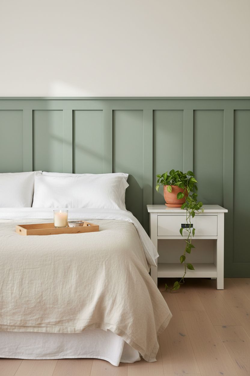
Sage green board and batten is basically the “new neutral” of the wall treatment world right now. When you pair a soft, muted sage — Sherwin-Williams Pewter Green or Behr Graceful Gray-Green are both worth sampling — with a warm linen or cream above, the whole thing reads incredibly serene. In a bedroom, it works behind the headboard as a built-in focal point that doesn’t scream for attention. The shadow play the battens create makes the green look like it shifts in natural light, which is part of why this combo photographs so well. It also happens to work with almost every wood tone from light oak to dark walnut.
Swap: If sage feels too safe, try Sherwin-Williams SW Pewter Green at full depth — it’s richer than it sounds and stunning in low light.
3. Warm White Battens Over a Darker Board Color (The Reverse Two Tone)
Most people assume two tone board and batten means the board and battens are one color, and the wall above is another. But there’s a third option that’s genuinely clever: paint the flat board one color and the battens a different, lighter shade on top of it. The batten strips become almost like architectural highlights, catching light differently than the recessed flat board behind them. Try a warm mushroom-brown flat board with Swiss Coffee battens, or a charcoal grey board with soft white battens. It’s subtle — you almost have to be standing in the room to fully see it — but the depth it creates feels genuinely custom-built rather than DIY weekend project.
Why it works: The shadow between the batten and the board reads as a third color, giving you more visual layering with just two paint colors.
4. Charcoal Gray Board and Batten with Soft White Above for a Moody Living Room
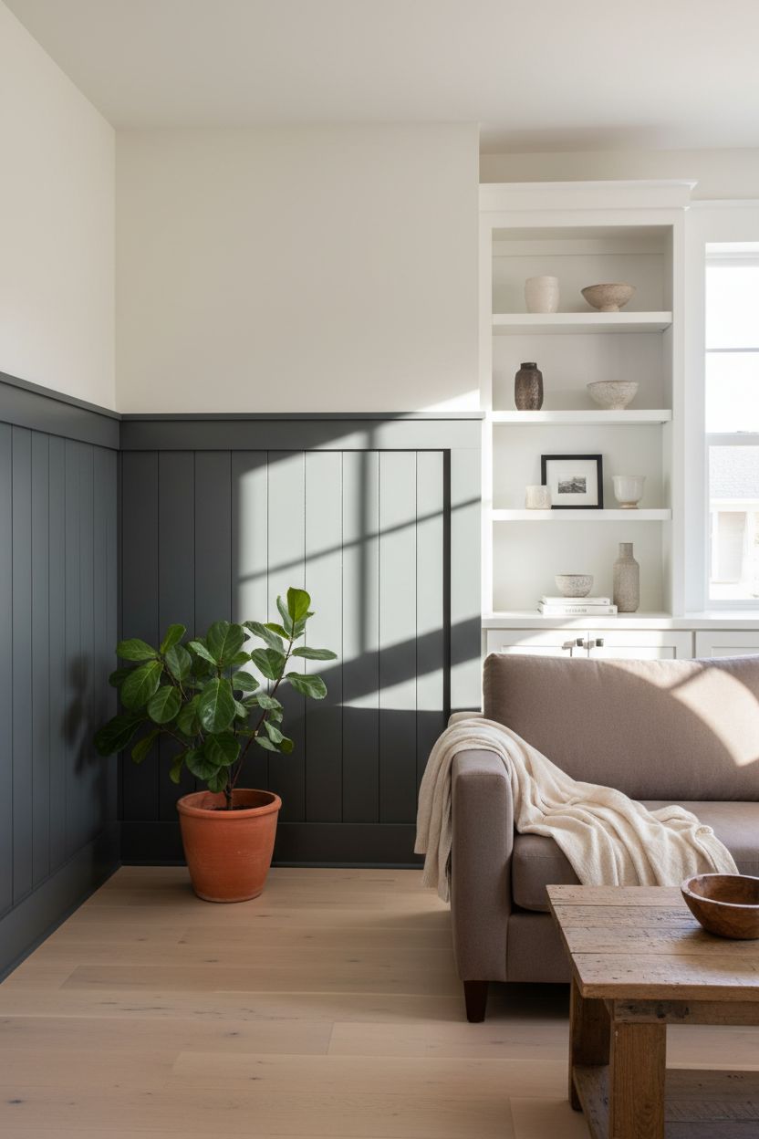
Charcoal gray paneling is bold and people sometimes chicken out on it, which is a mistake. A true moody charcoal — think Sherwin-Williams Peppercorn or Benjamin Moore Kendall Charcoal — on the lower board and batten section grounds a room in a way that feels expensive rather than heavy. Keep the upper wall soft, not bright white — an off-white with a slight warm undertone stops the whole thing from feeling like a graphic design project. This pairing is particularly striking in living rooms where you’ve got warm wood floors and natural linen furniture to balance the darkness. The battens catch light at a beautiful angle in the afternoons.
Tip: Matte finish on the dark panel hides imperfections and makes the color look deeper — save the eggshell for the upper wall only.
5. Blush Pink Lower Panel + White Upper Wall for an Entryway
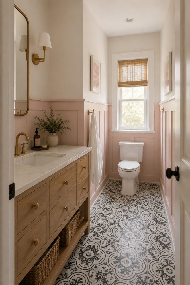
Before you roll your eyes at blush pink — hear me out. A muted, dusty blush (not bubblegum, not baby pink) on board and batten paneling in an entryway reads as sophisticated and genuinely warm. We’re talking something in the Benjamin Moore Pale Blush or Sherwin-Williams Romance territory. Paired with a crisp warm white above and brass hardware on hooks or a console, it photographs beautifully and makes guests feel immediately welcomed rather than interrogated by a stark white hallway. It works best in entries with natural light. A north-facing hallway might make it lean slightly lavender, so always sample first.
Swap: For a more editorial version, try Farrow & Ball Peignoir — it’s a cooler, smokier blush that reads almost as a neutral in certain lights.
6. Deep Teal Board and Batten + Fresh White Above for a Bathroom
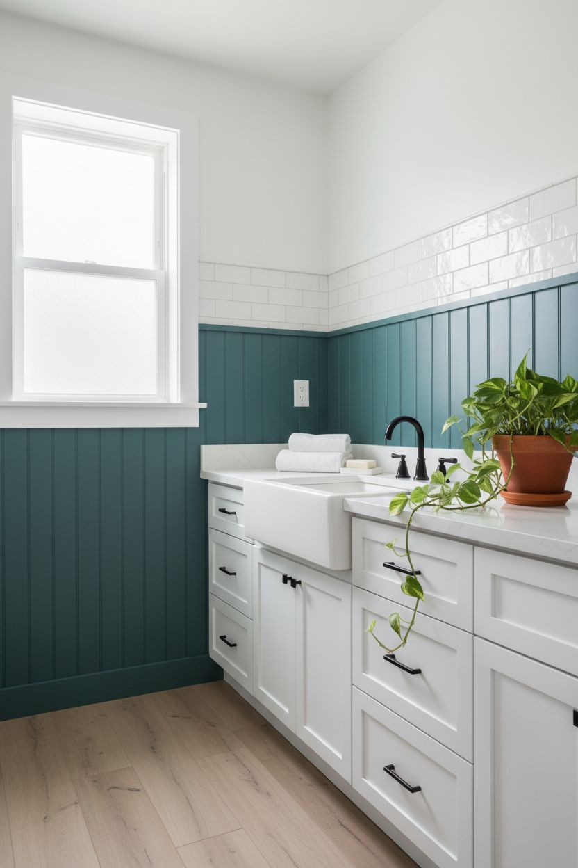
A deep, matte teal on bathroom board and batten is one of those combinations that people see in a magazine and immediately want in their own home. BEHR’s Dragonfly and Benjamin Moore Teal Ocean are both excellent in this space. The lower paneled section in a rich teal with a white upper wall and white subway tile creates so much visual interest that you need almost no art or decor to make the room feel complete. Moisture-resistant paint is non-negotiable here — standard interior flat paint will peel at the first steamy shower. Make sure everything below the cap rail gets at least a satin or semi-gloss sheen for durability.
Why it works: The strong color on the lower half makes a small bathroom feel anchored and intentional rather than cramped.
7. Soft Greige Lower Panel + Warm Cream Above for a Subtle, Whole-Room Look
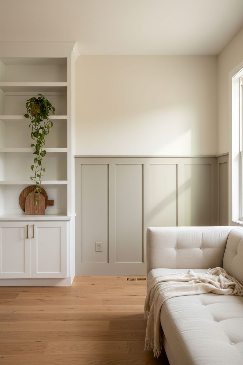
Not every two tone board and batten needs to be a statement. Sometimes the whole point is just to add texture and dimension without anyone being able to put their finger on exactly why the room feels more finished. A soft greige — Benjamin Moore Revere Pewter or Sherwin-Williams Accessible Beige — on the lower paneling paired with a warm cream above gives you that architectural layering without any drama. It’s ideal for living rooms where you want the furniture and art to do the talking. The battens’ shadow lines provide all the visual interest the wall needs, even in a low-contrast color scheme.
Tip: Match the undertones carefully — a greige with pink undertones will clash with a cream that pulls yellow. Always sample both on the actual wall together before committing.
8. Black Board and Batten Floor-to-Ceiling with a White Ceiling Break
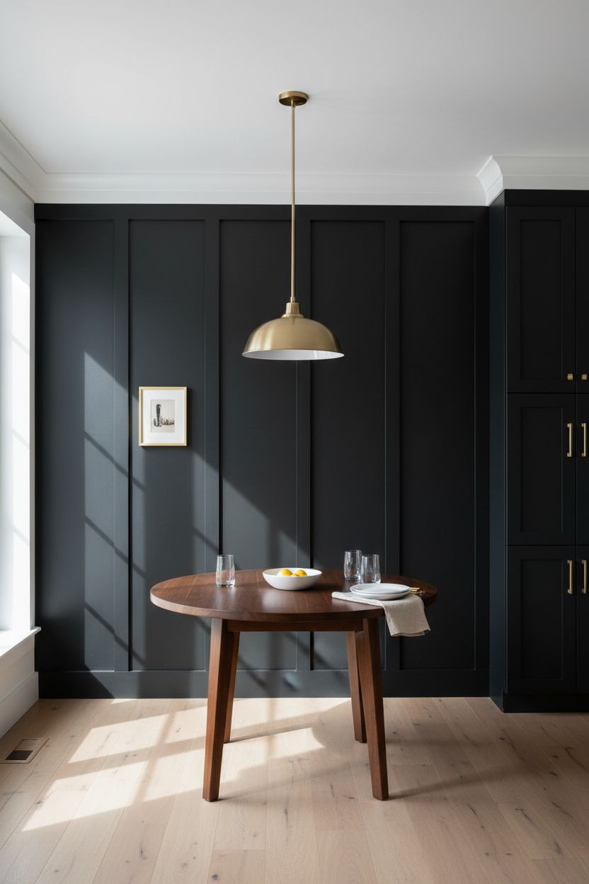
Full-height, floor-to-ceiling board and batten in matte black is a power move. Not for everyone, obviously — but in a dining room, home office, or bold entryway, the effect is genuinely stunning. The ceiling stays white, which creates an automatic visual cap and stops the room from feeling like a cave. Black battens over a black board means the shadow play is subtle and the overall effect reads as one deep, architectural surface. The room becomes a backdrop rather than the focus, which means art, furniture, and lighting get to shine. Natural wood elements — a table, floating shelves, a pendant — break the darkness and add warmth.
Why it works: The vertical lines draw the eye upward so aggressively that even a standard-height ceiling feels taller.
9. Olive Green Lower Panel + Off-White Above with a Picture Ledge at the Rail
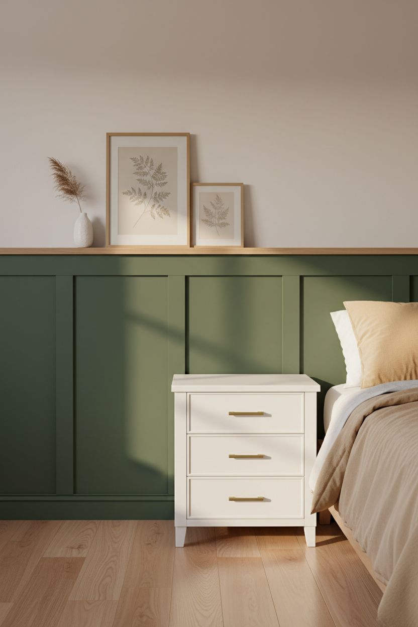
Adding a narrow picture ledge right at the cap rail is one of those functional details that earns its keep immediately. You can lean art, swap seasonal decor, and update the look without putting a single new hole in the wall. Pair that ledge with an olive green board and batten panel below — Sherwin-Williams Oakmoss or Benjamin Moore Rosemary work beautifully here — and a warm off-white above. The ledge becomes a display surface that visually belongs to neither zone, tying the two tones together. This setup works particularly well in dining rooms, bedrooms, and living rooms where you want a gallery-wall effect without the permanence.
Tip: Make the ledge at least 2.5 inches deep so frames don’t topple forward — a 1×3 board with a lip is the sweet spot.
10. Dusty Blue Panels + Warm White Above for a Coastal-Modern Bedroom
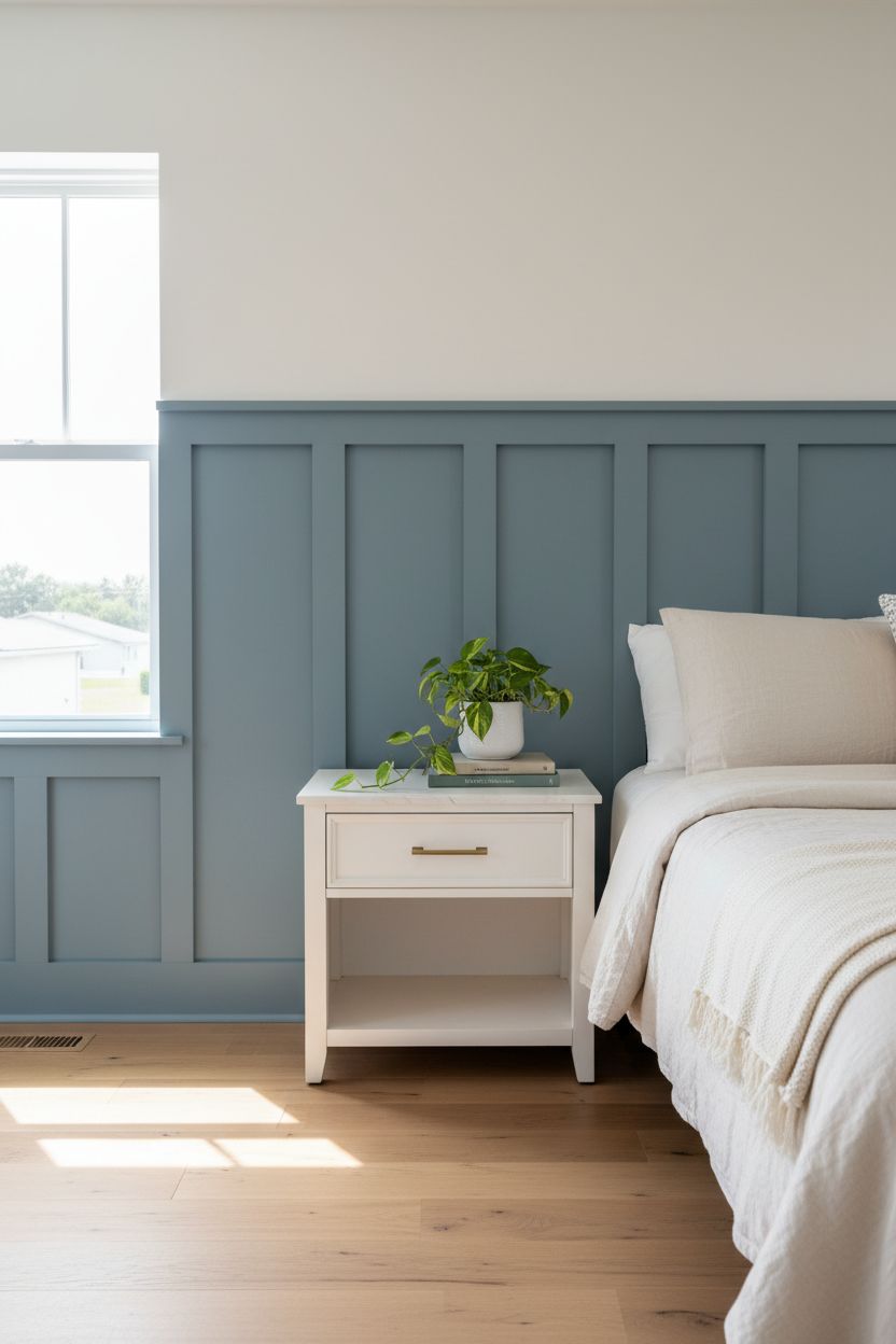
A muted, dusty blue — not bright or nautical, but something quieter, like Benjamin Moore Boothbay Gray or Sherwin-Williams Sleepy Blue — on the lower board and batten panel reads as both restful and refined in a bedroom. Against a warm white upper wall and warm wood floors, it has that coastal-modern quality without committing to anchor motifs or rattan everywhere. The two tone split at two-thirds wall height gives the room a layered, upholstered quality that feels more like a boutique hotel than a typical bedroom refresh. Pair with linen bedding and brushed brass hardware and you’re basically done decorating.
Why it works: Cool blue lowers your perceived heart rate in a space — there’s actual sleep-science reasoning behind choosing it for a bedroom wall.
11. Terracotta Lower Panel + Creamy White Above for a Warm, Earthy Living Room
Terracotta is one of those colors that feels deeply warm and grounding in a way that’s hard to replicate with any other hue. On board and batten paneling — try Benjamin Moore Adobe Dust or Sherwin-Williams Cavern Clay — it brings a rich, earthy quality that works particularly well in living rooms and dining areas. Against a creamy white above, it reads Mediterranean-adjacent without being kitschy. Lean into the warmth by adding natural materials: a jute rug, wooden furniture, woven baskets. The vertical batten lines temper the color’s earthiness with clean geometry, so the room never tips into “craft fair aesthetic.”
Swap: If terracotta feels too intense, try half the wall height instead of two-thirds — same warmth, less commitment.
12. Two Tone Board and Batten in a Kids’ Room: Muted Blue-Gray Below + White Above
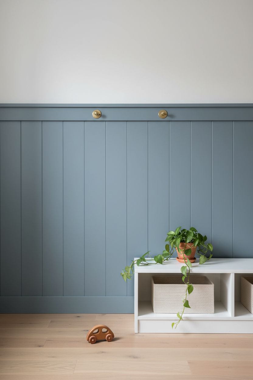
Kids’ rooms are actually the perfect testing ground for two tone board and batten because they’re spaces people repaint more frequently anyway. A muted blue-gray — Benjamin Moore Gray Owl or Sherwin-Williams Silver Strand — on the lower panel won’t read as babyish in two years the way a primary blue would. White above keeps the room bright. The batten wainscoting also has a purely practical benefit in a kid’s room: it protects the lower portion of the wall from scuffs, crayon marks, and the general chaos of childhood. Semi-gloss on the paneling is worth it here specifically for washability.
Why it works: The cap rail is the perfect height for hanging hooks or small shelves at a child’s eye level without drilling into drywall.
13. Hunter Green Lower Panel + White Above for a Bold Dining Room Statement
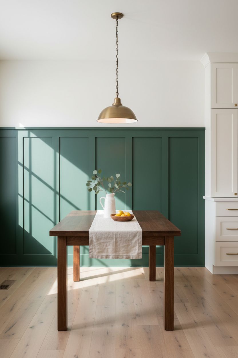
Dark hunter green on board and batten paneling in a dining room is one of the most confidently chosen things a person can do to their house. It’s rich, grounding, and looks spectacular in candlelight. Think Benjamin Moore Forest Green or Sherwin-Williams Hunt Club — deep, saturated, slightly moody. The white upper wall keeps the room from collapsing in on itself. The battens’ shadow lines become more pronounced with a darker color, which means the wall has genuine three-dimensionality even in photographs. Gold or aged brass light fixtures and hardware are the obvious companion — they glow against dark green in a way that feels genuinely luxurious.
Tip: In a dining room, run the board and batten all the way to the top rail at picture-molding height rather than chair-rail height — it makes the room feel like a proper dining room, not a hallway.
14. Cream-on-Cream Two Tone: Warm White Battens + Slightly Deeper Cream Background Above
The tonal two tone approach — where both colors are versions of the same hue rather than contrasting shades — is the most underrated option on this list. Paint the lower board and batten section a deeper warm cream or antique white, and the upper wall a slightly lighter shade of the same family. Benjamin Moore White Sand below and White Dove above, for example. The battens essentially disappear into the wall as a textural element rather than a color element. It reads beautifully in rooms with a lot of natural light and it photographs exceptionally well because the shadow lines become the star rather than the paint color. Quiet, layered, genuinely chic.
Why it works: In a room with strong furniture and art, a tonal two tone wall adds architectural weight without fighting for visual attention.
15. Midnight Blue Full-Wall Board and Batten with a White Chair Rail Break for a Home Office
A home office can handle more drama than any other room in the house because you’re not trying to relax there — you’re trying to focus. Full-wall board and batten in a deep midnight blue, like Benjamin Moore Hale Navy or Sherwin-Williams Naval, gives the space a serious, intentional quality that cheap furniture and white walls can’t fake. The white cap rail acts as a visual break so the color doesn’t swallow the room. Keep the ceiling white and the floor warm — light oak or warm wood tones are the counterweight to the dark walls. Built-in shelving in white against the dark panel looks custom and deliberate, even if it’s just IKEA.
Tip: Semi-gloss on the battens catches the light of a desk lamp beautifully in the evenings — matte will absorb it and the room will read darker than it needs to.
16. Warm Greige Battens Over a Darker Chocolate Brown Board for a Layered Mudroom
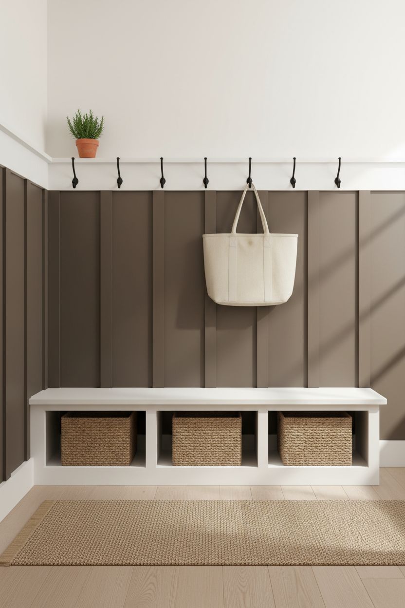
A mudroom can handle dark and durable in a way no other room can, and it needs to. Deep chocolate brown — Benjamin Moore Dark Chocolate or Sherwin-Williams Kona — on the flat board behind lighter greige battens gives the space a layered, intentional richness that hides actual dirt between deep cleanings. The battens in a lighter warm greige pop off the dark background and create that reverse two tone effect. This room is functional first, and the dark lower panel is your friend when it comes to scuff marks and boot prints. Gloss finish on everything below the cap rail for easy wipe-down.
Why it works: A dark, rich lower panel in a high-traffic room is smarter than white — it stays looking clean longer and actually is easier to maintain.
17. Limewash Finish on the Lower Board and Batten Panel + Smooth White Above
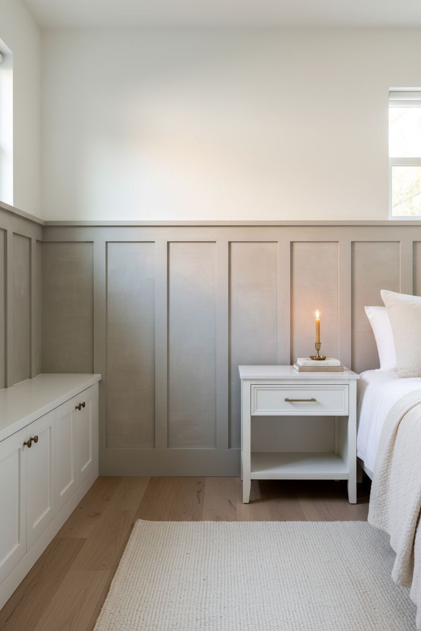
This one is for the person who wants two tone board and batten but also wants texture that goes beyond paint. Applying a limewash finish to the lower paneled section instead of a flat paint color adds a cloudy, aged, slightly uneven quality that makes the whole wall feel genuinely old in the best possible way. Above the cap rail, a smooth, flat white keeps it from looking like an accident. The contrast between the textured lower panel and the clean flat upper wall is visually sophisticated because the shift isn’t just tonal — it’s also textural. It works particularly well in dining rooms, bedrooms, and any space with warm natural light.
Swap: Portola Paints’ Roman Clay is a limewash-adjacent product with better consistency for DIY — it’s more forgiving than traditional lime-slaked paint if you’re new to the technique.
Frequently Asked Questions
What height should two tone board and batten be on a standard wall?
Two tone board and batten walls are most commonly installed at one of three heights: chair-rail height (around 36 inches), half-wall height (48–54 inches), or two-thirds wall height (roughly 60–72 inches on a 9-foot wall). The two-thirds height is the most current and design-forward option right now. Avoid stopping the paneling at exactly 48 inches from the floor — that’s where residential light switch plates typically land, and you’ll end up with an awkward detail to work around.
Do the battens and the flat board behind them have to be the same color in a two tone design?
Two tone board and batten paint ideas don’t require the battens and the flat board to match — that’s actually one of the more interesting directions you can take the treatment. Painting the battens a lighter shade than the flat board behind them creates a subtle dimensional contrast that adds visual depth. The reverse also works: a lighter board with slightly darker battens draws the eye to the vertical lines themselves. Most standard two tone designs do paint the entire paneled section one color and the upper wall a second, but neither approach is more “correct.”
What paint finish should I use on the board and batten lower panel vs. the upper wall?
The lower board and batten section should always get at least a satin finish, and semi-gloss is a smart choice in high-traffic rooms like entryways, mudrooms, and bathrooms. The upper wall can be flat or eggshell — it depends on how much traffic and moisture that area sees. Never use flat paint on the paneled section; it won’t hold up to cleaning and will look worn quickly. The slight sheen difference between a satin lower panel and a flat upper wall is actually a nice detail that reinforces the two tone division.
Can you do two tone board and batten in a small room without it feeling cramped?
Two tone board and batten can absolutely work in small rooms — the vertical batten lines draw the eye upward, which tends to make ceilings read as higher and the room as larger. The key is to avoid going too dark on the lower panel in a room with very little natural light, since deep colors in north-facing spaces can make them feel compressed. A lighter, more tonal two tone approach — where the two colors are close in value — is the safer choice for very small or poorly lit rooms. The paneling itself adds dimension and interest that a flat painted wall simply can’t replicate.
Is board and batten still trending in 2026, or is it on its way out?
Board and batten is still solidly in play in 2026, though the aesthetic has matured. The all-white farmhouse version has lost some steam, but two tone board and batten with richer, more saturated color combinations is very much current. The treatment has earned staying power because it adds genuine architectural character to a room rather than just surface decoration. Think of it like crown molding — it cycles in and out of peak trendiness, but rooms with it always look more finished than rooms without it.


