This post contains affiliate links and is a member of the Amazon Services LLC Associates Program. If you make a purchase using one of these affiliate or Amazon links, I may receive compensation at no extra cost to you.
10 Best Moody Green Paint Colors to Transform Your Space

You know that moment when you’re standing in front of a wall of paint swatches, overwhelmed by choices? Yeah, I’ve been there. And if you’re anything like me, you want a green that’s more than just “green.” You want something rich, dramatic, and sophisticated—something with depth.
That’s where moody greens come in. These shades bring a luxurious, natural feel to any space, whether you’re going for cozy and cocooning or bold and dramatic. I’ve rounded up 10 of the best moody green paint colors that designers (and homeowners) swear by.
1. Vintage Vogue by Benjamin Moore
If I had to describe Vintage Vogue in one word, it would be: classic. This deep, smoky green has an old-world charm that feels both elegant and grounding. It’s not quite olive, not quite forest green—it’s somewhere in between, making it incredibly versatile.
I once recommended this color for a home office, and when paired with dark wood furniture and antique brass accents, it felt like a private, vintage library straight out of a novel. It’s also stunning on kitchen cabinets or as an accent wall in a bedroom for a moody, sophisticated retreat.
🖌 Best for: Studies, libraries, cabinetry, or anywhere you want a timeless, deep green.
🎨 Pairs well with: Warm neutrals like beige, soft whites, and deep browns.
2. Green Smoke By Farrow & Ball
Green Smoke is no ordinary green. It’s deep, moody, and has this incredible smoky undertone that shifts between earthy olive and muted teal, depending on the light.
A friend of mine used it in her study, and it felt rich and cocooning during the day but had this soft, almost velvety depth at night. If you love a green that’s both bold and understated, this is the one.
🖌 Best for: Cozy living rooms, dramatic kitchens, or moody bedrooms.
🎨 Pairs well with: Warm whites, deep charcoals, and aged brass.
3. Backwoods by Benjamin Moore
If you’ve ever wanted to bring the feel of a forest into your home, Backwoods is the perfect shade. It’s a deep, warm green that reminds me of standing under towering trees just after a rainstorm.
I painted a client’s dining room in this color, and paired with candlelight and a dark wood table, it created the most intimate, woodland-inspired setting. It also works beautifully in kitchens if you want to add earthy depth to your cabinetry.
🖌 Best for: Dining rooms, kitchens, or cozy bedrooms.
🎨 Pairs well with: Warm whites, natural wood tones, and brass accents.
4. Bancha by Farrow & Ball
Inspired by Japanese green tea leaves, Bancha is a stunning olive green with an earthy richness. It has a very calming, zen-like feel, making it perfect for bedrooms or meditation spaces.
One of my favorite applications? Kitchen cabinets! Paired with brass hardware and creamy countertops, it feels elevated yet organic—like a modern farmhouse with a twist. If you want something bold but not overwhelming, this is your color.
🖌 Best for: Kitchens, bathrooms, or serene bedroom spaces.
🎨 Pairs well with: Soft pinks, muted golds, and crisp white trim.
5. Hunter Green by Benjamin Moore
Hunter Green is one of those iconic, never-goes-out-of-style colors. It’s deep, dramatic, and incredibly luxurious, making it a go-to for designers looking to add a rich, moody atmosphere.
I once saw this used in a home library with built-in bookshelves, and let me tell you—it felt like stepping into an old-world reading retreat. It also works beautifully for kitchen cabinets, giving them a classic yet modern feel.
🖌 Best for: Libraries, living rooms, and kitchen cabinets.
🎨 Pairs well with: Deep wood stains, brass, and off-whites.
6. Salamander by Benjamin Moore
Want a green that’s so dark it’s almost black? Salamander is the answer. It’s sophisticated, moody, and makes an incredible statement, whether on walls, trim, or even ceilings.
I used this in a client’s bedroom with deep emerald velvet curtains and gold sconces, and the effect was nothing short of luxurious. If you love a bold, moody aesthetic, this one’s for you.
🖌 Best for: Bedrooms, powder rooms, or dramatic accent walls.
🎨 Pairs well with: Gold, dark wood, and deep jewel tones.
7. Ripe Olive by Sherwin-Williams
As the name suggests, Ripe Olive is a luscious, rich green that leans slightly warm. It’s not as deep as forest green, but not as muted as olive, making it a great in-between shade.
I love this color for bathroom vanities and entryways, especially when paired with bold black-and-white tile flooring. It’s one of those shades that makes a room feel elevated but still cozy.
🖌 Best for: Entryways, bathroom vanities, or cozy living spaces.
🎨 Pairs well with: Warm neutrals, soft grays, and deep reds.
8. Mountain Olive by Behr
For a muted, earthy green that feels both vintage and modern, Mountain Olive is a fantastic choice. It’s subtle but has just enough depth to feel sophisticated and moody.
I saw this in a Parisian-style apartment with black-and-white art and vintage furniture, and it felt like something out of a magazine. It’s also gorgeous for kitchen islands!
🖌 Best for: Kitchen islands, cozy dens, or vintage-inspired spaces.
🎨 Pairs well with: Black, soft creams, and antique brass.
9. Pigeon by Farrow & Ball
If you’re looking for a soft, moody green with a hint of gray, Pigeon is an absolute winner. It’s subtle yet rich, shifting between green, gray, and even blue depending on the light.
I once saw this shade in a historic English cottage, covering built-in bookshelves and kitchen cabinets, and it looked incredibly chic. It’s the kind of color that adds moodiness without feeling too dark—perfect if you want something sophisticated but not overpowering.
🖌 Best for: Kitchens, built-ins, and cozy living spaces.
🎨 Pairs well with: Soft whites, muted blues, and natural wood tones.
10. Essex Green by Benjamin Moore
For the ultimate deep, moody green, Essex Green is a designer favorite. It’s so dark it almost reads black in certain lights, but it has just enough green undertone to keep it rich and inviting.
Use this on kitchen cabinets, exterior doors, or even trim for a bold, modern edge.
🖌 Best for: Exterior doors, kitchen cabinetry, or bold trim work.
🎨 Pairs well with: Creamy whites, deep blues, and warm gold accents.
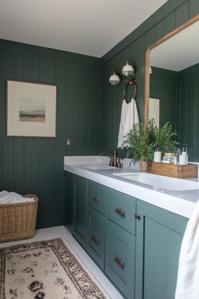
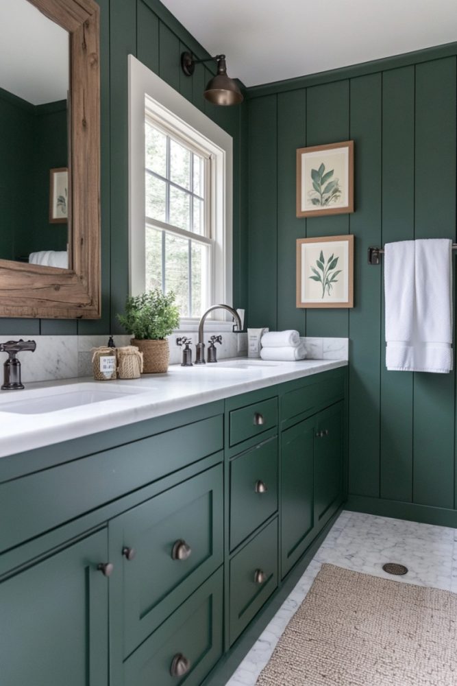
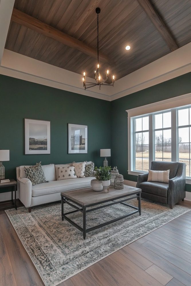
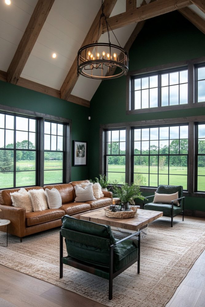
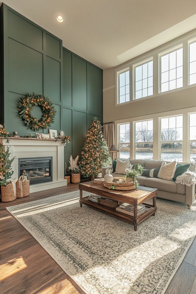
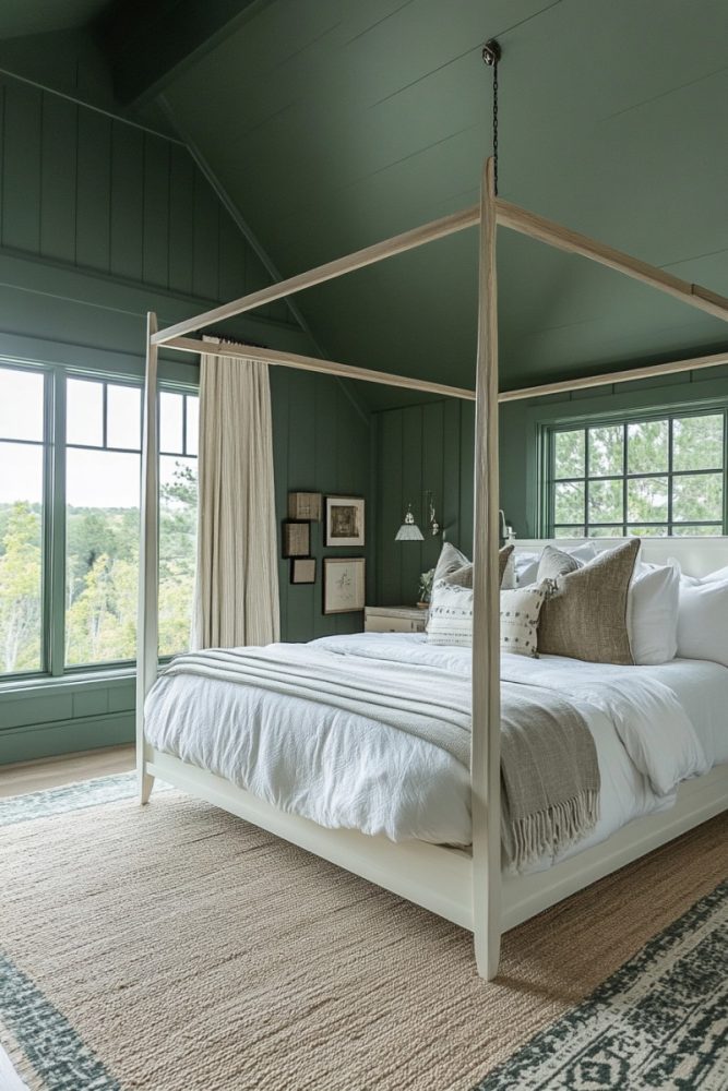
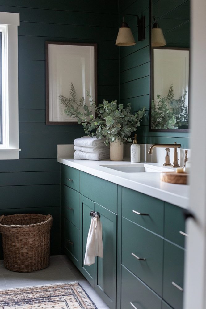
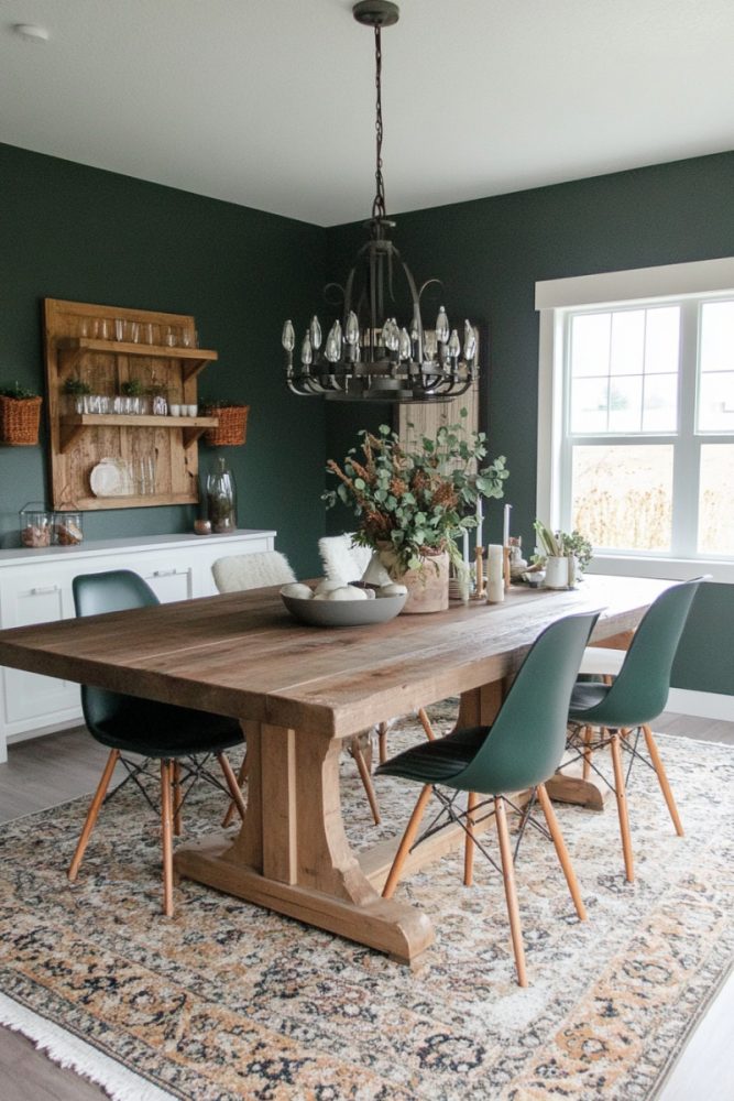
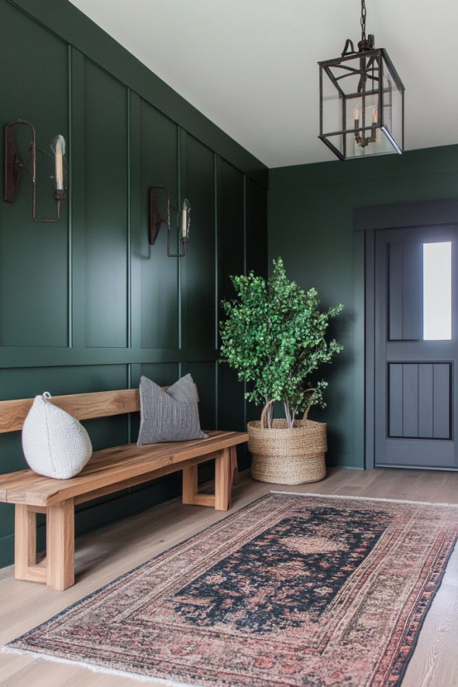
More Moody Green Paint Color Room Inspo







Final Thoughts
Moody green paint colors are rich, elegant, and timeless. Whether you want a deep forest green, a vintage olive, or a near-black statement shade, there’s a perfect moody green for every space.
Which one’s your favorite? Let me know how you plan to use these colors.
READ NEXT: 17 Bathroom Board and Batten Ideas To Step Up The Wow Factor