
This post contains affiliate links and is a member of the Amazon Services LLC Associates Program. If you make a purchase using one of these affiliate or Amazon links, I may receive compensation at no extra cost to you.
Oyster Bay by Sherwin Williams: A Complete SW 6206 Color Guide

If you love soft green paint colors but don’t want your room to feel too green, Oyster Bay by Sherwin Williams is one worth putting on your sample list.
Sherwin Williams Oyster Bay SW 6206 is a muted green with gray and subtle slate-blue influences. It has enough color to make a room interesting, but it’s subdued enough that it can almost take the place of a neutral.
And this isn’t one of those barely-there paint colors that looks off-white on the wall. Oyster Bay has some depth.
That makes it especially beautiful on kitchen cabinets, bathroom vanities, built-ins and exteriors, although it can absolutely work as a whole-room wall color, too.
If you’re considering Sherwin Williams Oyster Bay paint, here’s what you need to know about its undertones, LRV, coordinating colors and how it actually looks throughout a home.
What Color Is Sherwin Williams Oyster Bay?
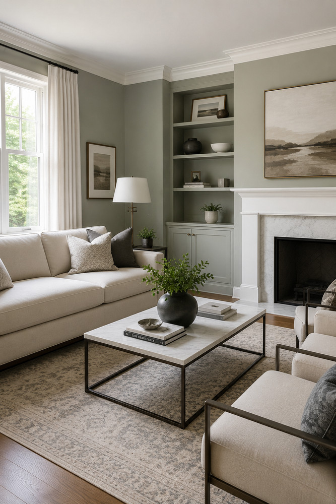
Oyster Bay SW 6206 is officially part of Sherwin Williams’ green color family. Sherwin Williams describes the color as an algae-hued neutral with slate-blue undertones.
That’s a pretty good description of what makes this color interesting.
It isn’t a traditional sage green, and it isn’t really a blue-green either. There’s enough gray mixed in to soften the color considerably.
The result is a muted, slightly cool green that can sometimes look:
- sage green
- gray-green
- blue-green
- soft gray with a green cast
Which version you see will depend heavily on your lighting and the other colors surrounding it.
Sherwin Williams Oyster Bay Quick Facts
Paint color: Oyster Bay
Number: SW 6206
Color family: Green
LRV: 44.121
RGB: 174 / 179 / 169
Hex: #AEB3A9
Use: Interior and exterior
With an LRV of about 44, Oyster Bay falls right around the middle of the light reflectance scale.
That number is important because it tells you immediately that Oyster Bay isn’t a light paint color.
It has enough depth to create noticeable contrast against white trim, countertops and tile.
What Are the Undertones of Sherwin Williams Oyster Bay?
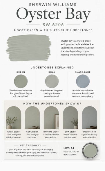
This is probably the most important thing to understand before putting Oyster Bay on your walls.
The primary color you’re seeing is green, but Oyster Bay has slate-blue undertones that give it a cooler, grayer appearance.
That combination is also why photographs of Oyster Bay can look surprisingly different from one another.
In one room, you may immediately see a muted sage green.
Move it into different lighting and suddenly it can look considerably grayer.
And next to certain finishes, you may notice more of that subtle blue influence.
I wouldn’t choose Oyster Bay based on a photo online alone. This is definitely a color worth sampling in your actual room.
Is Sherwin Williams Oyster Bay Warm or Cool?
I would put Oyster Bay on the cool side of neutral.
It doesn’t have the yellow undertones you find in warmer olive and sage greens. Instead, its gray and slate-blue influence gives it a cooler, quieter appearance.
That doesn’t mean an Oyster Bay room has to feel cold.
Pair it with warm white, white oak, natural linen, woven textures, brass, warm stone or medium-toned wood and you get a really nice balance.
That’s actually one of my favorite ways to use this color.
Instead of filling the entire room with other cool gray finishes, let Oyster Bay provide the cool color and bring warmth back through the materials.
How Dark Is Oyster Bay? Understanding Its LRV
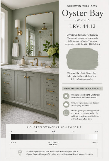
Sherwin Williams Oyster Bay has an LRV of 44.121.
LRV stands for Light Reflectance Value and runs from 0, which represents black, to 100, which represents white.
At 44, Oyster Bay sits comfortably in the mid-range.
In a bright room with large windows, it can look surprisingly soft and muted.
In a room without much natural light, however, you’re going to see significantly more depth.
This is one reason I especially like Oyster Bay for cabinetry, built-ins and vanities. You get enough contrast for the painted element to stand out without moving into a really dark green.
How Does Oyster Bay Look in Different Lighting?

Lighting can make or break almost any complex paint color, and Sherwin Williams Oyster Bay changes quite a bit depending on the room.
North-Facing Rooms
Cool northern light can emphasize Oyster Bay’s gray and blue side.
Expect the color to look more muted and potentially a little darker than the paint chip.
If you already have a lot of cool gray flooring or tile in the room, sample carefully. You may end up with a cooler overall palette than you intended.
South-Facing Rooms
This is where Oyster Bay can really come alive.
The abundance of warmer natural light generally makes the green easier to see and keeps the color from feeling too cool.
You still get that beautiful muted quality, but the overall room can feel softer.
East-Facing Rooms
You’ll get warmer, brighter light in the morning followed by cooler light later in the day.
Don’t judge your sample at 9 a.m. and call it done. Check it again in the afternoon.
West-Facing Rooms
The opposite happens here.
Oyster Bay may look cooler and grayer earlier in the day and warmer as strong afternoon and evening light enters the room.
Sherwin Williams Oyster Bay in a Living Room
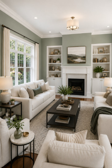
If you’re tired of white and beige walls but aren’t ready for a dramatic color, Oyster Bay can be a beautiful living room color.
There’s enough gray in it that the room doesn’t scream green.
I’d especially consider it in a living room with warm wood floors, creamy upholstery and plenty of natural light.
It can also be a great backdrop for a mix of traditional and modern pieces, which is one reason the color doesn’t feel limited to one particular decorating style.
For trim, I’d keep things relatively simple and use a soft white rather than introducing another complicated undertone.
Sherwin Williams Oyster Bay Bedroom
A Sherwin Williams Oyster Bay bedroom is probably one of my favorite applications of this color.
Bedrooms can handle a little more depth than many people realize, and Oyster Bay gives you color without making the room feel overly saturated.
Pair it with:
- warm white bedding
- flax or oatmeal linen
- medium or dark wood
- natural woven shades
- antique brass
- soft ivory curtains
That combination keeps the room from becoming overly cool.
You could also take Oyster Bay across the walls, trim and doors for a more enveloping look.
Sherwin Williams Oyster Bay Kitchen
There are two very different ways I’d consider using Sherwin Williams Oyster Bay in a kitchen.
The first is on the walls.
Oyster Bay walls can be a nice alternative to another beige or white kitchen, particularly when you already have white or warm wood cabinets.
But I actually think Oyster Bay becomes even more interesting on the kitchen cabinets themselves.
Sherwin Williams Oyster Bay Kitchen Cabinets
This may be my favorite use for SW 6206.
Oyster Bay has enough depth to make cabinetry look intentionally colored, but it’s considerably softer than the deep forest and olive greens we’ve seen on cabinets.
That makes it easier to live with.
For a timeless kitchen, I’d pair Oyster Bay cabinets with a warm white or softly veined stone countertop, warm metals and natural wood.
Another option is using Oyster Bay only on the island while keeping the perimeter cabinets a soft white.
Just pay close attention to your countertop.
A countertop with very strong cool-blue gray veining could pull Oyster Bay cooler, while a very creamy yellow countertop could exaggerate the contrast between the two.
Sherwin Williams Oyster Bay Bathroom
If you want a bathroom that feels serene without automatically reaching for pale blue, Sherwin Williams Oyster Bay is an excellent alternative.
It’s especially pretty with white marble, warm white tile, unlacquered brass or champagne-toned hardware and natural wood.
There’s also some great real-world inspiration for this particular application.
Sherwin Williams has featured a professionally designed bathroom in which Oyster Bay was used on the walls, cabinetry and trim. The designer had the color mixed at 75% strength and then used different sheens on the walls and millwork.
That’s a really interesting approach if you love Oyster Bay but think full-strength SW 6206 might be a little too dark for your bathroom.
Does Oyster Bay Work in Small Rooms?
Yes, but I wouldn’t choose it specifically because you’re trying to make a small room look bigger.
Remember that LRV of 44.
This is still a medium-depth paint color.
Instead, use Oyster Bay in a small room when you want the space to feel cozy, intentional and colorful.
A small powder room, laundry room or mudroom could actually be the perfect place to use it.
And if the room doesn’t have much natural light, don’t automatically fight that fact. Sometimes embracing a slightly moodier paint color looks much better than trying to force a dark room to appear bright with the wrong pale paint.
Sherwin Williams Oyster Bay Exterior
Sherwin Williams Oyster Bay exterior paint deserves serious consideration if you’re looking for a muted green house color.
Exterior sunlight tends to wash paint colors out, so Oyster Bay’s additional depth becomes an advantage here.
Outside, I’d expect it to read lighter and softer than it does inside.
It’s particularly well suited to homes with natural surroundings because the muted green doesn’t feel overly colorful.
I would consider Oyster Bay exterior paint with:
Warm white trim: Creates a classic green-and-white exterior without a harsh contrast.
Natural stone: The muted green can connect beautifully with earthy stone colors.
Wood accents: Cedar and other warm woods add warmth against Oyster Bay’s cooler undertones.
Dark accents: A very dark bronze, charcoal or near-black front door can create much stronger contrast.
I’d be more careful if your home’s permanent materials have pronounced pink, peach or orange undertones. Always paint a large sample beside your roof, brick and stone before deciding.
What Trim Color Goes With Oyster Bay?
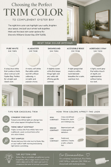
You don’t need to overcomplicate this.
Sherwin Williams actually lists Spare White SW 6203 and Greek Villa SW 7551 among Oyster Bay’s coordinating colors.
Those give you two noticeably different directions.
Oyster Bay + Spare White
Spare White gives you a quieter, more subdued combination.
If you don’t want a strong contrast between the walls and trim, this pairing is worth sampling.
Oyster Bay + Greek Villa
Greek Villa brings more warmth to the palette.
I particularly like the idea of this pairing when a room includes warm woods, creams and natural textures because the warmer white can keep Oyster Bay from feeling too cool.
Your home’s fixed finishes still matter, so don’t pick a trim white from a screen.
Sherwin Williams Oyster Bay Coordinating Colors
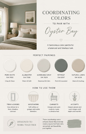
According to Sherwin Williams, three coordinating colors for Oyster Bay SW 6206 are:
Spare White SW 6203
A light neutral that creates a soft transition next to Oyster Bay.
Greek Villa SW 7551
A warmer white that can provide more noticeable contrast and warmth.
Prairie Grass SW 7546
An earthier coordinating color for a more natural palette.
You certainly aren’t limited to those three colors.
Oyster Bay can also look beautiful alongside warm wood tones, creamy whites, dark bronze, charcoal, muted natural greens and some soft stone colors.
The key is remembering that Oyster Bay already has multiple undertones. The more complicated your surrounding colors become, the more important sampling becomes.
Oyster Bay vs. Sea Salt
If you’re comparing Sherwin Williams Oyster Bay vs. Sea Salt, the biggest difference is depth.
Sea Salt SW 6204 is the lighter, airier choice.
Oyster Bay has considerably more visual weight and creates a stronger color statement.
If you’re looking for a subtle wash of color across a bright room, you may prefer Sea Salt.
If you keep sampling pale green-gray colors and wishing they had a little more presence, Oyster Bay may be exactly what you’re missing.
Oyster Bay vs. Comfort Gray
Comfort Gray SW 6205 sits between Sea Salt and Oyster Bay on the same Sherwin Williams color strip.
That’s useful because it gives you another option when Oyster Bay feels almost right.
Think of Comfort Gray as a stepping stone between the lighter Sea Salt and deeper Oyster Bay.
If Oyster Bay feels a little too dark when you sample it but you still love this general color family, Comfort Gray is absolutely one I’d test beside it.
Oyster Bay vs. Retreat
Retreat SW 6207 takes this color family considerably deeper.
If Oyster Bay feels subdued and relaxed, Retreat makes more of a statement.
I tend to think Oyster Bay is easier to use across an entire room, while Retreat can be especially striking on cabinetry, built-ins or in a room where you intentionally want more depth.
Put the two next to each other and Oyster Bay will immediately look lighter and softer.
Oyster Bay vs. Acacia Haze
Acacia Haze SW 9132 is another muted green that often lands on the same sample list as Oyster Bay.
The important thing here is not to assume that two muted greens will behave identically just because they look similar online.
Sample them next to your flooring, countertops and trim.
With colors in this category, your home’s fixed materials often make the decision for you.
What Colors Should You Be Careful Pairing With Oyster Bay?
This is something that gets overlooked in a lot of paint color reviews.
A coordinating color doesn’t have to be ugly on its own to look wrong next to Oyster Bay.
I’d be especially careful around:
Strong yellow creams. A very yellow cream can make Oyster Bay’s cooler green-gray quality much more obvious.
Pink or violet grays. These can create an undertone battle against the green.
Very icy blue-grays. Depending on the lighting, they may bring out more of Oyster Bay’s cool slate-blue side than you wanted.
Complicated beige stone. Granite, travertine and some natural stones can contain several undertones at once. Look at the actual combination rather than relying on color names.
None of these are absolute rules. They’re simply combinations I’d want to sample carefully before buying several gallons of paint.
Is Sherwin Williams Oyster Bay Still a Good Color in 2026?
Yes — particularly if you’re choosing it because it works with your home rather than because you’re trying to follow a specific trend.
We’re seeing much more interest in muted, nature-inspired colors than the cool gray interiors that dominated for years, and Oyster Bay fits naturally into that direction.
But it doesn’t feel like a trendy emerald or olive green.
Its gray influence makes it much quieter.
That gives Oyster Bay the ability to work with traditional, transitional, coastal, organic modern and even some modern farmhouse interiors without making the room feel themed around a particular color trend.
Is Oyster Bay the Right Paint Color for Your Home?
I’d put Sherwin Williams Oyster Bay SW 6206 on your shortlist if you want a muted green with noticeable depth and don’t mind a color that changes somewhat throughout the day.
It’s particularly worth sampling if you:
- love sage and gray-green colors
- want more color than Sea Salt
- need a medium-depth green for cabinetry
- want a soft green exterior
- have warm wood or natural materials to balance it
- want something more interesting than beige or gray
I’d be more cautious if your room is very dark and you’re specifically looking for a light, airy wall color. Oyster Bay’s LRV of about 44 means it can have considerably more depth than you expect after seeing bright photographs online.
And that’s really the takeaway with this color.
Oyster Bay isn’t a barely-there neutral. It’s a muted green that can behave like a neutral when it’s surrounded by the right materials.
That’s what makes it so good.
Before committing, paint a large sample and look at it in the morning, afternoon and evening. Sherwin Williams also cautions that colors displayed on screens may not accurately represent the actual paint color, so a physical sample is much more useful than choosing from photographs alone.
If Oyster Bay works with your lighting and fixed finishes, it’s a beautiful way to bring color into a home without making the room feel overly green.
