This post contains affiliate links and is a member of the Amazon Services LLC Associates Program. If you make a purchase using one of these affiliate or Amazon links, I may receive compensation at no extra cost to you.
21 Blue Accent Wall Ideas That Instantly Change the Whole Room

There’s something about a blue accent wall that makes a space feel done without looking like it’s trying too hard. It’s confident, calming, and somehow both modern and timeless. Whether you’re into deep navy drama or soft misty tones, the right blue instantly grounds a room—and gives it actual personality.
We pulled together 21 of our favorite blue accent wall ideas —from subtle matte textures to glossy, color-drenched statements. These ideas don’t scream “Pinterest circa 2015,” and they don’t need a full renovation either. Just a can of paint, a vision, and maybe a good playlist. Let’s dive in.
Why Blue Accent Walls Just Work
Blue is one of those rare colors that plays well with almost anything. It can cool down a warm space or add depth to a minimal one.
The magic is in the tone—go deeper for a cozy, cocoon effect or lighter for something serene and spa-like.
Texture matters too: matte finishes feel modern, while high-gloss or lacquered blues bring a punch of glam.
And placement is everything—sometimes the wall you don’t expect to highlight is the one that makes the biggest impact.
1. Moody Navy Bedroom
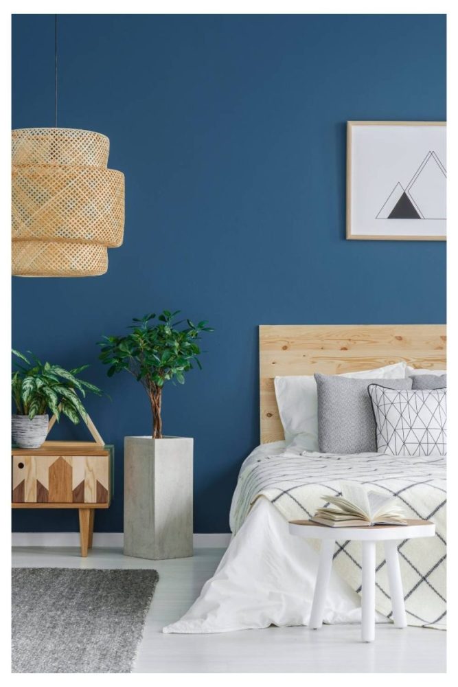
A deep navy wall behind the bed turns a basic bedroom into a sleep sanctuary.
It’s bold, but not loud—and it makes crisp white bedding look extra intentional.
We love pairing it with brass sconces or warm wood accents for contrast.
Think: boutique hotel meets modern minimalism.
RELATED: 19 Paint Colors That Make A Room Look Bigger (Without Going Full White)
2. Dusty Blue Dining Room
Dusty blue is the secret weapon of color-shy decorators—it’s soft, stylish, and totally livable.
On a dining room wall, it adds a layer of polish without stealing the spotlight.
This tone pairs beautifully with black, beige, or olive green details.
It’s the kind of color that makes dinner feel just a little more elegant.
3. Glossy Cobalt in a Powder Room
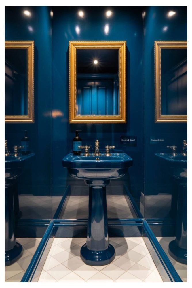
Want drama in a tiny space? Go full-gloss cobalt blue.
The shine makes it feel chic instead of claustrophobic, and it reflects just enough light to feel luxe.
Add a vintage mirror or sculptural lighting for extra impact.
Powder rooms are made for bold choices—and this one delivers.
4. Coastal Blue Paneling
A classic paneled wall in a light coastal blue instantly says “vacation house”—even if you live in a city apartment.
It brings a breezy, beachy vibe that still feels elevated.
Perfect with rattan, crisp linens, and maybe a framed seascape or two.
This one’s basically a serotonin boost in wall form.
5. Charcoal Blue in a Home Office

If you want a home office that feels focused and modern, try a charcoal-toned navy.
It adds sophistication without feeling cold—and works especially well with leather chairs or metal shelving.
We like it with low lighting and textured neutrals for a subtle moody vibe.
Great for channeling main-character energy on Zoom calls.
6. Sky Blue Nursery Accent Wall
Soft sky blue instantly calms down a nursery without veering into babyish territory.
It plays beautifully with natural woods, whites, and even pops of mustard or terracotta.
Use it behind a crib or changing station to define the space.
It feels like fresh air in paint form.
7. Indigo Geometric Mural
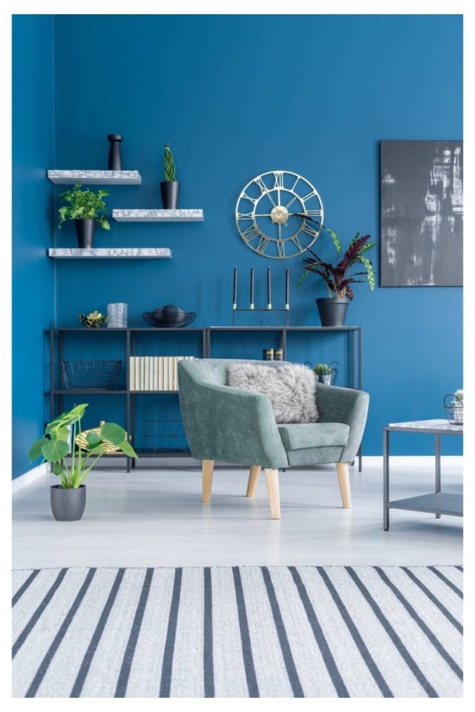
This one’s for the design maximalists: an indigo wall with painted-on geometric shapes or blocks.
It’s graphic, artsy, and totally unique—like a gallery wall, but way cooler.
Stick to varying tones of the same blue family to keep it cohesive.
It makes a great backdrop for simple, modern furniture.
8. Midnight Blue Fireplace Wall
A fireplace wall in a deep midnight blue feels luxe and intimate—like a velvet curtain you want to touch.
We love it with a raw stone surround or minimalist mantle.
Add candles, low lighting, and a soft throw to complete the look.
This one’s made for wine nights and rainy-day movies.
9. Two-Tone Wall with Pale Blue on Top

Divide your wall horizontally and paint the top half a soft, airy blue.
It draws the eye up and makes the room feel taller without going full-on color block.
Try it in an entryway or small hallway to stretch the space visually.
It’s subtle, but so smart.
10. Denim Blue in the Kitchen
Yes, a blue kitchen wall can look sophisticated—especially in a soft denim tone.
It adds depth behind open shelving or above a breakfast nook.
Pair it with white cabinets, copper accents, or matte black hardware.
We didn’t expect to love this one, but it totally works.
11. Watercolor-Effect Feature Wall
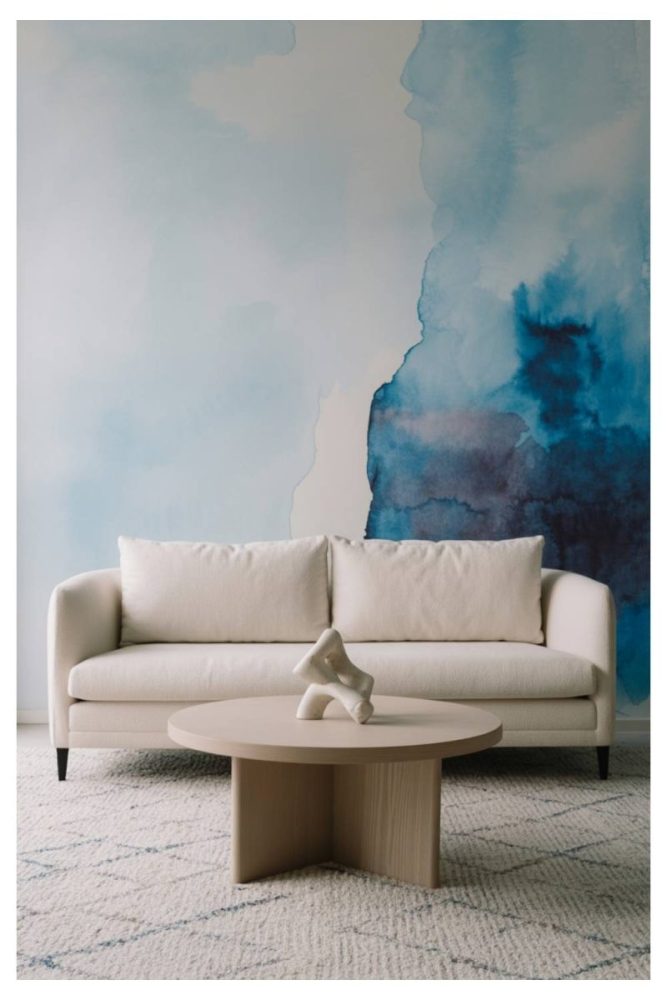
For a dreamy, ethereal vibe, try a hand-painted watercolor effect in varying shades of blue.
It’s soft and artistic without feeling messy—perfect for a bedroom or creative studio.
Use big, blended brushstrokes for that foggy, horizon-line look.
Like a Monet painting you live inside.
12. Navy Board and Batten
Board and batten detailing gets a moody upgrade with deep navy paint.
It brings texture and dimension while still keeping things structured.
Use it in a hallway, stairwell, or living room focal wall.
We love the contrast with cream or camel-colored furniture.
13. Periwinkle Pop in a Kids’ Room

Periwinkle is playful, fresh, and totally underrated.
It’s bright enough for a kids’ room but still chic enough to grow with them.
Try it on one wall behind a bed or reading nook, layered with prints and art.
Instant mood-lifter, no cartoons required.
14. Blue Ceiling as a “Fifth Wall”
Flip the idea of an accent wall—paint the ceiling instead.
A soft blue ceiling brings the sky indoors and makes the whole room feel taller.
It works especially well in white or neutral rooms that need a little life.
Unexpected? Yes. Gorgeous? Absolutely.
15. Navy and White Stripes
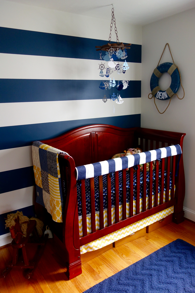
Vertical stripes in navy and white create height and drama with a bit of preppy flair.
It’s classic but not boring—and totally transforms a hallway, powder room, or accent wall in a nursery.
Keep the rest of the space clean and minimal to let the stripes shine.
A little nautical, a lot cool.
16. Muted Blue Wallpaper
Wallpaper in a dusty or muted blue to make your room pop.
It’s an easy detail that feels very designer.
Works great in living rooms or cozy reading nooks.
17. Lacquered Teal Dining Wall
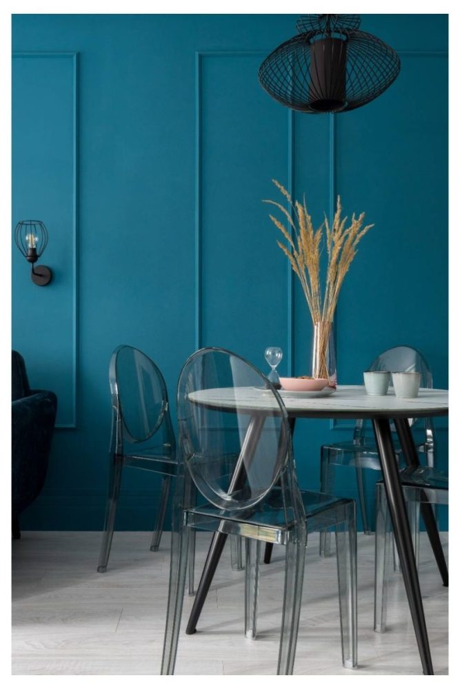
Want to make guests go “whoa”? Try a high-gloss teal wall in your dining area.
It reflects candlelight beautifully and feels glam in a not-trying-too-hard way.
Add a modern chandelier and mixed wood tones to ground it.
It’s giving dinner party energy, always.
18. Soft Blue Grasspaper Finish
A subtle grasspaper blue wall gives you texture and tone in one swoop.
It feels earthy, soft, and modern all at once.
This is one of those looks that’s best in person—the depth catches the light just right.
We love it in a sun-drenched living room or minimalist bedroom.
19. Navy Herringbone Wallpaper
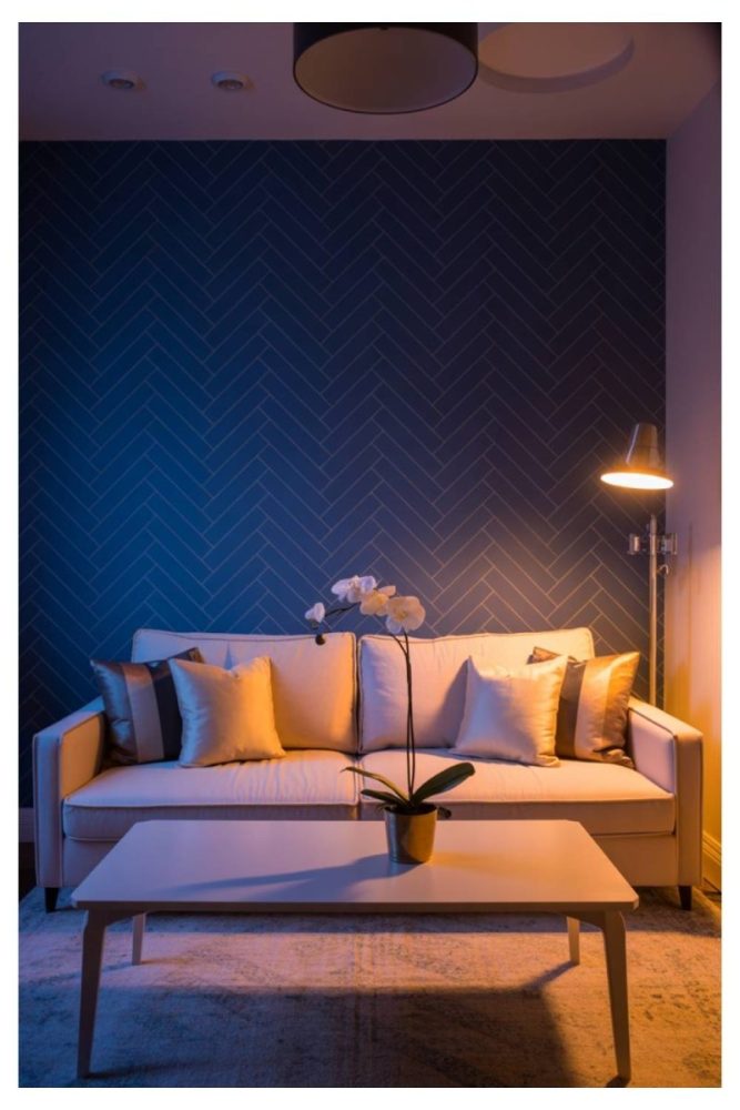
If you’re not ready to commit to paint, a navy herringbone wallpaper is a foolproof move.
It adds texture and pattern without overwhelming the space.
Try it in a foyer or bathroom for a quiet “wow” moment.
Pairs beautifully with brass fixtures and marble.
20. Cerulean Blue Entry Wall
Your entryway sets the tone—so why not make it bold?
A punchy cerulean blue feels energetic and welcoming right out of the gate.
It’s especially great with black-and-white tile or a patterned runner.
Throw in a sculptural mirror and you’re done.
21. Deep Blue Behind a Gallery Wall

Instead of a neutral backdrop, try placing your art on a moody blue wall.
It makes every frame and color pop more—especially golds, creams, and pastels.
We love this in a hallway or stairwell where the layout can be a bit playful.
It turns a basic collection into a full-on vibe.
Conclusion
A blue accent wall doesn’t have to be complicated, but it should feel intentional. Whether you’re drawn to soft, serene tones or deep, dramatic hues, the right blue sets a tone—and transforms a space faster than you’d expect.
So save your favorites, pin the ones that speak to you, and don’t be afraid to go bold. Paint is temporary. Good taste is forever.